Kafka's Organic
If we treat pets like family, why should their food look and feel any different from ours? That idea shaped everything. Kafka’s Organic wasn’t just about creating packaging — it was about reframing pet food as fresh, joyful, and crafted with the same love you’d put into your own meals.
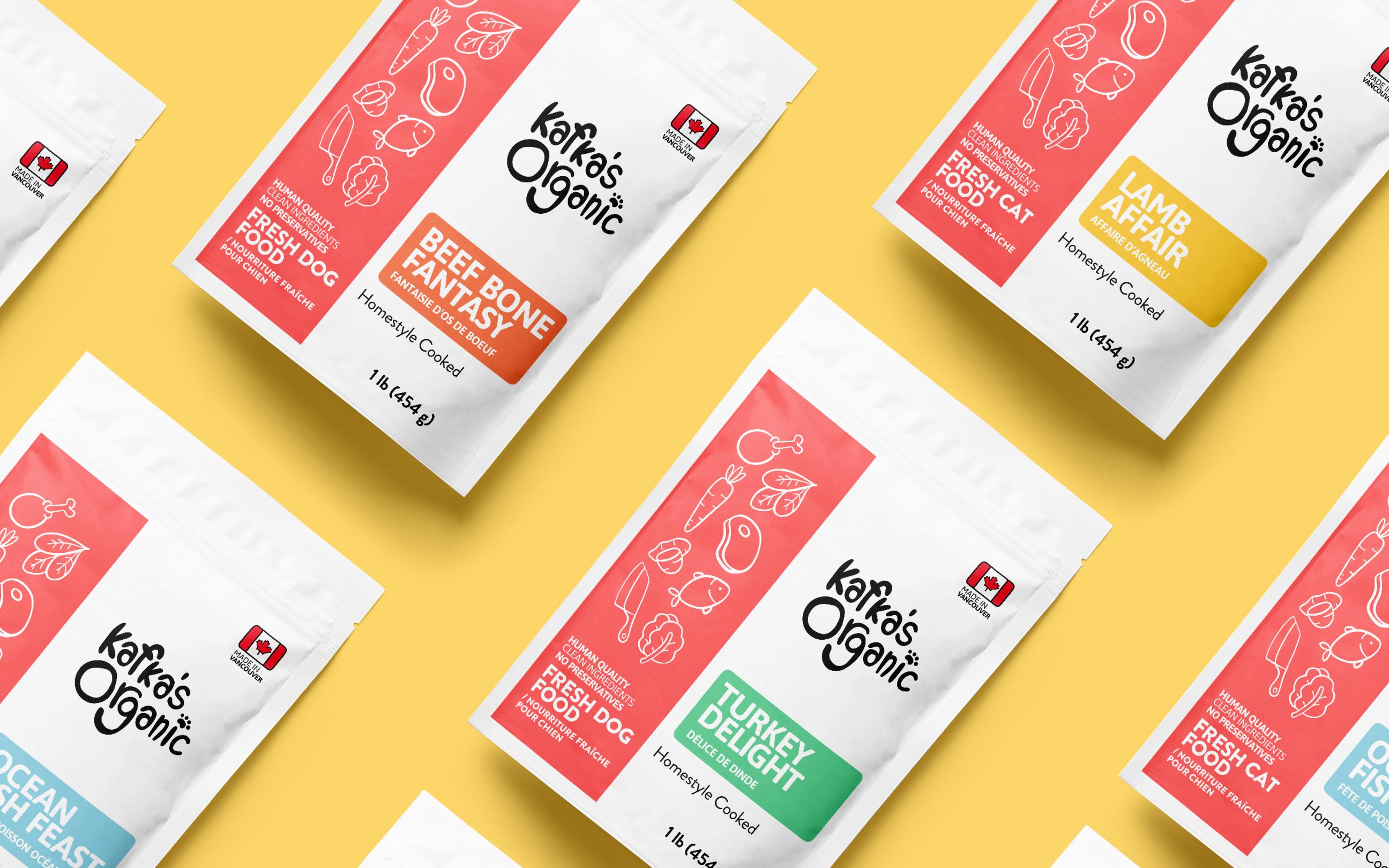
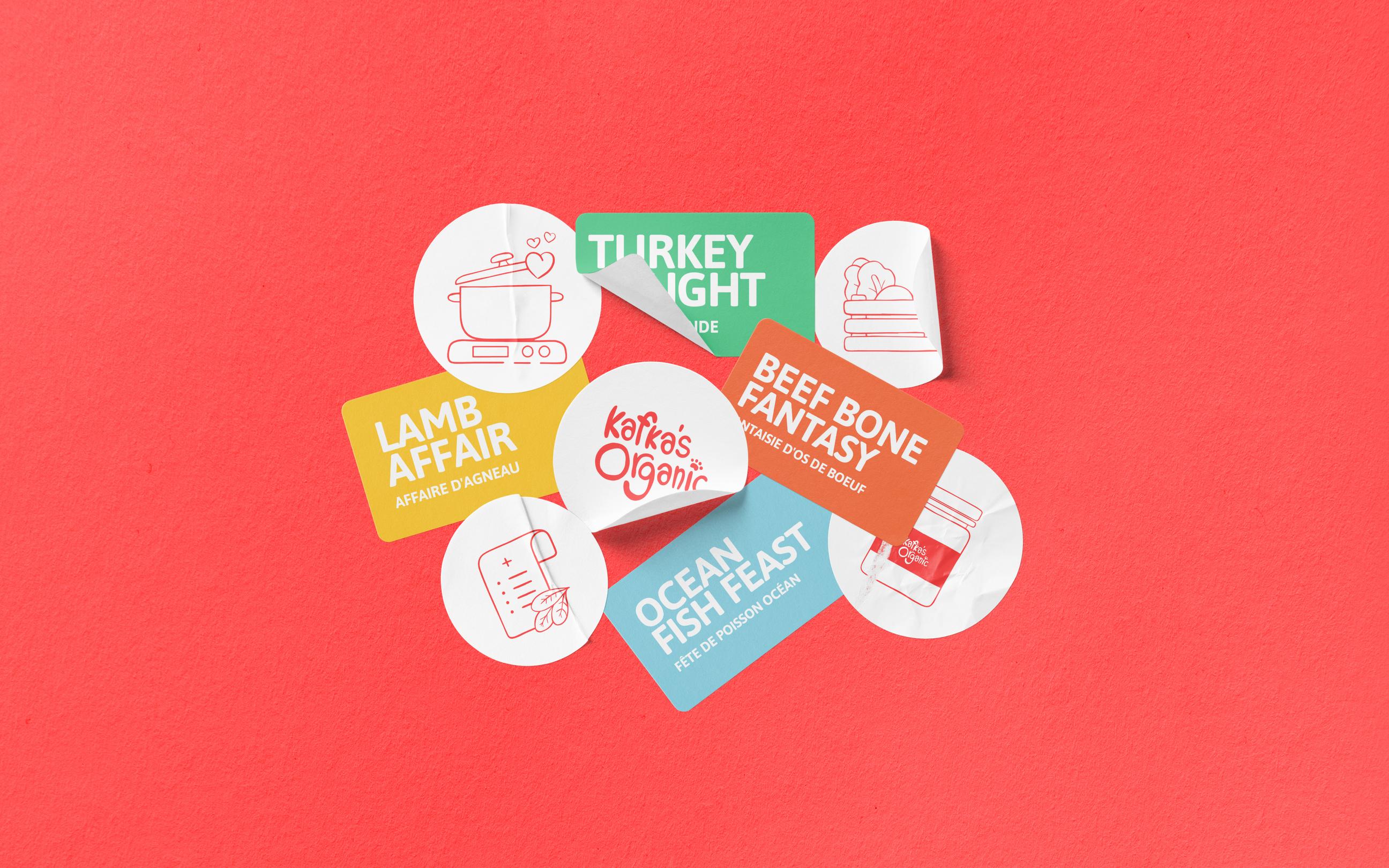
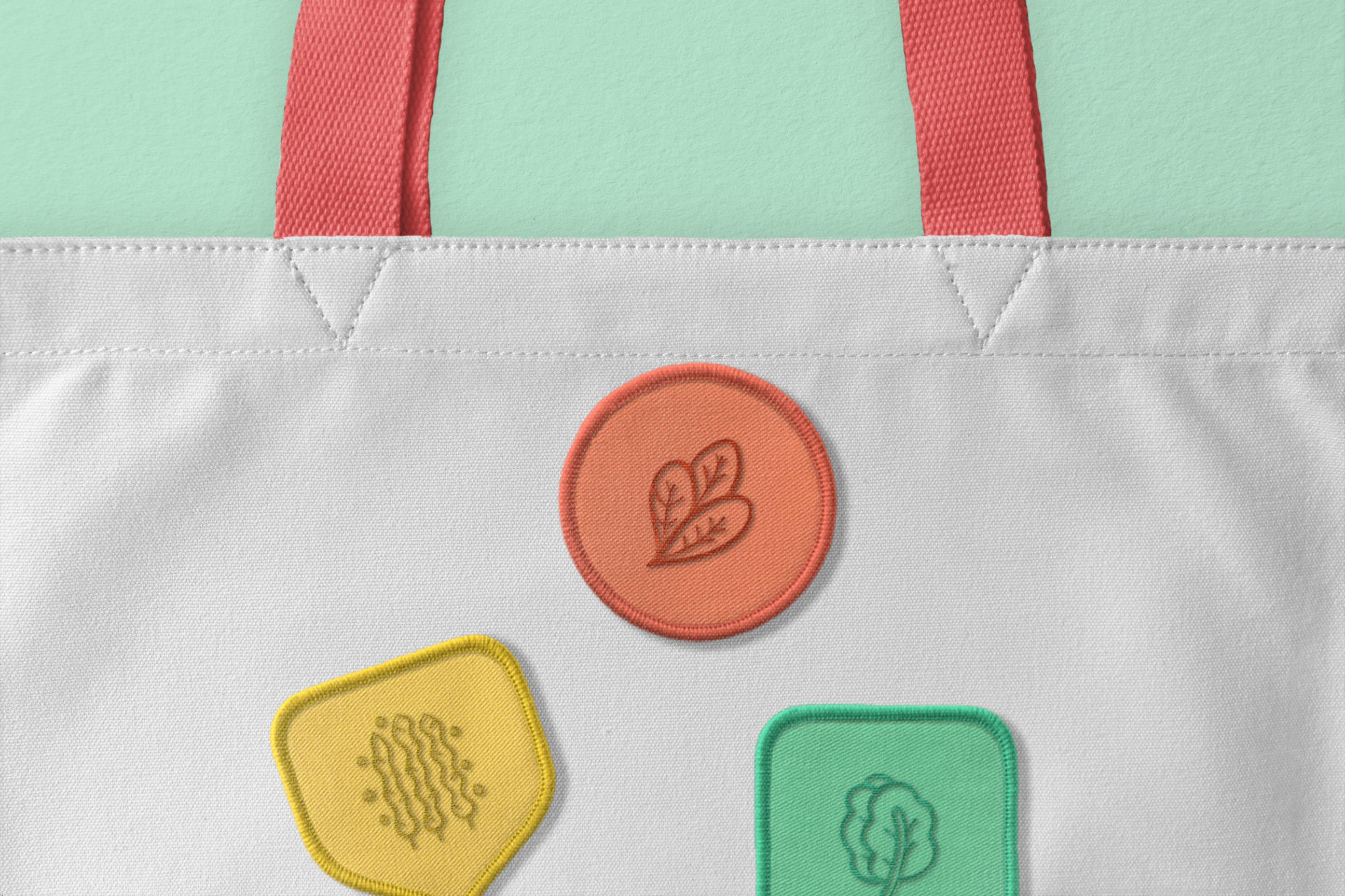
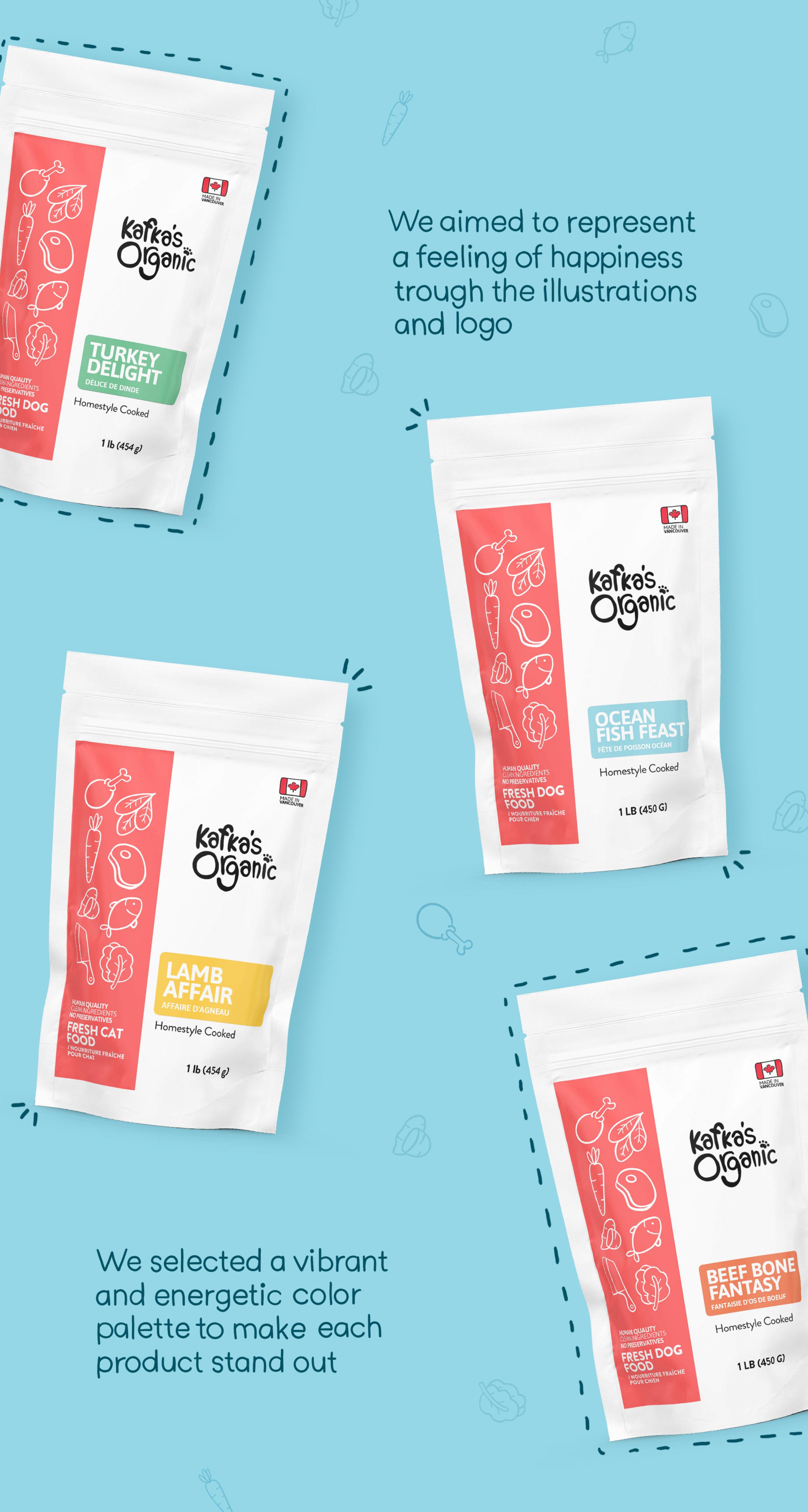
We built the identity around warmth and honesty. White space gave the packaging clarity, bold color blocks brought variety without clutter, and hand-drawn illustrations made it personal — perfectly imperfect, like a home-cooked meal. Every detail, from the handwritten logo to the subtle “Made in Canada” badge, was stitched with trust. The result is a brand that feels premium yet approachable, playful yet grounded — a story told through color and line about care, freshness, and family.