MWORK
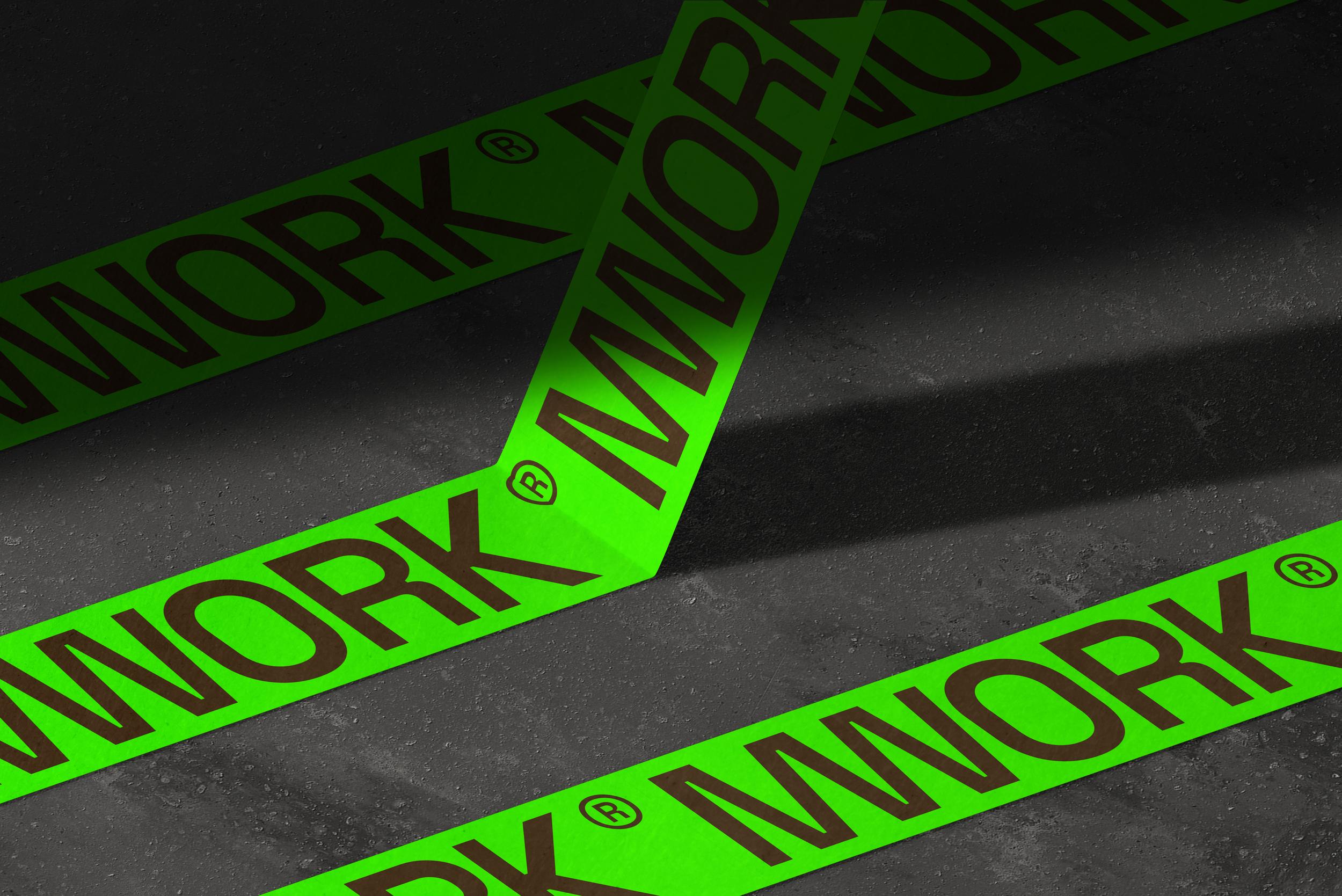
MWORK came to us as a design-build firm specializing in innovative construction materials and transforming both commercial and unique residential spaces. Their work is unapologetically bold, and they needed a brand that could meet that same energy head-on. We didn’t lean on brutalism as a passing trend—we used it as a philosophy. Built on a strict grid system, every element of the identity was engineered with precision, balance, and intent. The typography is assertive, the neon green unapologetically loud, and together they create a system that refuses to fade into the background.
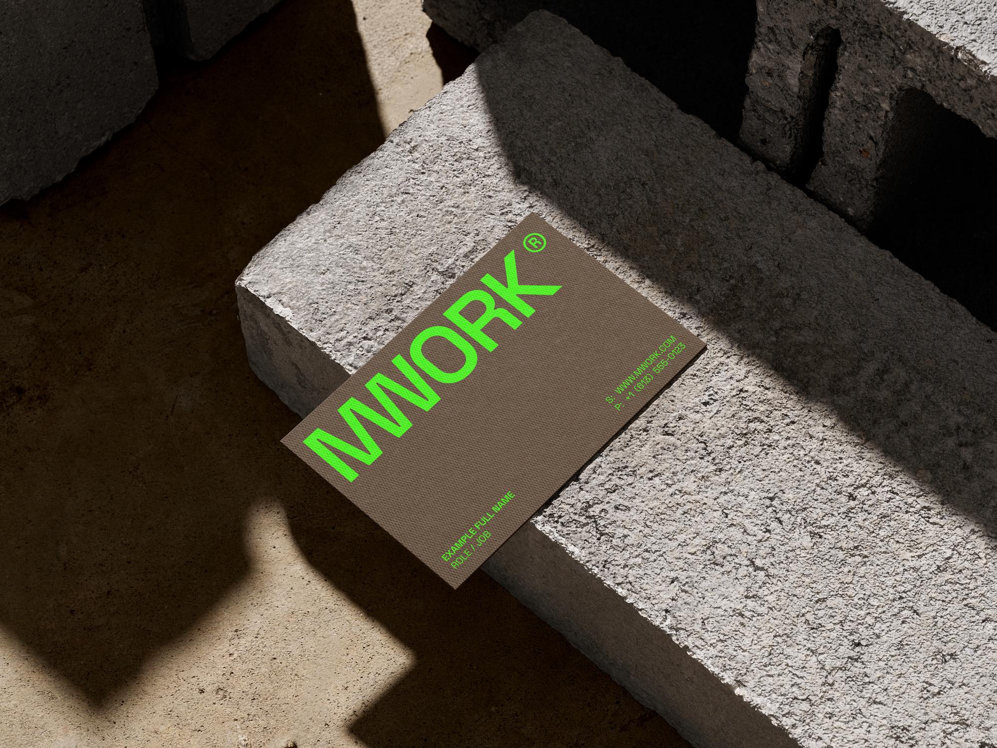
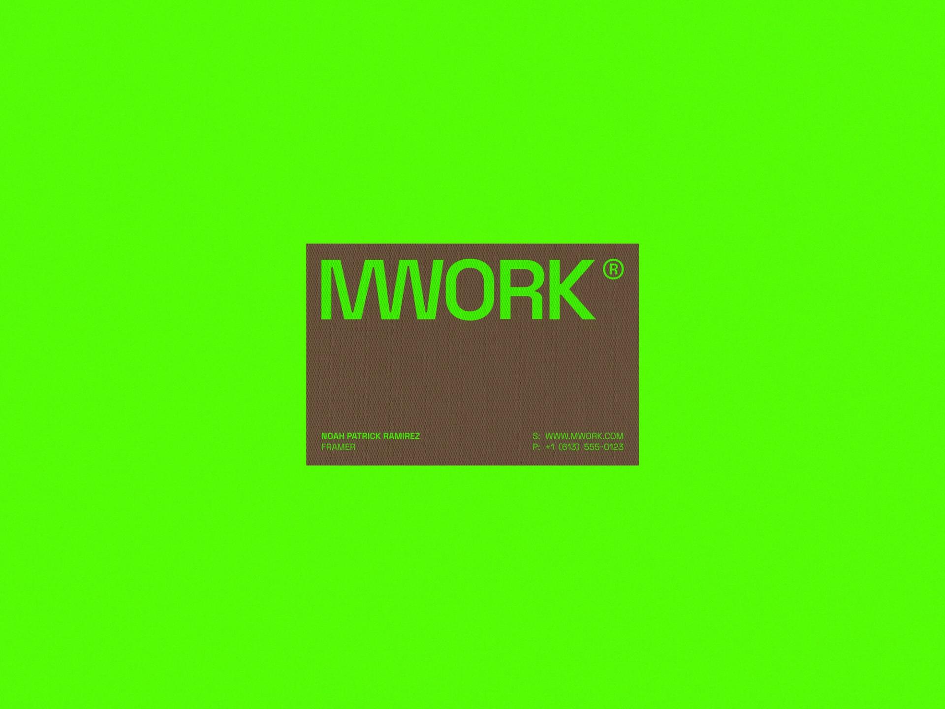
To ground the intensity, we introduced tactile, earthy counterpoints. Heavy brown paper stocks and raw textures brought physicality, permanence, and a sense of grit to the brand. The resulting identity is a study in contrast: neon and earth, modernity and tradition, industrial grit and design discipline. It’s not just a logo or a color—it’s a full brand language that speaks before a single word is read. For a design-build firm carving its place in a competitive landscape, that presence makes all the difference.