Shoreside Living Real Estate
Shoreside Living came to us with a vision: to capture the calm sophistication of coastal life and translate it into a timeless brand identity. The goal wasn’t to shout luxury but to whisper it — through quiet confidence, refined typography, and an icon that instantly conjures palm-lined horizons. Every element of the design is minimal yet intentional, setting the tone for a lifestyle brand that speaks to elegance, leisure, and escape.

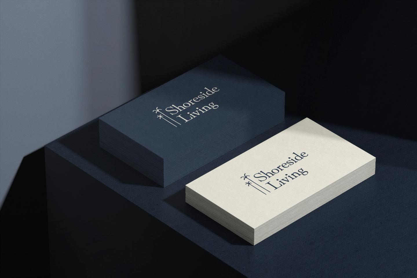
We built an identity that feels both grounded and aspirational. The palette leans into deep coastal hues, balanced by airy neutrals that echo sand, sky, and sea. The logomark — tall, slender palms — becomes an anchor of familiarity and serenity, while the type system communicates refinement without pretense. From the logo to the business cards, the brand carries a quiet strength: premium without being ostentatious, approachable without losing exclusivity.
