SRIIC Real Estate
SRIIC came to us at a turning point—they needed more than a polished logo, they needed an identity that could carry the weight of trust, guidance, and momentum. Immigration is about journeys, and we built their brand to reflect that. The mark is engineered on an invisible grid, every curve and cut calculated for balance and precision. It’s minimal on the surface, but beneath it lives a quiet structure that mirrors the reliability of an institution built to last.

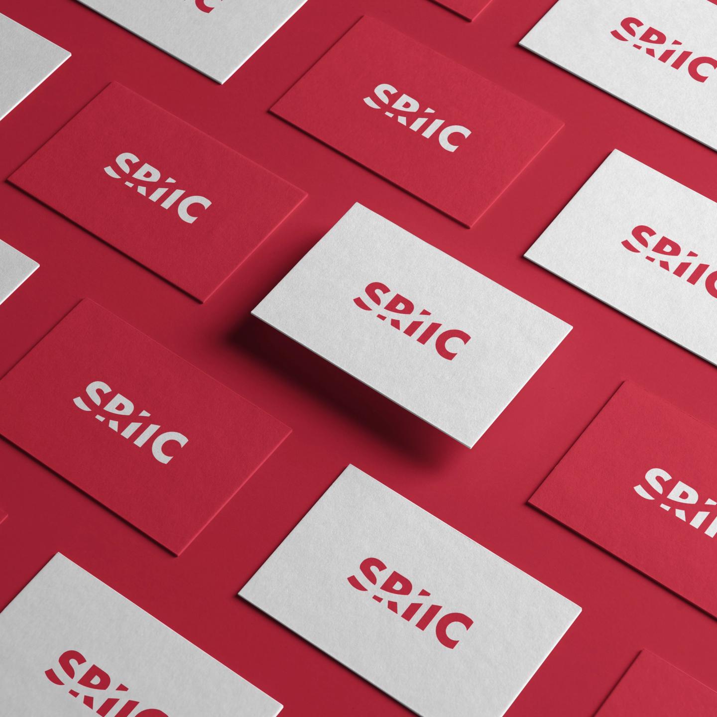
The sweeping diagonal became the core narrative: a path forward, a horizon line that stays steady while everything else changes. Negative space was designed to lead the eye, creating motion in stillness—guiding the viewer through a story of progress. This wasn’t about decoration; it was about authority and trust, shaped in a way that lingers long after you’ve seen it. With custom typography, bold applications, and a visual system built for scalability, SRIIC’s new brand now stands as a beacon of direction and certainty for those seeking a new chapter.
