A brand you can hold.
Packaging and print, considered down to the finish.
From identity to object
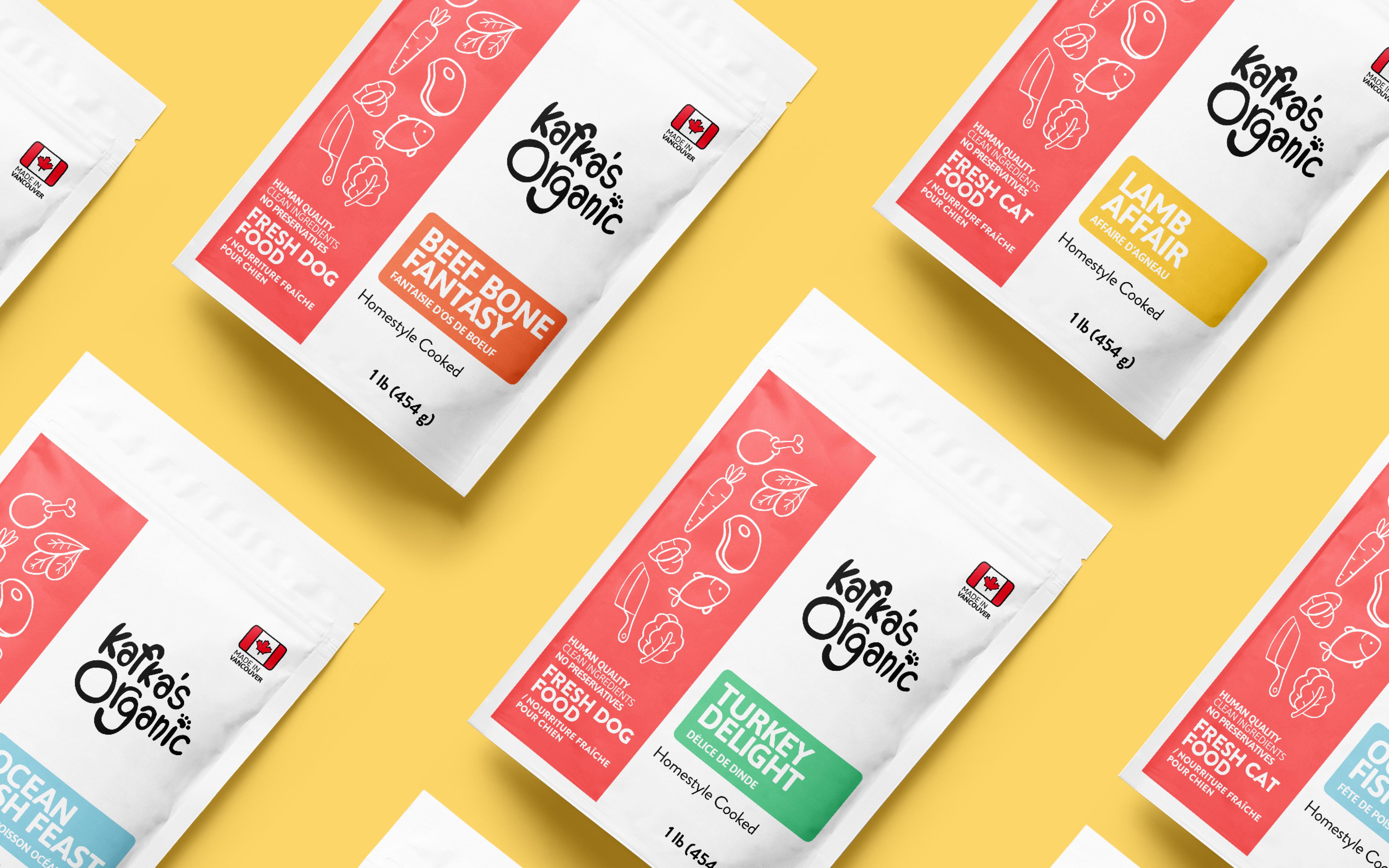
A new product needs a package. An established brand needs its printed materials to catch up. Hooman designs packaging, labels and print as part of the same identity, with clear choices about what someone sees first, reads next and holds in their hands. The package family above uses a consistent layout while color and naming distinguish the recipes.
One family. Clear differences.
Build recognition across every variation.
Hierarchy
Make the product easy to identify.
Variation
Give every variant a distinct identity.
Consistency
Keep the family visibly connected.
Design the reading order
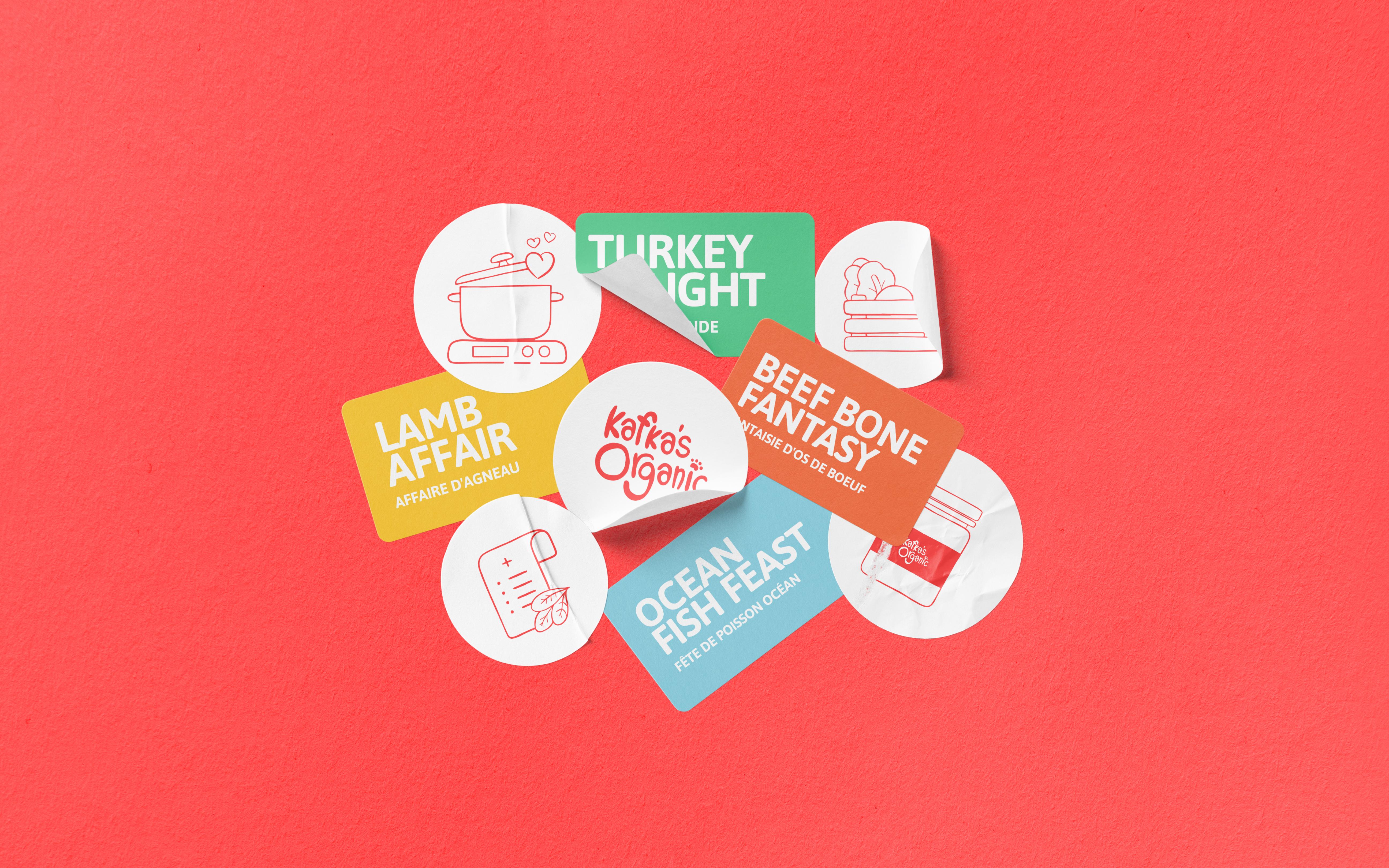
We begin with the information someone needs to choose: what the product is, which version they are holding and what distinguishes it. That order guides the scale, position and contrast of the name, descriptor and supporting copy.
The label family shown here keeps the brand and structure consistent while color and recipe names change. Recognition comes from the parts that stay fixed; navigation comes from the parts that change. We decide those rules before adapting the artwork across the range.
We check the design on the actual dimensions, with the longest product name and the densest approved copy. A layout that only works on the simplest variant is not a finished system.
What we can take on
We establish the information hierarchy, then develop the artwork across the agreed product range. One label becomes a system with room for different names, sizes and variants. Existing dielines, approved product copy and supplier requirements shape the design from the start.
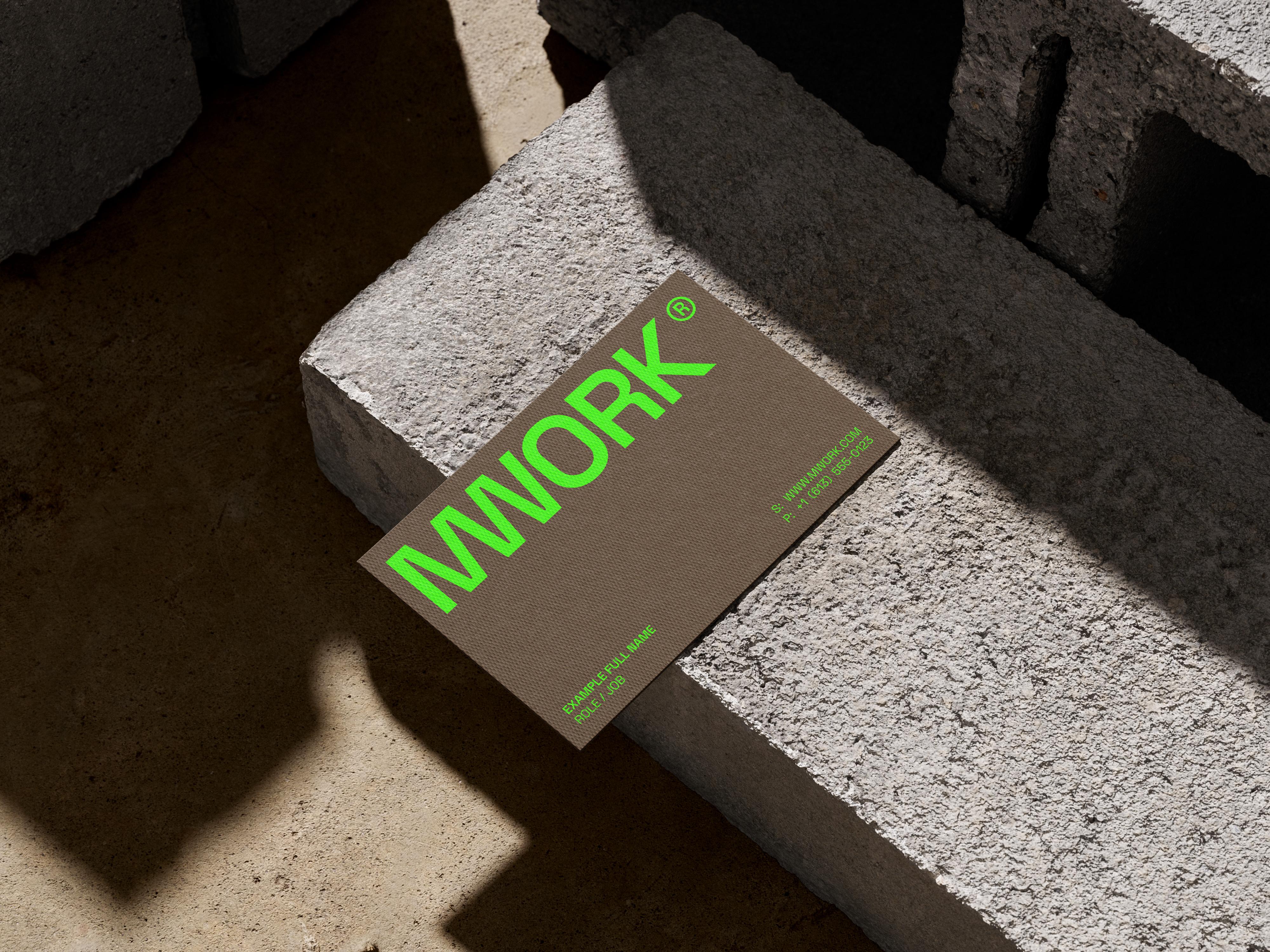
Business cards, stationery, brochures and inserts should feel related without using the same layout everywhere. We adapt type, color and imagery to the size, reading distance and purpose of each piece, then prepare the agreed artwork for production.
We work from the printer's specifications and confirm the intended stock, finish and artwork requirements before final delivery. Proof review and supplier coordination can be included in the scope. Printing, manufacturing and shipping are separate services and costs to agree with the supplier.
Design meets production.
Decisions made before the print run.
Work from the real constraints
Format comes first. We confirm the dimensions, supplied dieline, folds, seams and printable areas with the production partner. Important text should be placed deliberately around those constraints rather than discovered to be awkward when the artwork reaches the printer.
Stock and finish affect the direction. We discuss whether the piece should feel restrained, tactile, bright or utilitarian, then check the proposed choices against the supplier's capabilities and the project's production budget. Material decisions belong in the design conversation.
Artwork approval is a defined step. Your team signs off product facts and copy; the supplier confirms technical specifications; we prepare and review the design against the agreed brief. Physical samples and proofs can be included when the project calls for them.
An artwork system you can use
The agreed deliverables can include a master layout, artwork for each approved variant, print-ready exports, editable source files and a concise guide to adapting the system. We specify the file formats and ownership at the start.
We separate a new variant from a redesign. The guide identifies what can change, what stays fixed and when a longer name, new format or different product category needs a design review. That makes future additions easier to plan.
Printer charges, tooling, physical prototypes and shipping are scoped separately. We can coordinate with your production partner, but a design proposal should make those responsibilities clear rather than hide them inside a general deliverables list.
Start with one real piece
Bring the product or printed item, your existing identity and any supplier specifications. We can begin with one package or a focused set of materials, establish the direction, then extend it across the agreed range. If the identity itself needs work, we define that alongside the physical applications so the two support each other.
FAQ
Most common questions
Yes. We can extend an existing identity into packaging and print. Share the brand files and guidelines so we can see what is established, what needs adapting and whether any missing elements should be designed as part of the project.
Our core role is design and artwork. Supplier coordination and proof review can be scoped with the project, while the supplier handles physical production. We agree who owns each step, including final sign-off, before files go to print.
Your team provides and approves the product facts, required label copy and claims. We design their hierarchy and placement. Any specialist review of that information should be completed before final artwork approval.
Send the number of products or pieces, the variants, your existing brand materials, supplier specifications and intended launch date. We use those details to define the design work, adaptations, review stages and final deliverables.