Light & Dark Mode Done Right: A Home-Services App UI Breakdown
By Yekta
Most light and dark mode writeups start with generic advice and end with a toggle. That is not helpful if you are actually shipping a product.
In this breakdown, we are using one concrete use case: Ample, a home-services app UI we designed, shown here in both light and dark mode on the same screen. We are going to stay anchored to this exact image and unpack the decisions that make it feel clear and steady. Not just the colors, but the system behind them.
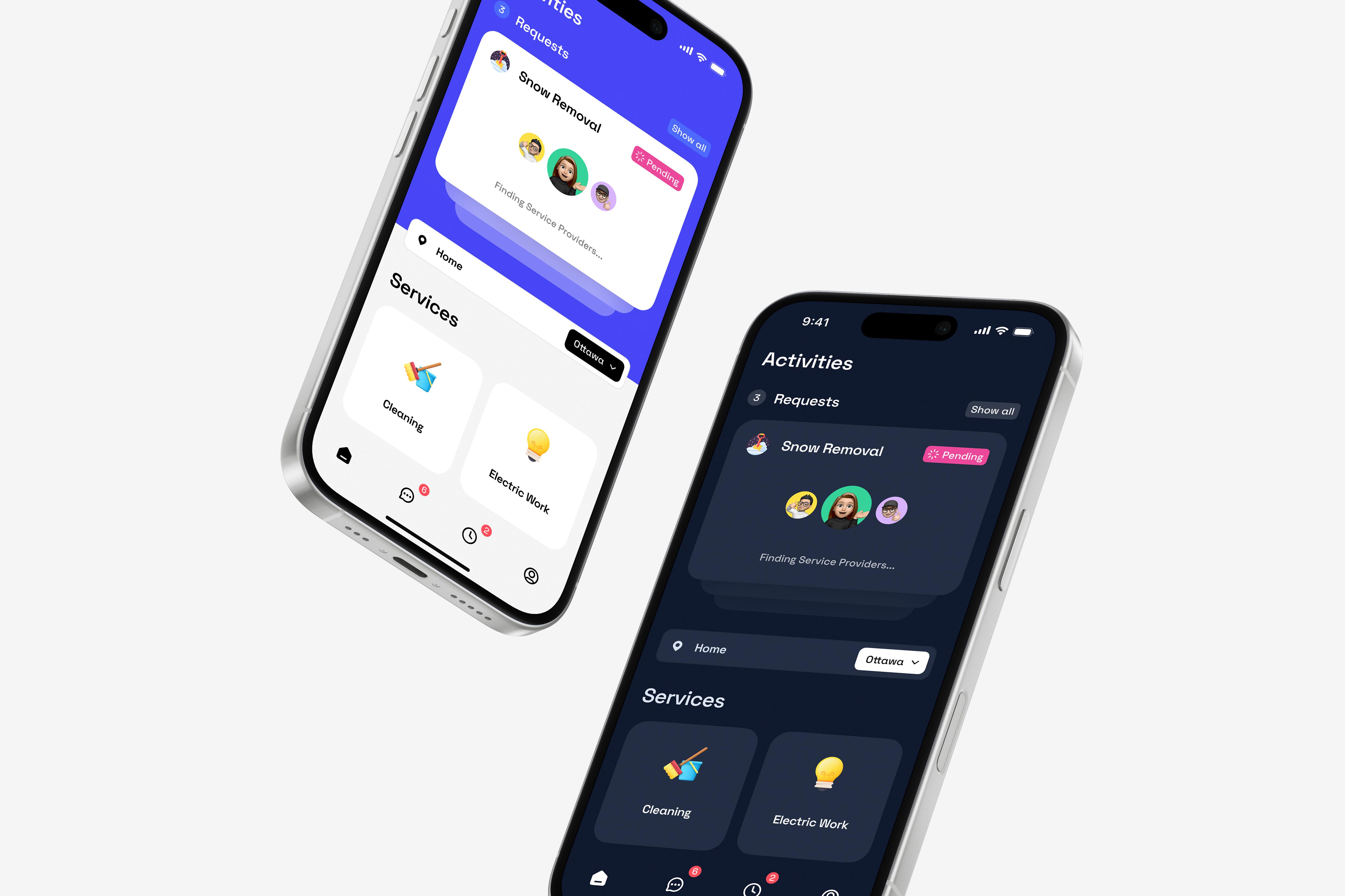
Light and dark mode mobile app interface mockups showcasing a home services platform, including service requests and categories such as cleaning, electric work, and snow removal.
You will see how consistency is maintained across themes, how contrast is handled without making dark mode feel heavy, and how small choices around status, spacing, and polish add up to an interface that stays readable and trustworthy when users are booking real-world services.
Dark Mode Done Right: Consistency & Contrast Across Themes
Dark mode works here because it is treated as a parallel system, not a visual afterthought. The shift from light to dark changes the environment, not the experience. That distinction is where most dark mode designs fail, and where this one holds up.
In dark mode, surfaces move to deep charcoal rather than pure black. This choice reduces glare and preserves depth, especially during longer sessions or low-light use. Text and icons respond accordingly, shifting to white and soft grays that maintain strong contrast without feeling harsh. Primary information remains immediately readable, while secondary content steps back just enough to stay supportive.
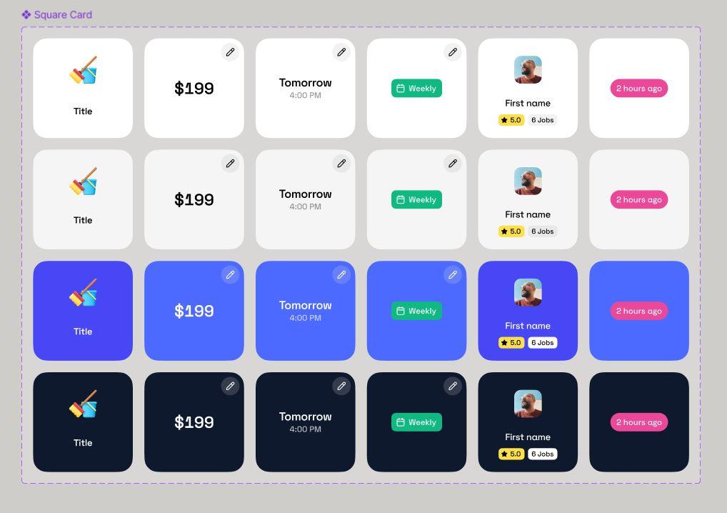
Square card UI component variations showcasing different content types—price, schedule, status, user profile, and time—displayed across light, primary, and dark themes.
What matters is that brand behavior stays consistent. Accent colors do not change meaning between themes. If a highlight draws attention in light mode, it does the same in dark mode. That consistency prevents users from reinterpreting the interface when switching themes and reinforces trust in the system.
UI elements adapt intelligently. Dividers become subtle light strokes instead of shadows. Cards rely more on spacing and contrast than elevation. Nothing feels heavier or flatter than it should. The design language translates cleanly, rather than being reimagined.
From a product perspective, this is where we added real value. Dark mode was designed alongside light mode, not layered on later. That allowed us to preserve readability, accessibility, and brand clarity across both themes.
The result is simple but important: nothing is lost in translation. Users get the same clarity, the same confidence, and the same experience, regardless of how or when they use the app.
Intuitive Layout & Navigation: Clear Organization for Users
At a glance, this interface answers three questions every home-services app must answer immediately:
- 1.What is happening right now?
- 2.Where am I?
- 3.Where can I go next?
The layout and navigation choices in this screen are built around those questions, not around visual experimentation.
Activities as the default starting point
The app opens on the Activities screen, not a promotional homepage or a service catalog. That decision reflects how people actually use home-services apps. Once a request is placed, tracking its progress becomes the primary task.
Requests like Cleaning, Electric Work, and Snow Removal are presented as individual cards within a single scrollable view. Each card follows the same structural pattern:
- Service icon on the left
- Service name as the primary label
- Status shown clearly alongside the title
This makes the screen easy to scan without forcing the user to read line by line. Even with multiple active or past requests, the layout would scale without becoming overwhelming. The user does not need to tap into each item to understand what is going on.
Predictable structure across screens
The layout establishes consistency early. What users see in the Activities list carries through into the request detail view. The Snow Removal request shown in the dark-mode screen mirrors the same core information: service name, status, and contextual message.
This continuity matters for navigation. When users move from the list view into a detail view, they are not learning a new layout. They are simply going deeper into the same structure. That reduces friction and prevents the feeling of being “lost” inside the app.
Location as part of navigation, not a hidden setting
The location selector labeled “Ottawa” sits persistently in the top bar. This is a navigation decision, not just a data point.
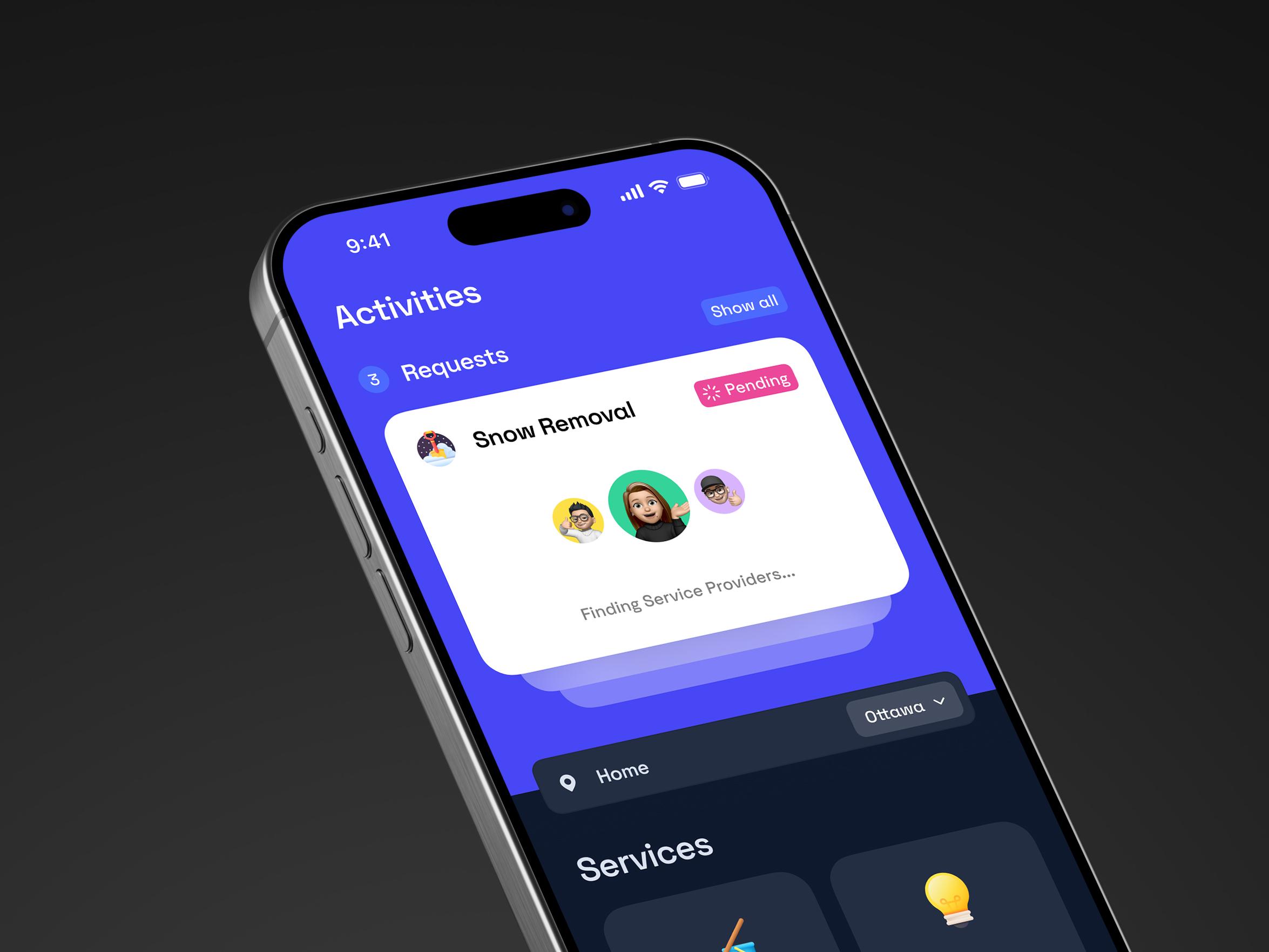
A clean, calm snapshot of a service app in motion—requests in progress, providers being matched, and progress you can actually see.
In home-services products, location defines what can and cannot happen. By keeping the city visible at all times, the interface ensures users always understand the context their requests live in. If something is unavailable or delayed, the user can immediately connect that outcome to location, rather than assuming a system error.
Placing location control in the top bar also makes changing it feel intentional and lightweight. It avoids burying a critical control inside profile or settings screens, which often leads to confusion.
Bottom navigation that supports real usage patterns
The bottom navigation bar uses a familiar, fixed structure. It stays anchored while content changes above it. This supports common mobile behaviors such as one-handed use and fast switching between core sections.
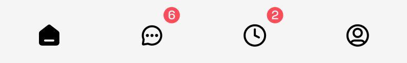
Bottom navigation bar with home, messages, activity, and profile icons, showing unread notification badges.
The icons are recognizable and restrained. They do not introduce new metaphors or gestures that require explanation. This allows users to rely on muscle memory rather than constant decision-making.
From a navigation standpoint, the bottom bar does one thing well: it provides reliable exits from any screen without interrupting the main content flow.
Why this layout works for home services
Home-services apps are used in practical, sometimes stressful moments. Users are often checking status quickly, confirming location, or switching tasks while multitasking in the real world.
This layout succeeds because it stays out of the way. Information is grouped logically, navigation is predictable, and the user always knows where they are and what state their request is in. Nothing competes for attention unnecessarily.
Good navigation rarely feels impressive. It feels obvious.
This interface earns trust by making orientation effortless and by respecting how people actually navigate mobile apps when real-world tasks are involved.
Clear Visual Hierarchy: Emphasizing What Matters at a Glance
Once layout is doing its job, visual hierarchy takes over. This is where our design decides what deserves attention first, what can wait, and what should never compete for focus.
The eye is pulled to meaning, not decoration
Across both screens, the strongest visual signal is the service itself. “Snow Removal,” “Cleaning,” and “Electric Work” are treated as the primary units of meaning. They carry the highest text weight and sit at the visual center of their containers. This ensures users understand what they are looking at before processing anything else.
In our design, decorative elements never compete with meaning. Icons support recognition, but they stay visually subordinate to text. That keeps the hierarchy semantic rather than ornamental, which is critical in utility-driven products like home services.
Status is visible, but never dominant
The “Pending” status reflects deliberate restraint. It is clearly styled as a badge, separated from the service name, and easy to spot during a quick scan. At the same time, it remains secondary in size and weight.
That balance is intentional. Status communicates state, not identity. By keeping it visually supportive rather than dominant, the UI informs without creating anxiety. The experience feels calm, even while something is still in progress.
Placement reinforces importance
Hierarchy here is driven as much by placement as by typography. Primary information sits higher and closer to the left edge, where the eye naturally lands first. Supporting information, such as progress messages, appears directly beneath it, signaling dependency rather than competition.
This vertical ordering allows users to scan top to bottom and understand the state of a request in a single pass. There is no visual hunting, and no need to interpret layout logic on the fly.
Light and dark mode mobile app interface mockups showcasing a home services platform, including service requests and categories such as cleaning, electric work, and snow removal.
Dark mode preserves the same hierarchy
In the dark-mode request view, the hierarchy remains intact because contrast is doing the work, not color alone. Service titles and status retain the highest contrast against the background, while secondary text recedes just enough to stay readable without stealing focus.
This consistency is part of our broader design footprint. Switching between light and dark modes should never require relearning what matters. The hierarchy stays stable even as the environment changes.
Progressive disclosure keeps focus tight
The request detail screen surfaces only what matters in the waiting moment: service name, current status, and a single progress message. Less critical information is intentionally absent.
This is progressive disclosure applied with discipline. By limiting what appears upfront, the interface reduces cognitive load and keeps attention on the one question users care about most: is this moving forward?
Good visual hierarchy does not rely on loud gestures. It relies on restraint. In this design, size, contrast, and placement work together to make important information obvious and everything else easy to ignore. The result is an interface that feels calm, readable, and dependable under real-world pressure.
Familiar Components & Trust Signals: Designing Confidence
Trust here is built through clarity of process, not explanation. The interface makes the system’s behavior legible at the exact moment users start wondering what is happening behind the scenes.
Status messaging like “Pending” paired with a plain-language update such as “Finding service providers in Ottawa” removes ambiguity. Instead of abstract system states, users see a concrete action taking place in a specific place. That specificity matters. It replaces silence with accountability and turns waiting into something understandable.
Nothing is hidden or softened. The app does not rush reassurance or overpromise outcomes. It simply communicates what stage the request is in and what the system is actively doing.
That transparency creates confidence. Users do not need to guess, refresh, or second-guess the app. The product earns trust by showing its work.
Typography, Iconography & Imagery: Clarity Through Precision
At this stage, the interface no longer needs to explain itself. What remains is polish. Typography and imagery do the quiet work of keeping the experience readable, human, and instantly recognizable in both light and dark environments.
Typography that holds up in any condition
The UI relies on a clean, modern sans-serif typeface designed for screen readability. Text styles are limited and consistent, which prevents visual noise and helps users process information quickly.
Headings use stronger weight and larger size to anchor attention, while secondary text steps back through lighter weight and reduced contrast. This separation ensures readability without forcing the eye to work harder, especially during quick checks or repeated use.
Typography here does not try to be expressive. It tries to be dependable.
Icons and imagery that speed up recognition
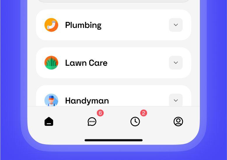
Mobile app services list with quick navigation, showing categories like Plumbing, Lawn Care, and Handyman.
Service icons act as fast visual shorthand. A snow-related symbol for Snow Removal or a tool icon for Electric Work lets users recognize categories instantly, even before reading text. This improves scannability and supports faster decision-making.
Avatars add a subtle human layer. A small profile image or placeholder communicates that real people are involved, which softens the transactional nature of the experience and increases trust without demanding attention.
All icons share a consistent style and scale. That consistency keeps the visual language cohesive and prevents distraction. Nothing feels out of place or decorative for its own sake.
Small details, finished experience
Typography and imagery are often invisible when done right. Here, they work together to keep the interface calm, legible, and familiar across modes. They do not compete with content or flow. They support it.
This is where the design quietly proves its maturity. Not through bold gestures, but through restraint and consistency.
One System, Two Themes, Zero Compromises
A light and dark mode toggle is easy. A light and dark mode system that stays clear is the work.
Using Ample as the use case, we broke down what makes this UI feel steady in both themes: surfaces that avoid glare, contrast that stays readable, brand behavior that does not change meaning, and components that translate cleanly instead of being reinvented. Underneath that, the same fundamentals hold the experience together: straightforward orientation, a hierarchy that keeps attention on the right things, status communication that removes guesswork, and polish that supports readability without calling attention to itself.
If you are designing a dual-theme interface, here are three practical next steps:
- 1.Audit every screen in both themes for meaning, not aesthetics. Nothing should change what it communicates.
- 2.Check contrast and secondary text behavior. If it looks “nice” but is tiring to read, it is not done.
- 3.Treat states like “Pending” as product moments. Make the system feel present, not silent.
Want a quick way to test your own UI? Pick one high-stakes screen and run it through both themes. Then ask: does it feel like the same product, or two different ones?
If you are building a marketplace or service app and want help designing light and dark mode as one coherent system, reach out.