Responsive Healthcare Dashboards: Same Data, Different Job
By Yekta
On mobile, healthcare dashboard UX changes what it prioritizes, not just how it stacks. Three things shift: the metric hierarchy, because a patient needs one answer instead of a comparison; control size, because a mis-tap selects the wrong day of data; and how much certainty the interface implies, because a wearable estimate is not a lab result. The level of care stays the same.
Healthcare dashboard UX is not a layout problem. Most teams treat responsive design like one: make the cards stack, shrink the text, call it mobile-friendly. But in a health product, where a misread spike sends someone to urgent care and a buried note means a clinician misses context, responsive stops being about fitting content and starts being about reallocating attention.
We ran into this building Pulsia, a healthcare platform that moves Apple Watch data between patients and their care teams. Desktop had to support multi-metric comparison and pattern correlation for the clinical side. Mobile had to support a quick check-in between real life. Same data, two different jobs. When the stakes are that high, you can't shrink the layout and hope the meaning holds.
| If you treat responsive as | You ship | In a health product that means |
|---|---|---|
| A layout problem | The same content, narrower | narrower A patient scrolling past the number they opened the app for |
| An attention problem | Different priorities per device | The right metric first, on a screen someone checks in a hallway |
What follows is the version we arrived at through a real product build. The same pressure shows up in any data-heavy enterprise dashboard. Health is just where the consequences are easiest to see.
What is healthcare dashboard UX?
Healthcare dashboard UX is the design of interfaces that help patients, clinicians, and care teams read health data quickly and safely. In a responsive product the goal isn't shrinking one dashboard across devices. It's preserving meaning, context, and trust across two different workflows.
Shrinking a Layout Isn't the Same as Rethinking It
The best responsive healthcare dashboards don’t “shrink nicely.” They change jobs.
Look at the same heart data in two places. Desktop is built for parallel comparison: Heart Rate and HRV sit side by side, and the ECG categories below act as a sorting rail. You scan across cards, spot a strange day, then zoom in. That's the classic dashboard promise, tuned for quick detection across a lot of information at once.
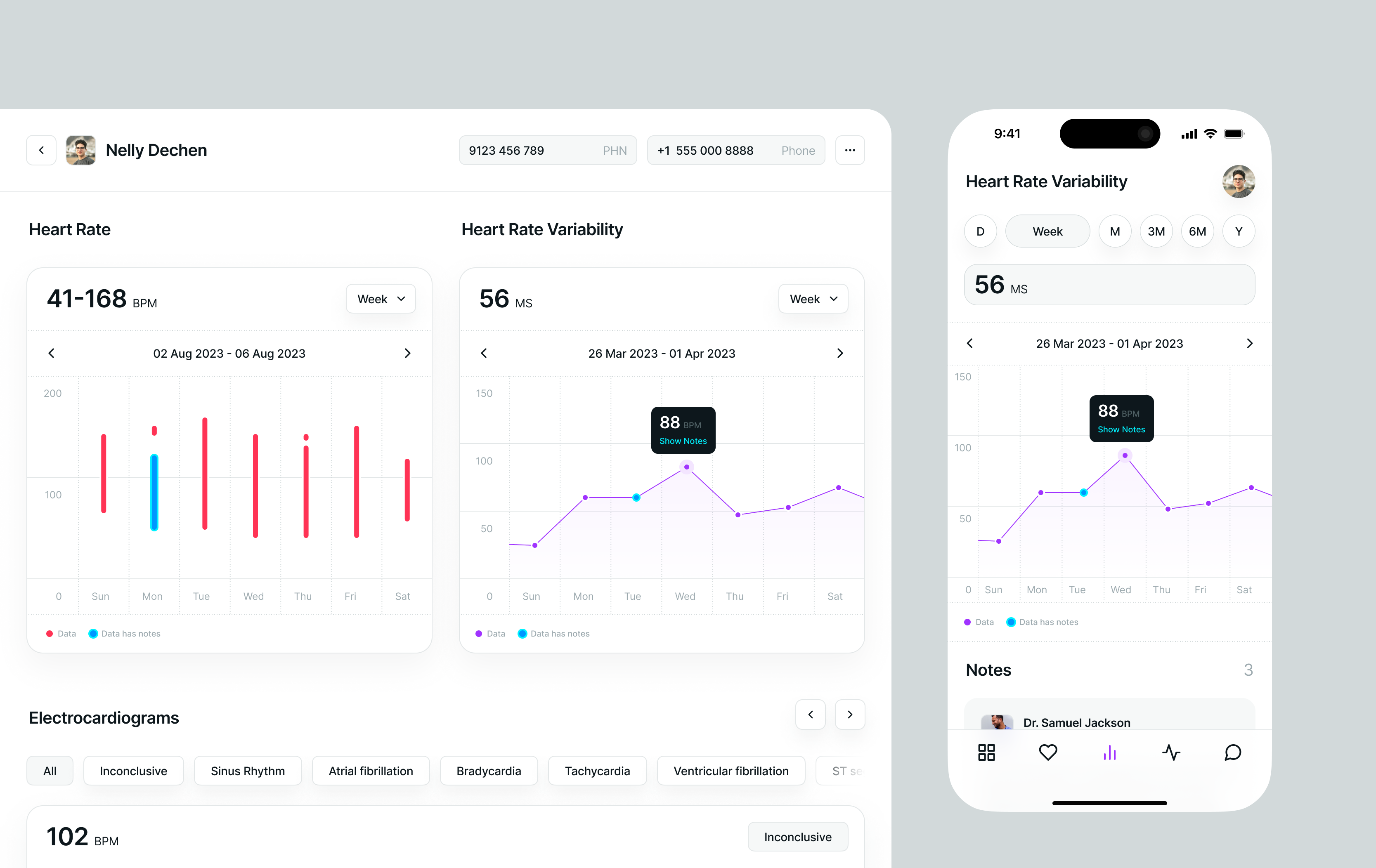
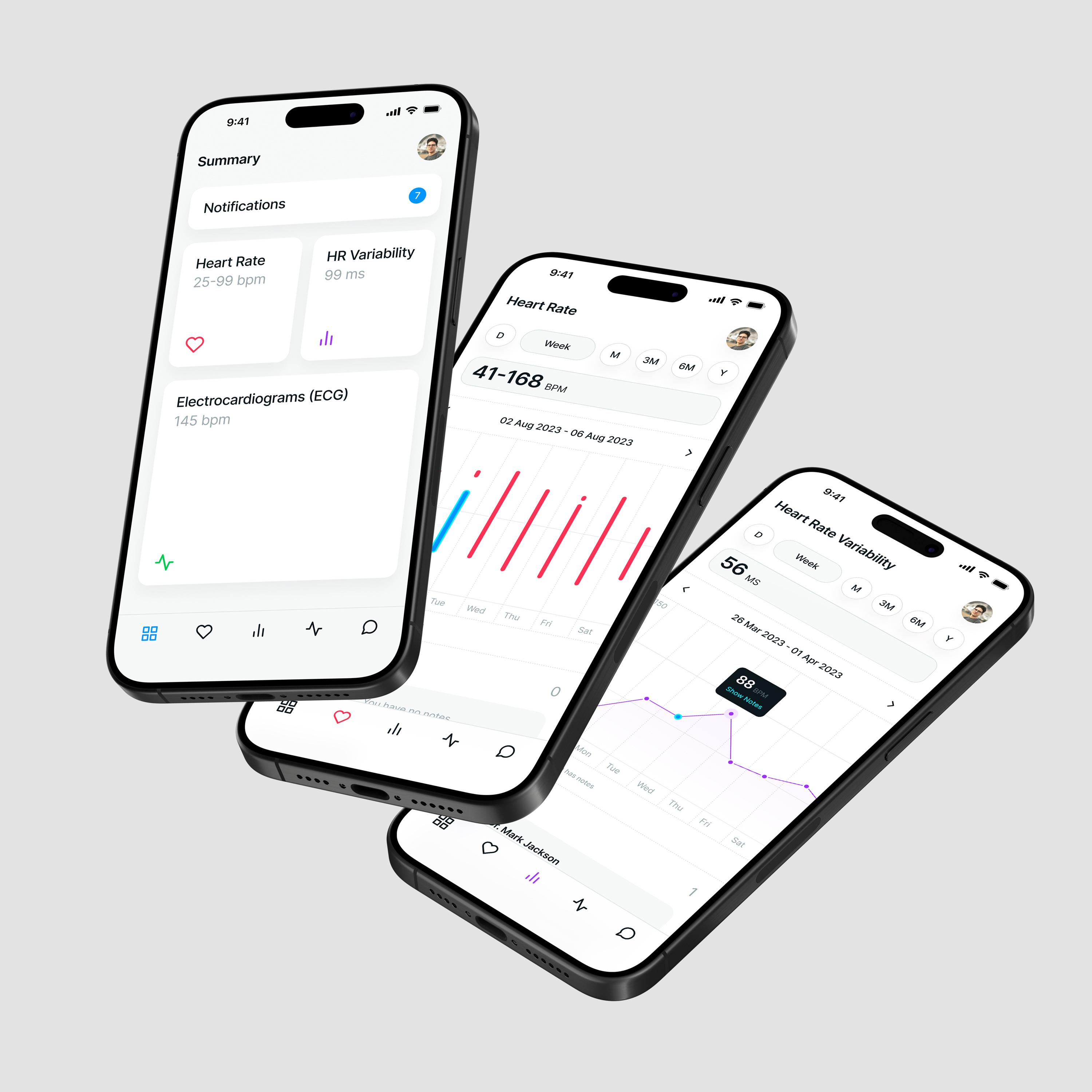
Mobile flips the posture. HRV stands alone. The timeframe selector is front and center (D/W/M/3M/6M/Y), because on a phone you're usually doing a quick "how's my week going" check between other things. Notes live right under the chart like a sticky note on the fridge, not a spreadsheet tab. Context is one thumb away.
| Dimension | Desktop view | Mobile view |
|---|---|---|
| Likely use | Clinician/caregiver review | Patient self-check |
| Thinking mode | Scan + correlate | Check + reflect |
| Metric scope | Multi-metric (HR, HRV, ECG) | Single-metric (HRV |
| Navigation style | Compare panels + categories | Quick timeframe toggles |
| Attention | Wide floodlight | Tight flashlight |
| Context capture | Taxonomy-driven | Notes-first |
| Failure mode | Missing a correlation across days | Tapping the wrong day |
Why not just stack the desktop cards on mobile?
Because stacking keeps information but loses the hierarchy. Everything that was scannable in parallel becomes sequential, so the metric someone opened the app for now sits three scrolls down. The fix is reordering by mobile priority instead of inheriting desktop layout order. A phone isn't a tiny workstation. It's a quick glance in a hallway mirror.
Why keep the same scaffolding (big number, then time, then chart)?
Consistency is the handrail. When someone moves between a desktop review and a phone check, the shared structure tells them they're looking at the same thing, so they spend their attention on the data instead of relearning the interface. Change what gets priority. Don't change where things live. Check our blog about the shared design system across both surfaces.
Same Controls, Different Personality
Here's where dashboard interaction design gets genuinely interesting and where a lot of teams quietly get it wrong.
Look at the time range selector in the Pulsia screenshot. On desktop, it's a small dropdown tucked into each card. Calm, minimal, out of the way. On mobile? It becomes a full-width strip sitting right where your eye lands: D / Week / M / 3M / 6M / Y. Same function, completely different personality. All options visible at once, so moving from Day to Month is one tap instead of a menu hunt.
One detail worth stealing😁: the selected segment expands to show its full label while the others compress to initials. "Week" reads as a word. The rest stay as D, M, 3M, 6M, Y. You get the scannability of a segmented control and the clarity of a written label, without spending width on six full words.
Fitts’ Law explains why touch targets matter, but in this case, the numbers make the point better. WCAG 2.2 sets the minimum target size at 24 by 24 CSS pixels for Level AA. Apple recommends 44pt, Material recommends 48dp, and the average fingertip is around 16 to 20mm wide, which is already larger than the WCAG minimum on most phones.
So for a control that decides which day of heart data someone is reading, 44 should be the baseline. A full-width strip is easier to reach, harder to miss, and safer for the kind of interaction this screen needs.
The tooltip + "Show Notes" pairing is progressive disclosure doing its most useful work. Don't show everything upfront. Signal that more exists, then reveal it when someone wants it. A cyan point means a note is attached, and the legend spells that out.
That last part is a real constraint, not a flourish. Colour alone can't carry meaning under WCAG 1.4.1, because a red-green colour blind user or a low-contrast screen loses the distinction entirely. A labelled legend helps. It doesn't fully solve it. The honest version needs a second cue on the point itself, a shape change or a small marker, so the signal survives without hue. If you're building something similar, decide that early. Retrofitting a chart's visual language after launch is far more expensive than choosing it upfront.
Two more things the screens are quietly doing. The desktop header carries the patient's PHN and phone number, because a clinician reviewing a case needs identity confirmed before they read a number. Mobile carries neither, because a patient already knows who they are. And mobile notes are attributed to a named clinician, so the context has a source.
In health data, that loop matters. A spike without context is unsettling. A spike with a note reading "bad sleep, long run" is just information, and the chart becomes a conversation instead of a graph
HR, HRV, and ECG Are Three Different Jobs, Not Three Cards
Information architecture in a healthcare dashboard doesn't just organise data. It makes a quiet bet about who's reading and what they need to do next. In Pulsia the bet is explicit: HR and HRV track physiology over time, ECG classification triages discrete events. Two different cognitive tasks, one dashboard, no pretending they're the same shape.
HRV is where the architecture has to make a real call. Apple Watch surfaces it through HealthKit as a single number in milliseconds, but that number means different things depending on your baseline, your measurement window, and what happened the night before.
The gap is measurable. A 2025 validation study in Sensors ran an Apple Watch Series 6 against a 3-lead research ECG across 78 adults. Agreement on the raw signal was near-perfect: 1.15% mean absolute percentage error on R-R intervals at rest. The derived HRV series, the cleaned N-N intervals that HRV metrics are actually built from, came in at 31.31%.
Read that as a design brief. The heartbeat is close to exact. The number built on top of it is an estimate with a wide band. An interface that renders both in the same typeface, at the same size, with the same visual confidence, is making a claim the data doesn't support.
Designing uncertainty in health apps is an actual skill.
So Pulsia doesn't stamp "your HRV is low today" on a number. It foregrounds time and trend, and lets the pattern speak. Display precision should match measurement precision.

That's a regulatory line too. The gap between "here is your trend" and "here is your result" tracks the gap between software that informs a clinician and software that makes a clinical claim. Regulators read interfaces, not intentions, and a label, a colour, or a threshold badge can cross that line without anyone deciding to. Get counsel into the design review, not the launch review.
The ECG view follows the same logic. Sinus Rhythm, Atrial Fibrillation, Bradycardia are sorting labels that help a clinician triage faster, not diagnoses.
Why doesn't my health app tell me if my HRV is "good" or "bad"?
Because a responsible one shouldn't, at least not without serious context. HRV norms vary enormously between people. A well-designed health dashboard shows your trend, not a universal threshold, because your baseline is the only baseline that matters.
What do the ECG categories like "Sinus Rhythm" or "Atrial Fibrillation" actually mean in an app?
They're sorting labels, not diagnoses. In a clinician-facing dashboard they help a doctor triage and cross-reference events faster. They don't replace a proper read. The UI's job is to surface patterns, not conclusions.
Why does the desktop show ECG categories but mobile doesn't?
ECG classification is a correlation task. You're cross-referencing patterns across dates and types, and that's desktop territory. On mobile, one metric at a time keeps cognitive load low and the answer fast.
Can a dashboard design decision affect regulatory classification?
It can contribute to it. Software that displays data for a clinician to interpret is treated differently from software that outputs a conclusion, and interface choices sit right on that boundary: a threshold badge, a red state, or the word "abnormal" all edge toward a claim. This is a legal question rather than a design one, so treat it as a reason to bring regulatory review into design early rather than as advice you can act on from a blog post.
In Health Apps, Accessibility Is a Safety Issue
Accessible healthcare dashboards aren't a layer you add at the end. It's what makes a health product safe to use in the first place, and here "safe" isn't a metaphor.
The pressure points in a product like Pulsia are specific. On mobile, tap targets that are too small or too close together produce selection errors, not just slower taps. Someone trying to open a note on a particular day hits the wrong point instead. The data is right there, and the interaction fails it. On desktop the same risk wears different clothes: keyboard users navigating a chart need visible focus states and a logical tab order, or the chart becomes an island. These are the conditions under which real people use real health products.
Pulsia's visual design does a lot right: sparse grids, a restrained palette, highlighted points, a legend that encodes a second state. The honest next step is making those states travel beyond sight. Accessible labels on annotated data points, chart interactions that complete without vision. The visual layer has done its job. The non-visual layer needs to catch up.
There's also a clock on this now. The European Accessibility Act has applied since June 2025, and WCAG 2.1 AA is the reference standard under the ADA and Section 508 in the US. Accessibility stopped being only an ethical argument and became a market access one.
The privacy side runs deeper. Pulsia lives inside Apple HealthKit, which is built on explicit, granular consent: separate permissions for reading and writing, topic-level sharing, a fresh decision at every handoff. So the product is never just moving numbers around a screen. It's managing a data relationship between a patient and their care team, which is why the desktop view confirms identity with a PHN before showing a single reading. Depending on where you operate, that relationship sits under HIPAA, under PIPEDA and provincial health privacy legislation in Canada, or under GDPR. The design decisions and the legal ones turn out to be the same decisions.
What makes the Notes layer considered is that it doesn't only add context to a chart. It creates an auditable narrative alongside raw biometric signals, and because each note carries a named author, that narrative has provenance. A clinician reviewing an HRV trend sees what was happening in someone's life when the data changed, and who recorded it. That's trust as a structural decision, not a tagline.
Does a health app legally need to follow WCAG?
In most cases yes. The European Accessibility Act has applied since June 2025, and WCAG 2.1 AA is the reference standard under the ADA and Section 508. Past the legal question: someone misreading a chart because of low contrast isn't a UX edge case in a health product.
What makes a health app feel trustworthy?
Honest data presentation, user control over sharing, and context that travels with the numbers. If a spike in your chart has no explanation attached, that's a trust problem waiting to happen.
Is HIPAA compliance a design problem or an engineering problem?
Both, and the design half gets skipped. Engineering handles encryption, access control, and audit logs. Design decides what appears on a shared screen, how consent is requested, what a notification reveals on a lock screen, and whether someone actually understands who can see their data. Compliance failures are often interface failures.
Design Decisions, Real Consequences
Health dashboards don’t just visualize data. They encode responsibility.
Get responsive design wrong in most contexts and someone gets annoyed. Get it wrong here and someone misreads their heart data at 2am, or a clinician triaging 40 patients a day misses the one note that explains the spike.
Teams building health products make these calls constantly. Which metric earns the prime spot on mobile. Whether a tap target is reliably hittable. How much certainty to imply from a wearable reading. Which states still work without colour. Those choices shape trust and accuracy, not just engagement.
If you're working on a health dashboard now, "good" looks like alignment across the whole room:
- Product treats mobile as a different workflow, not a smaller canvas.
- Design knows when to show a trend (and context) instead of handing users a verdict.
- Engineering tests interaction like a safety features: keyboard paths, screen readers, touch targets, focus states.
- Strategy frames privacy and accessibility as part of care, not a compliance afterthought.
- Clinical reviews what the interface implies, not just what it displays.
Pulsia taught us that responsive healthcare design isn’t about making things fit. It’s about making sure the meaning survives the move. Same data, different surface, same level of care.
A responsive healthcare dashboard passes when the meaning survives the smaller screen, not when the layout does.
None of this is unique to health data. Any data-heavy enterprise dashboard has the same problem: too many metrics, not enough attention, and a user who needs one answer fast. Healthcare is just where the consequences are impossible to ignore. Simplicity is what builds trust in enterprise products.
Four checks for responsive healthcare dashboard UX
- 1.Does the mobile view have its own priority order?
Mobile should not inherit desktop layout order if the user’s task is different. - 2.Are touch targets safe for the action?
Controls that change the health data someone is reading should be large, clear, and hard to mis-tap. - 3.Does the interface show uncertainty honestly?
Trends, estimates, and wearable-derived metrics should not be presented with more certainty than the data supports. - 4.Does context travel with the data?
Notes, authorship, timestamps, and patient identity should appear where they reduce risk and improve interpretation.
Who we are
Hooman Studio is a digital product design and development studio born in Vancouver, Canada. We work on products where the interface carries real consequences: healthcare dashboards, clinical tools, enterprise platforms, and internal systems that people use all day. Pulsia is one of them.
What to do next
If one of the four checks above is unresolved in your product, that's usually where the risk is concentrated. We run responsive and accessibility reviews on live health dashboards: touch targets, focus order, certainty language, colour dependence, and whether context travels with the data.
Send us a screen and we'll tell you what we'd change.
you can see our approach in healthcare app UX, or the healthcare website we folded out of paper.(:
- Shrinking a Layout Isn't the Same as Rethinking It
- Same Controls, Different Personality
- HR, HRV, and ECG Are Three Different Jobs, Not Three Cards
- In Health Apps, Accessibility Is a Safety Issue
- Design Decisions, Real Consequences
- Four checks for responsive healthcare dashboard UX
- Who we are
- What to do next