Designing for Clarity: How Restraint Builds Trust in Enterprise Mobile UX
By Yekta
You’re looking at a screen that does less than you expect. Well, that’s the point!!
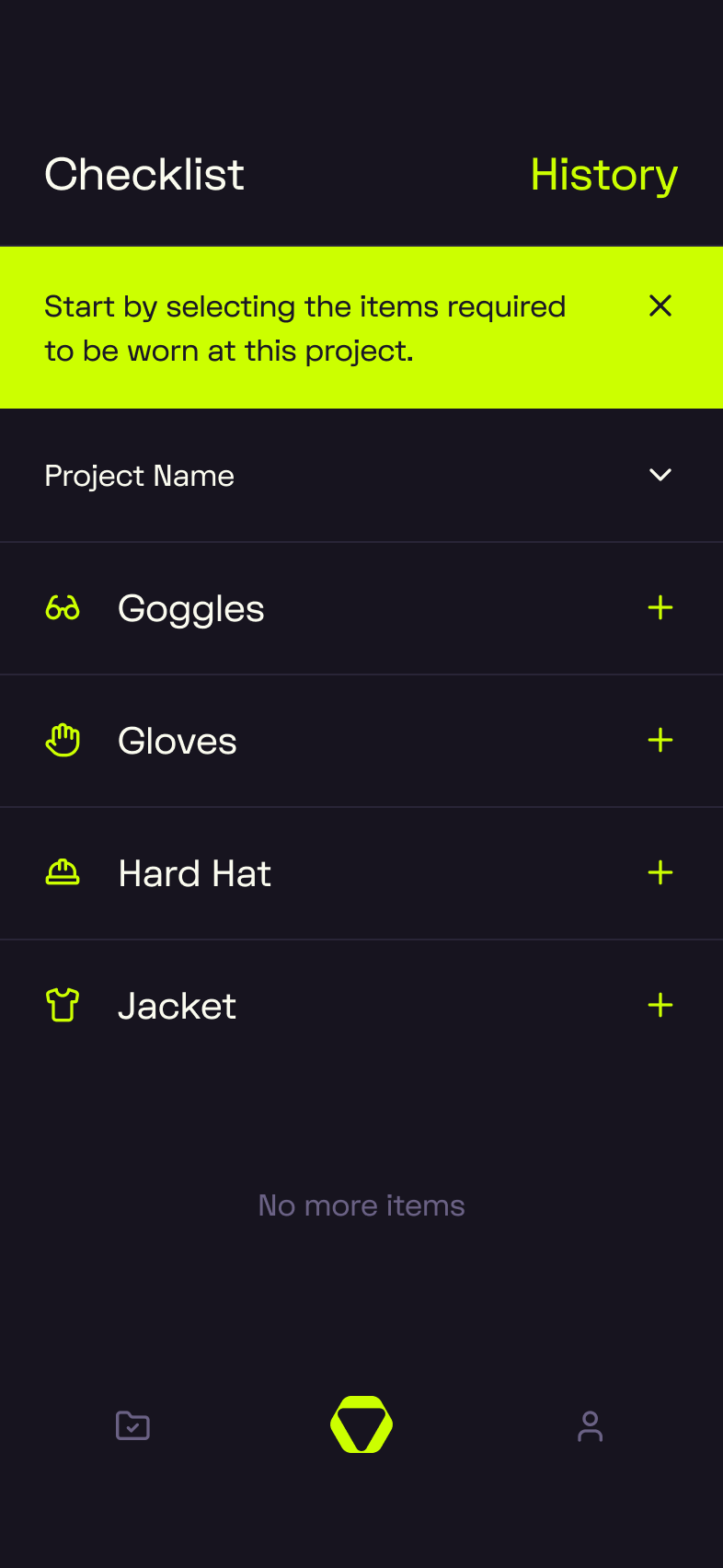
No tabs, no charts, no feed of notifications. Just a dark background, a neon highlight, and a single checklist sitting there, ready. It doesn’t brag. It doesn’t blink. But the more you look at it, the more deliberate it feels.
This is a screen from OpusSafe Construction, a mobile enterprise product we designed for field teams. And in this blog, we’re going to sit with it. Really sit with it. Because everything you see, and don’t see, was a choice. And those choices are what make this interface quietly powerful.
The post ahead isn’t about how we made it beautiful. It’s about how we made it work. We’ll break down how clarity, color, structure, and omission all do the same job: earning trust when attention is scarce and pressure is high.
Let’s start where users do, with what’snot shouting at them.
Designing by Omission: Why Enterprise Products Earn Trust by Saying Less
This screen doesn’t try to impress you. That’s exactly why it works.
No extra tabs, no half-baked insights, no “optional” steps pretending to be helpful. Just the task at hand, and space to do it.
In enterprise UX, trust starts with restraint. The more stuff you see, the more decisions you have to make. Hick’s Law tells us: more choices = more time spent choosing. In high-stakes environments, that kind of decision fatigue is a liability.
This is where UX by omission earns its keep. By leaving things out, or hiding them until they’re needed, you reduce friction, lower the stakes of every tap, and keep the focus where it belongs. Progressive disclosure in enterprise apps isn’t about dumbing things down. It’s about staging complexity. Let the power sit quietly in the background until it’s actually relevant.
Feature creep in enterprise software often looks like ambition. But to the user, it reads as chaos. When everything shouts, nothing feels trustworthy. Quiet interfaces, like this one, speak louder.
Designing Enterprise Mobile UX That Feels Simple, Not Simplistic
In OpusSafe, the goal was enterprise mobile UX simplicity without pretending the work is simple. Field checklists come with heavy requirements: safety, accountability, timing. But none of that should land on the user all at once. The screen stays focused on what they need right now, not what the system needs in the background.
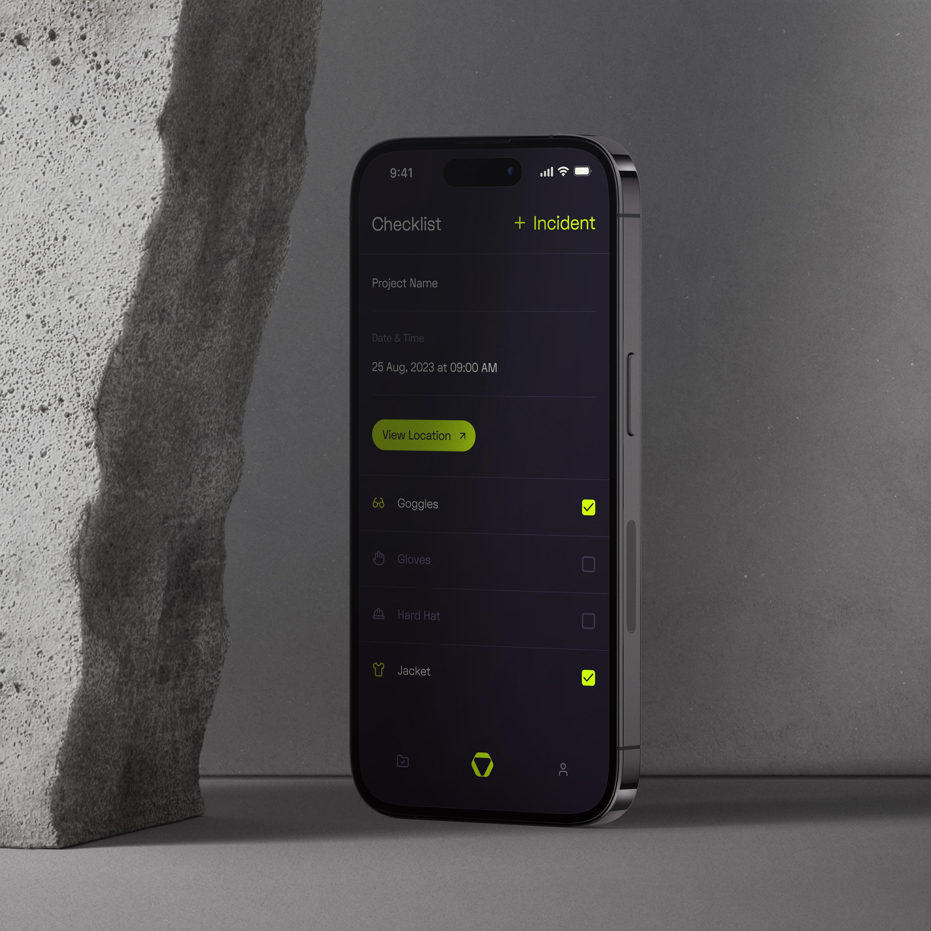
That’s progressive disclosure in enterprise workflows working exactly as it should. The checklist loads clean. The next action is obvious. If more context is needed, like where it happened or what was missed, that layer appears when you go looking. Not before.
And while it feels light, it’s not shallow. There’s still invisible complexity in enterprise UX doing the hard work behind the screen: recording who completed what, when, and where. Making sure tasks show up the same way across teams. Keeping a record that holds up for audits, not just checkmarks.
That’s where enterprise design systems consistency quietly builds trust. Every screen behaves predictably. Every list follows the same pattern. And that makes simple interface enterprise software adoption a whole lot easier because users feel like they’ve seen it before, even when they haven’t.
Visual Hierarchy for High-Stakes Use Cases: Clarity Under Cognitive Load
So once you’ve decided to keep the surface calm, the next job is making sure people can read it fast. That’s where visual hierarchy in enterprise mobile UX does its job, it guides the eye, without making a scene. On this OpusSafe screen, your attention moves in a clean line: title, project context, one clear action, then checklist rows that follow a steady visual rhythm. Nothing competes. Nothing clutters. You’re never wondering what comes next.
That matters, especially when cognitive load in high-stakes UX isn’t coming from the app. It’s coming from the real world. Think: gloves, noise, time pressure, distractions. The interface has to do more with less, because the user’s attention is already split. That’s why glanceable UI design for field users exists. The screen should say just enough, fast enough, for someone who might only have a second to spare.
Even the scan pattern works in your favor. You take in the top row, sweep across, drop down into the list. That’s the F-pattern at work. And when you tap? Touch target size and Fitts’ Law in mobile UX means every button or row is big enough to hit without thinking, even when your hands are tired or covered in dust.
Color as a Trust Signal in Enterprise UX: When Restraint Beats Branding
In enterprise products, color earns its place. It doesn’t decorate. It communicates.
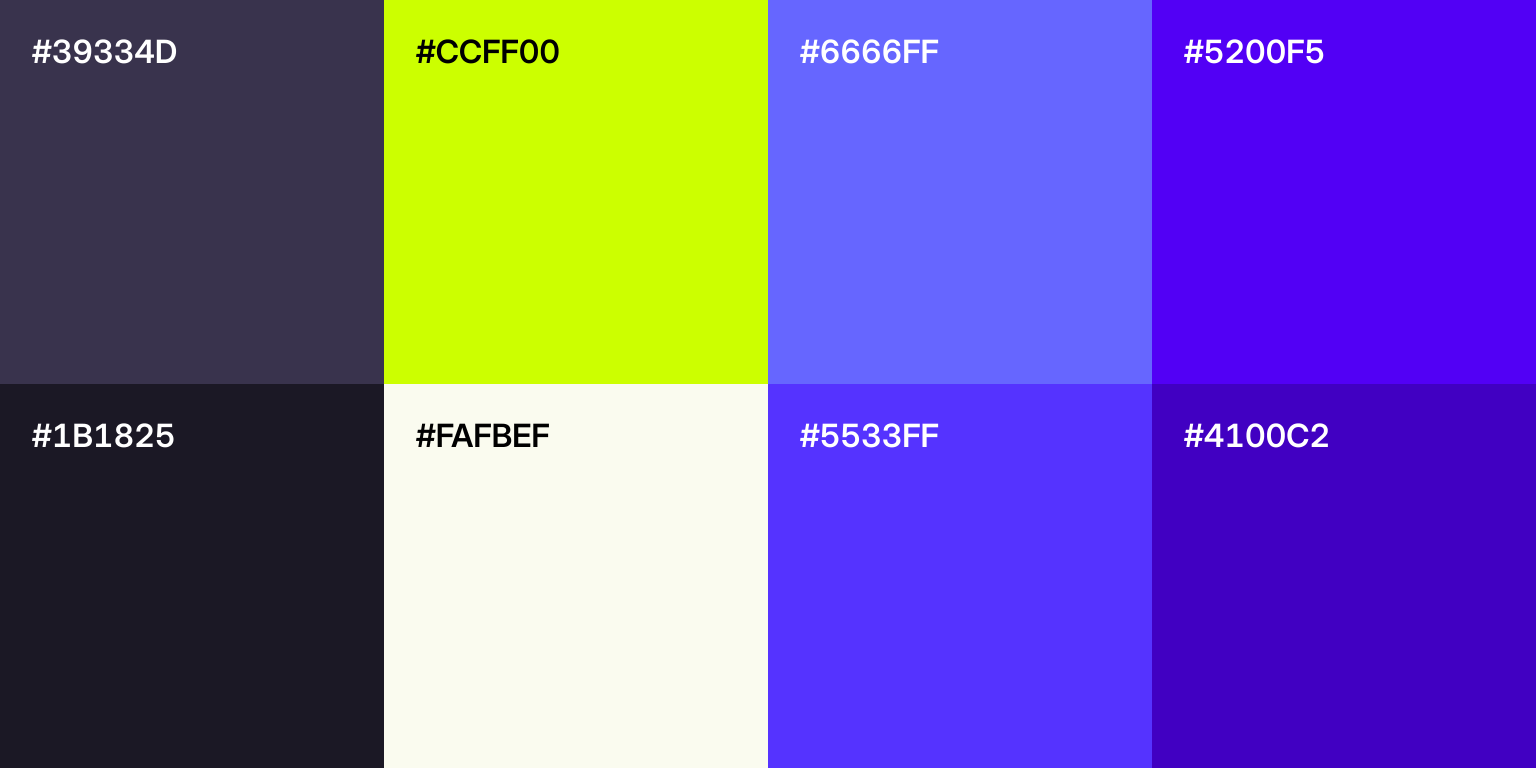
On this screen, almost everything steps back. Dark greys, near-black surfaces, muted text. And then there’s the neon yellow. You notice it immediately. That’s the point. This is accent color discipline in action. Roughly speaking, most of the UI stays neutral so the accent can actually do its job. When yellow appears, it means something. Action. Status. Attention.
That’s quiet branding. No oversized logos. No color explosions. Just a consistent signal users learn to trust. Over time, that yellow becomes muscle memory. See it, react to it.
More importantly, color here functions as information, not decoration. In a high-stakes environment, users don’t have time to interpret vibes. They scan, they act, they move on. Limiting the palette ensures color equals meaning, not noise. One accent, one role.
Dark mode raises the bar even higher. High contrast is non-negotiable, but comfort matters too. Bright colors can easily overwhelm on dark backgrounds if overused. Here, the accent stays contained to small, purposeful elements. The interface stays calm. The signal stays sharp.
That balance is where trust forms. When color feels deliberate, users stop questioning the UI and start relying on it.
And That's a Wrap!
You made it this far, so here’s the gist and what to do with it.
We took one OpusSafe screen and pulled it apart from four angles: omission, simplicity, hierarchy, and color. Same theme every time. In enterprise tools, trust comes from reducing choice, lowering cognitive strain, and making the next step obvious. Progressive disclosure keeps the surface clean without stripping power. Consistency makes the product feel learnable on day one. And that single neon accent earns attention because it’s rare, not because it’s loud.
If you’re designing enterprise mobile experiences, try this on your next screen:
- Cut one element that’s “nice to have” and see if the task gets faster
- Make one action unmistakably primary
- Limit your accent color to one job, then enforce it everywhere
Now We're curious. Where do you see feature creep sneaking into your product right now, and what would you remove first if you had to earn more trust with less UI?