The Berkeley Scramble: How Hooman Studio Solved a $22M Branding Crisis
By Mobina
Because "Under a Bridge" is Not a Valid Dorm Option
Let’s be real: the UC Berkeley housing market is less of a "market" and more of a Hunger Games sequel. With the university only housing a measly 23% of its students, the "Berkeley Scramble" is a rite of passage no one actually wants. When the team behind Helios (Berkeley Student Housing) approached us, they had a $22 million project and a noble mission, but their marketing was stuck in the "boring corporate brochure" phase.
Asking an investor for $800,000 isn't like asking to borrow a fiver for a latte; it requires a level of trust that PDFs just can't build. Hooman Studio stepped in to serve as the bridge between "I need a Green Card" and "I want to fund a project that actually matters." We didn't just design a logo; we built an ecosystem of credibility that turned a complex immigration/ Student housing process into a sleek, human-first narrative.
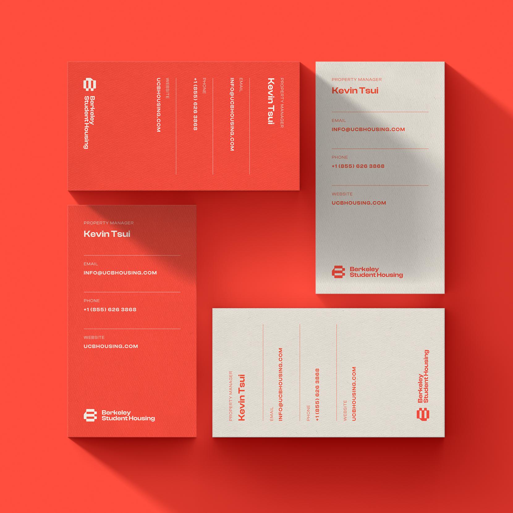
The Visual Identity: Salmon, White, and Zero Fluff
When we sat down to define the visual soul of Helios, we knew we had to murder the "corporate real estate" trope. In an industry obsessed with stuffy navy blues and "trust-me" gold foil, we pivoted to a high-contrast palette of Salmon and White. This wasn't just a rebellion against boredom; it was a strategic choice to mirror the academic energy of Berkeley while maintaining a clean, "tech-forward" aesthetic. The salmon hue brings a human warmth to a $22M project, while the off-white provides a clinical, high-end backdrop that screams "institutional quality" without the institutional ego.

The logo itself was designed to be as structurally sound as the five-story building it represents. We moved away from literal "house" icons and leaned into a bold, geometric mark that balances stability with motion. The typography is a study in "Human-first" logic—clean, sans-serif, and authoritative enough to sit next to a Forbes or Los Angeles Times headline without looking like a startup plaything. Every line weight and spatial decision in the branding was made to ensure the logo looks as credible on a construction site banner as it does on a legal filing for a Form I-526E. It’s a visual identity that doesn't just ask for an $800,000 investment; it commands it by proving that every detail has been considered.
The Strategic Architecture: Beyond the Logo
While the colors catch the eye, the "Hooman" value is in the information architecture. We didn't just dump data; we built a narrative.
- The Grid: We designed a 2-pager that treats information like architecture, making complex EB-5 data scannable at a glance.
- The Path to Residency: We took the headache-inducing Form I-526E process and broke it down into five digestible, human steps, from hiring a lawyer to achieving permanent residency.
- The Product Nuance: We highlighted the 37 fully furnished units, emphasizing "turnkey" living for students and "hassle-free" assets for investors.
- Technical Finishes: The brand identity mirrors the interior specs, incorporating the light grey flooring and white-and-grey color scheme into the document’s own design language to ensure the visual vibe matches the physical build.
Boots on the Ground: The Video Production
You can’t film "vibes" from a desk. Our crew headed to 1698 University Ave at 9 AM sharp to capture the soul of the project.
- The Reality Check: We interviewed 5 to 6 students at the campus entrance. We didn't feed them lines; we asked about the Berkeley housing shortage and what they actually look for in a home.
- The Location Flex: We captured B-roll of the 15-minute walk to campus, proving that proximity isn't just a bullet point, it’s a lifestyle.
- The Construction B-Roll: We filmed the work in progress. For an EB-5 investor, seeing a crane is more comforting than a bank statement; it’s proof of the 64% job cushion and the project's viability.
The Technical Edge: The Hooman Dashboard
While we were busy filming interviews and tweaking the logo’s kerning, the Helios team was busy not stressing out. Why? Because every asset, from the exterior renderings to the repayment timelines, was managed through the Hooman Dashboard. No "lost in translation" emails, just pure transparency for a project that demands it.
The Conclusion: Don't Let Your Project Be "Just Another Building"
At the end of the day, Helios isn't just a collection of 2-bed, 2-bath units. It’s a solution to a systemic failure in the UC system. Hooman Studio’s job was to make sure the world—and the investors—knew that. We brought the technical polish, the narrative depth, and just enough wit to make a $22M real estate deal feel like a human story.
If your project currently lacks visual polish, we should probably talk. We specialize in taking early, unrefined product versions and transforming them into compelling brands that captivate and excite.