Design Systems for Mobile Apps: A Guide to Scalable and Consistent UI Design
By Yekta
If your app feels like it was designed by three different people on three different days, you’re not imagining it — that’s usually a missing (or broken) mobile design system. A mobile design system is a shared set of rules, components, and decisions that define how your app looks, behaves, and scales across screens. It’s what keeps buttons consistent, spacing predictable, interactions familiar, and teams aligned as the product grows.
This guide is for designers, product managers, and developers building mobile apps on iOS, Android, or cross-platform stacks who want consistency without rigidity. We’ll break down how mobile design systems actually work, what they’re made of, how they differ from web systems, and how teams like Material You, Airbnb, Spotify, and Duolingo maintain coherence at scale. Then we’ll zoom back out and talk about real-world workflows, governance, and the mistakes that quietly derail even good systems.
Here’s the quick snapshot so you know you’re in the right place:
What You’ll Learn (Fast Overview)
- Your app’s shared rulebook + toolbox: tokens, components, patterns, and the guidelines that keep everything consistent.
- Consistency, modular components, accessibility, and performance-first thinking.
- Colors, typography, spacing systems, icon rules, gestures, motion, and a reusable mobile component library.
- Unified values for color, type, spacing, elevation, radius, and motion — synced across Figma, iOS, Android, RN, Flutter.
- Unify foundations → adapt interactions for iOS vs Android (navigation, elevation, gestures).
- Figma variants/variables, Storybook, Supernova, Zeplin — organized so design + dev stay in sync.
- Versioning, audits, contribution rules — everything that keeps your system from drifting into chaos.
- Material You’s personalization, Airbnb’s cross-platform tokens, Spotify’s platform parity, Duolingo’s playful consistency.
- Too many variants, stale docs, ignoring accessibility, building without context.
Why This Guide Matters
Because a mobile design system isn’t about making things pretty — it’s about making your product faster to build, easier to scale, and calmer to use.
Let’s jump in and make your mobile app feel unified, intentional, and actually manageable again.
What a Mobile UI Design System Actually Is (and Why It Matters)
A mobile UI design system is your app’s shared rulebook + toolbox. It defines how your product should look, feel, behave, and scale across every screen. If you’ve ever asked yourself, “What is a mobile design system, and why does every app team talk about it?”—here’s the friendly breakdown.
Instead of designing new buttons, colors, or layouts every time, you reuse documented, tested, and consistent UI components built specifically for mobile apps. That means fewer surprises, fewer design debates, and way more focus on user experience. It’s not only a set of files; it’s a living product standard that improves mobile UX consistency, speeds up feature shipping, and creates scalable UI you don’t need to redesign every month.
What’s Actually Inside a Mobile Design System?
Think of it like a recipe book, ingredients list, and kitchen rules—all in one.
Design System vs Style Guide vs UI Kit (Don’t Mix These Up)
Design System:
The full strategy + rules + ready-to-use components + philosophy.
Style Guide:
A visual rulebook (typography, colors, icon style).
UI Kit:
Drag-and-drop component files you design with (e.g., in Figma).
In short:
Design system is the ecosystem. UI kit and style guide live inside it.
Why Mobile Design Systems Are Different from Web
Mobile apps can’t copy-paste web rules. Here’s why:
Mobile uses touch, not clicks
components need finger-friendly targets.
Screen space is small and vertical
content must be scannable.
Apps must follow platform rules
like Apple’s Human Interface Guidelines and Google’s Material Design guidelines to feel native.
Updating an app requires store approvals
so decisions must be right earlier.
Mobile integrates with hardware
like GPS, camera, and gestures so patterns must consider these behaviors.
Quick FAQs
Stay tuned. We’re going deeper next.
The Anatomy of a Scalable Mobile Design System
A mobile design system only works if people can understand it quickly, apply it consistently, and evolve it safely. The problem with many guides is that they list ingredients without explaining how those pieces fit together.
This section breaks a mobile design system into four logical layers, from philosophy to execution. Each layer builds on the one before it.
Design System Principles (The Why)
Before colors, buttons, or grids, a mobile design system needs principles. These are the guardrails that shape every decision, especially as teams and features scale.
Consistency Without Rigidity
Consistency is not about making everything identical. It is about making behavior predictable.
When the same action always looks and behaves the same way, users stop thinking about the interface and start focusing on their task. For teams, consistency eliminates design debates and reduces rework.
A strong mobile design system defines:
- When patterns must stay identical
- Where controlled variation is allowed
- How platform conventions influence consistency
Modularity and Reuse by Default
Scalable systems are built from reusable pieces, not custom screens.
Modular components allow teams to assemble interfaces quickly without redesigning common elements. When a component improves, every screen using it improves too.
This is why most mobile design systems rely on atomic or token-based thinking. Smaller parts combine into larger patterns without losing control.
Accessibility as a Baseline, Not an Add-On
Accessibility cannot be layered on later in mobile products.
Touch targets, contrast, typography scaling, and screen reader support must be built into the system itself. If accessibility lives outside the system, it will be forgotten under pressure.
Mobile design systems that scale treat accessibility rules as non-negotiable defaults.
Performance-Aware Design Decisions
Performance is a design concern, not only an engineering one.
Heavy animations, oversized assets, and inconsistent spacing rules all affect rendering and battery usage. A mature mobile design system includes performance constraints so components remain lightweight and predictable on both high-end and low-end devices.
Design Foundations (The Rules)
Foundations are the shared rules every component depends on. If these are unclear, everything above them becomes inconsistent.
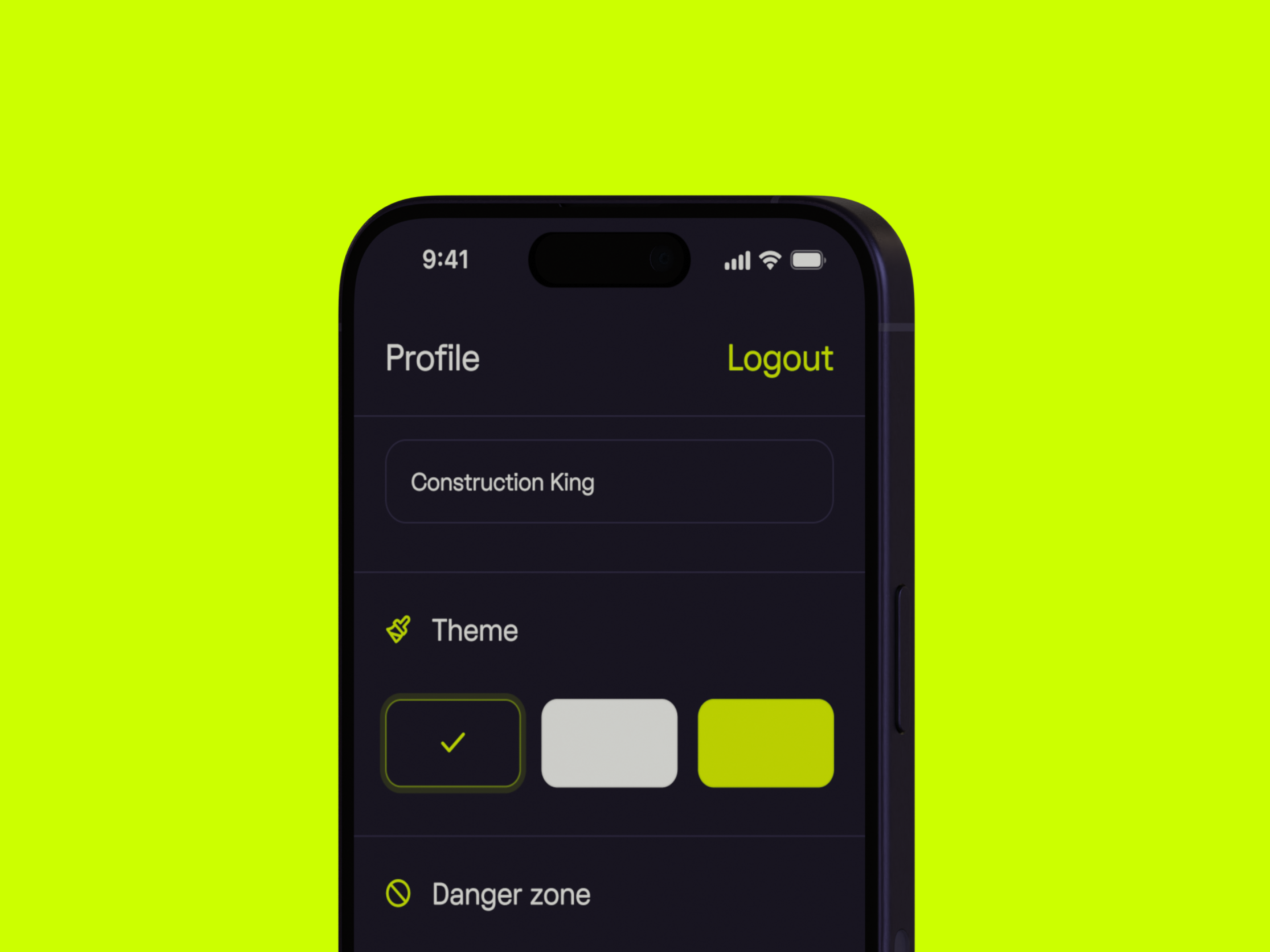
Color System and Theming
A mobile color system is more than a palette.
It defines semantic roles such as primary actions, secondary actions, surfaces, borders, and feedback states. Tokens should support light and dark modes without redesigning screens.
Clear color rules prevent visual drift and simplify implementation across iOS, Android, and cross-platform frameworks.
Typography for Small Screens
Typography systems for mobile must work harder than web typography.
They need clear hierarchy, readable body text at small sizes, and support for dynamic type scaling. Line height, font weight, and truncation rules should be explicit so layouts do not break when users adjust system settings.
A good mobile typography system prioritizes clarity over personality.
Spacing and Layout Structure
Spacing is one of the most common sources of inconsistency in mobile apps.
A defined spacing system, often based on an 8-point grid, creates visual rhythm and speeds up decision-making. Standard margins, paddings, and safe-area rules ensure layouts adapt cleanly across screen sizes, notches, and orientations.
When spacing rules are clear, screens feel intentional even before styling.
Iconography and Visual Language
Icons must communicate quickly in limited space.
A mobile design system should define stroke weight, corner radius, sizing rules, and when icons require labels. Platform differences matter here. iOS and Android users have different expectations, and ignoring them makes apps feel foreign.
Consistency in iconography prevents the “mixed style” problem that erodes polish.
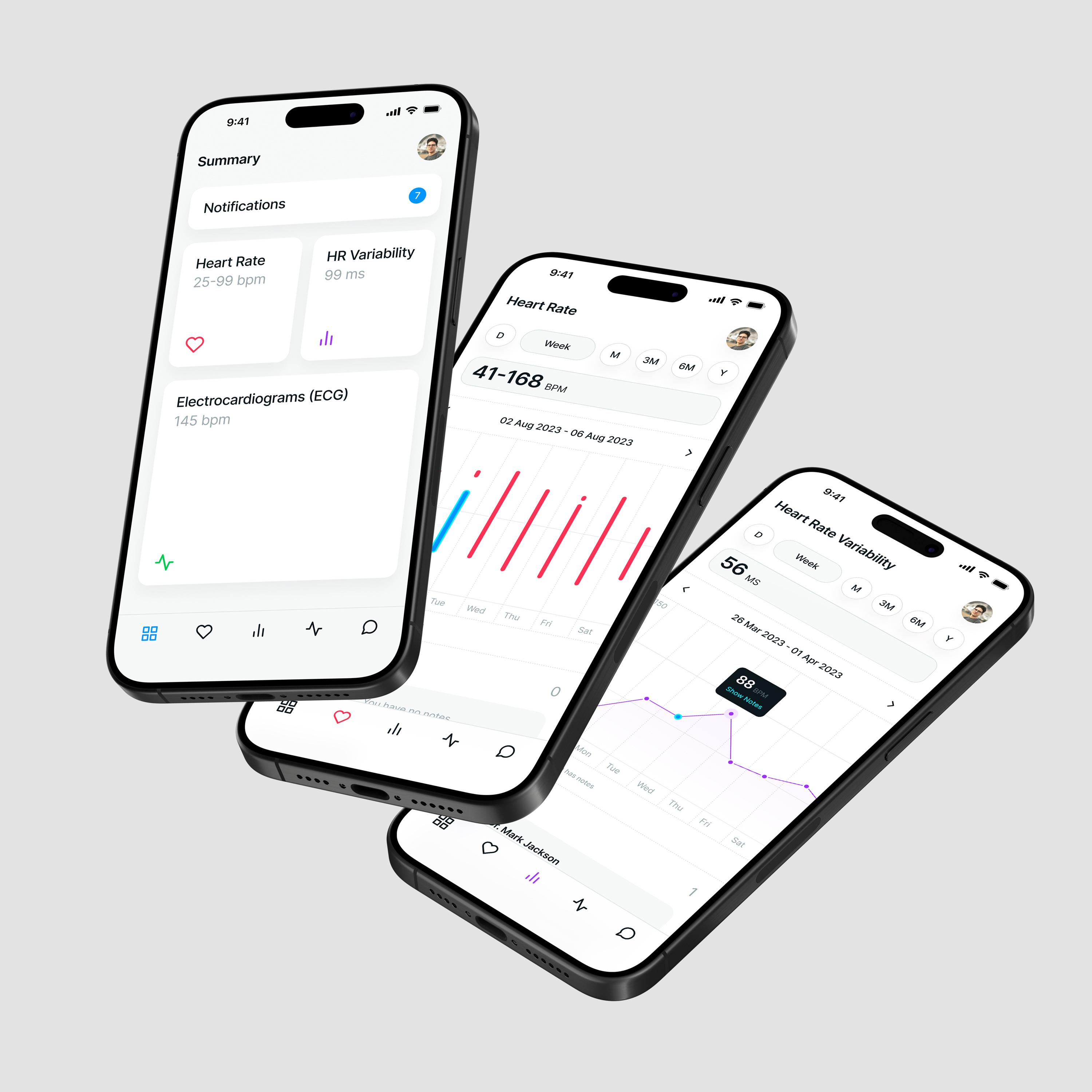
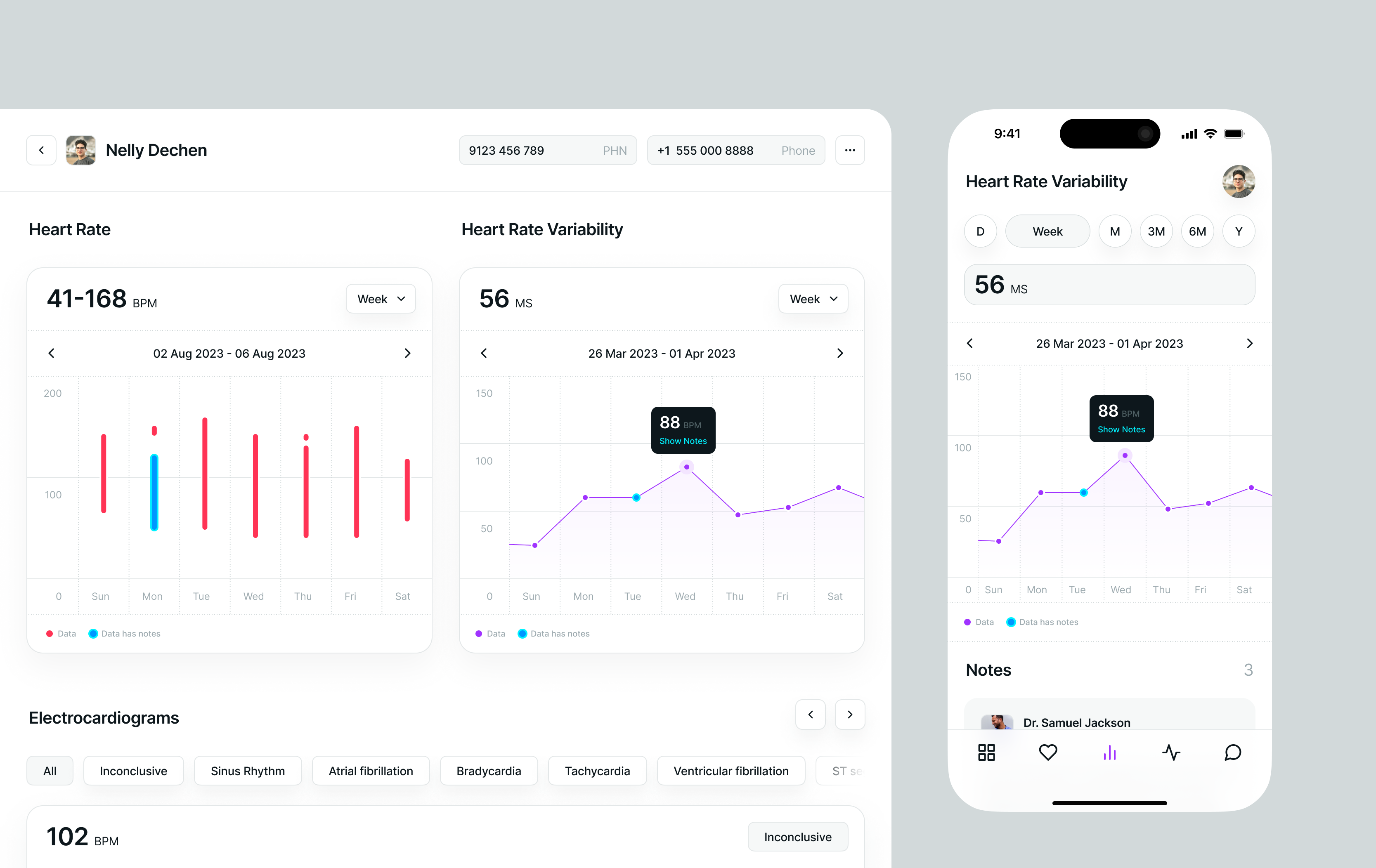
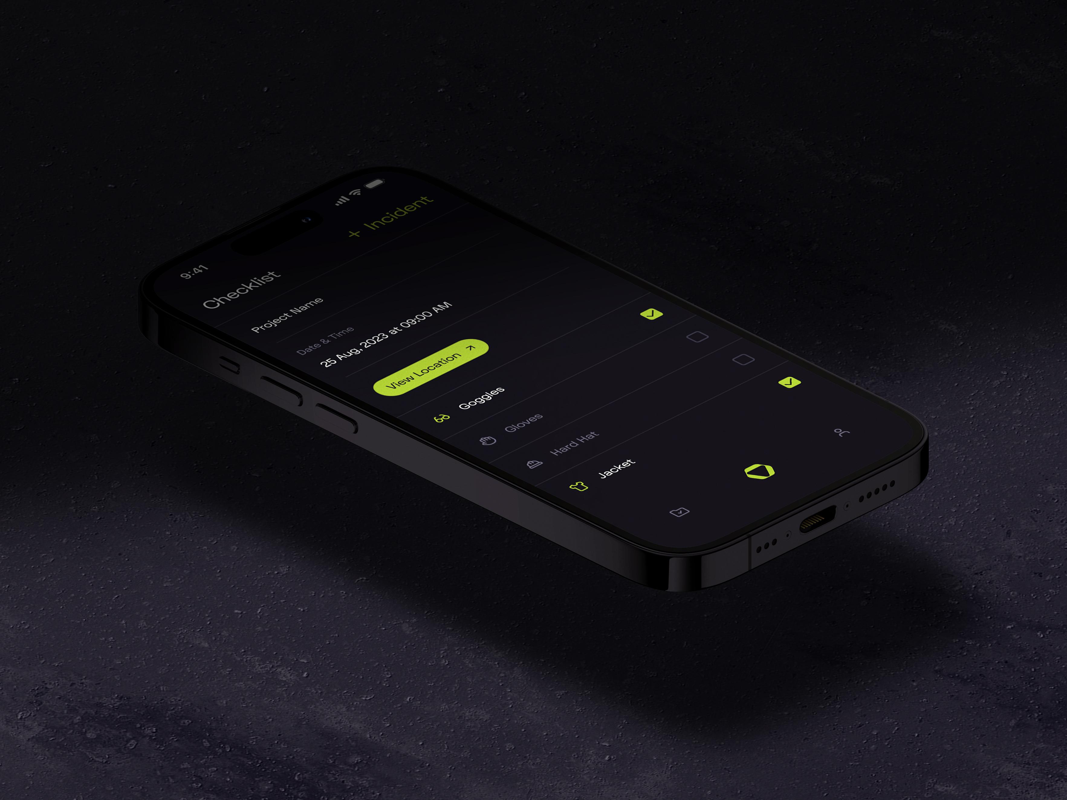
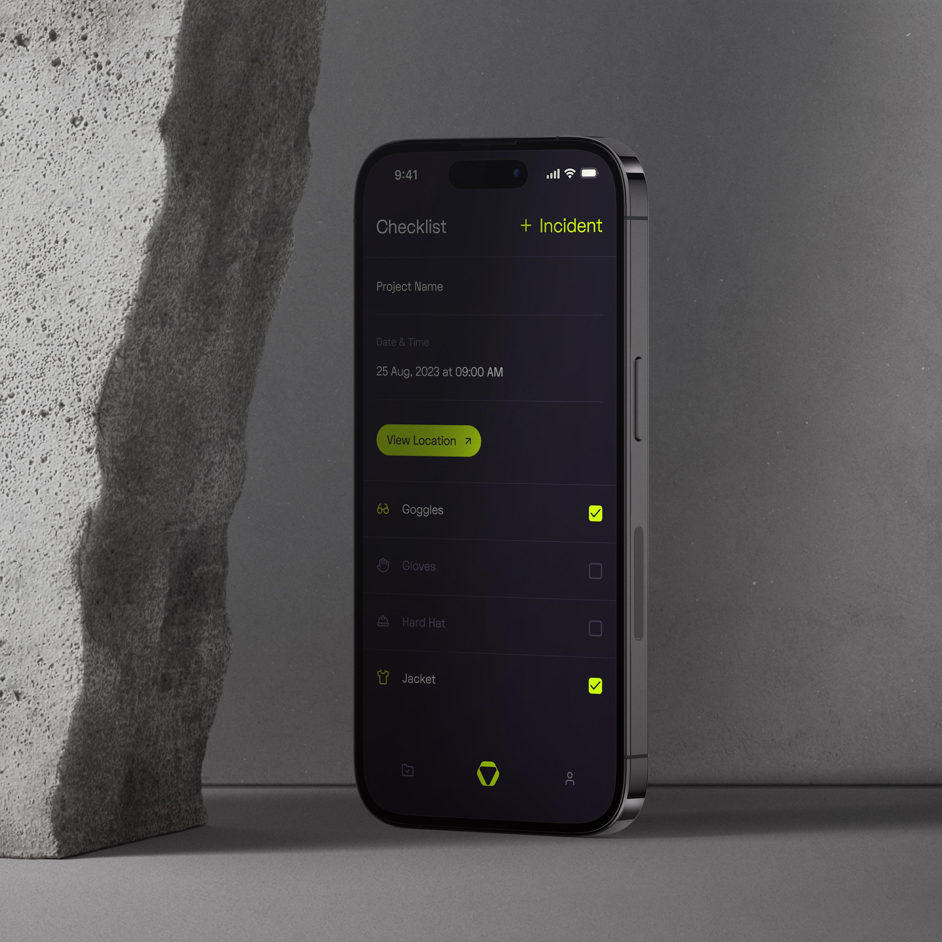
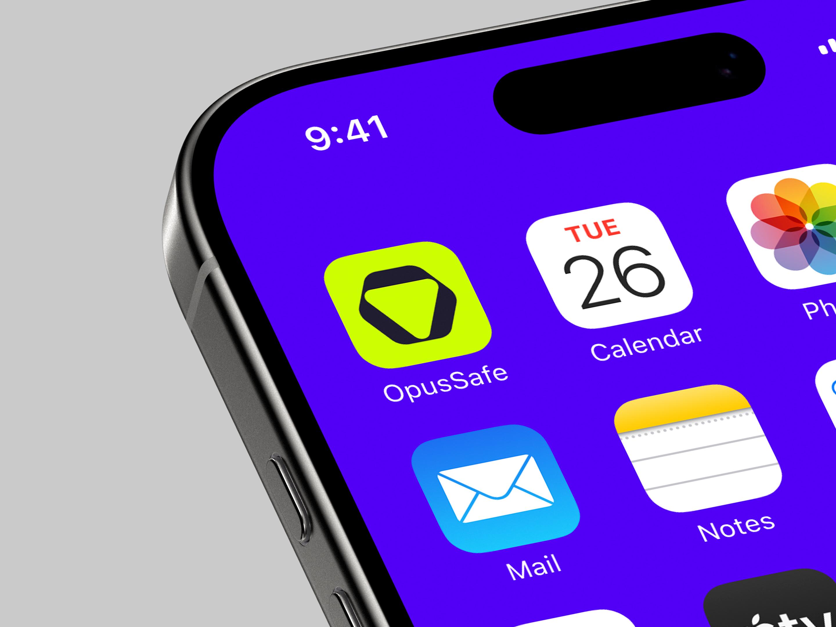
UI Components and Patterns (The Building Blocks)
This is the layer most teams recognize first.
Reusable components such as buttons, inputs, lists, cards, sheets, and dialogs form the visible system. Each component should document:
- Usage guidelines
- States such as default, pressed, disabled, and loading
- Allowed variations and constraints
Patterns go one level higher. They describe how components work together to solve common problems like onboarding, forms, or error handling.
Clear patterns reduce cognitive load for users and implementation risk for teams.
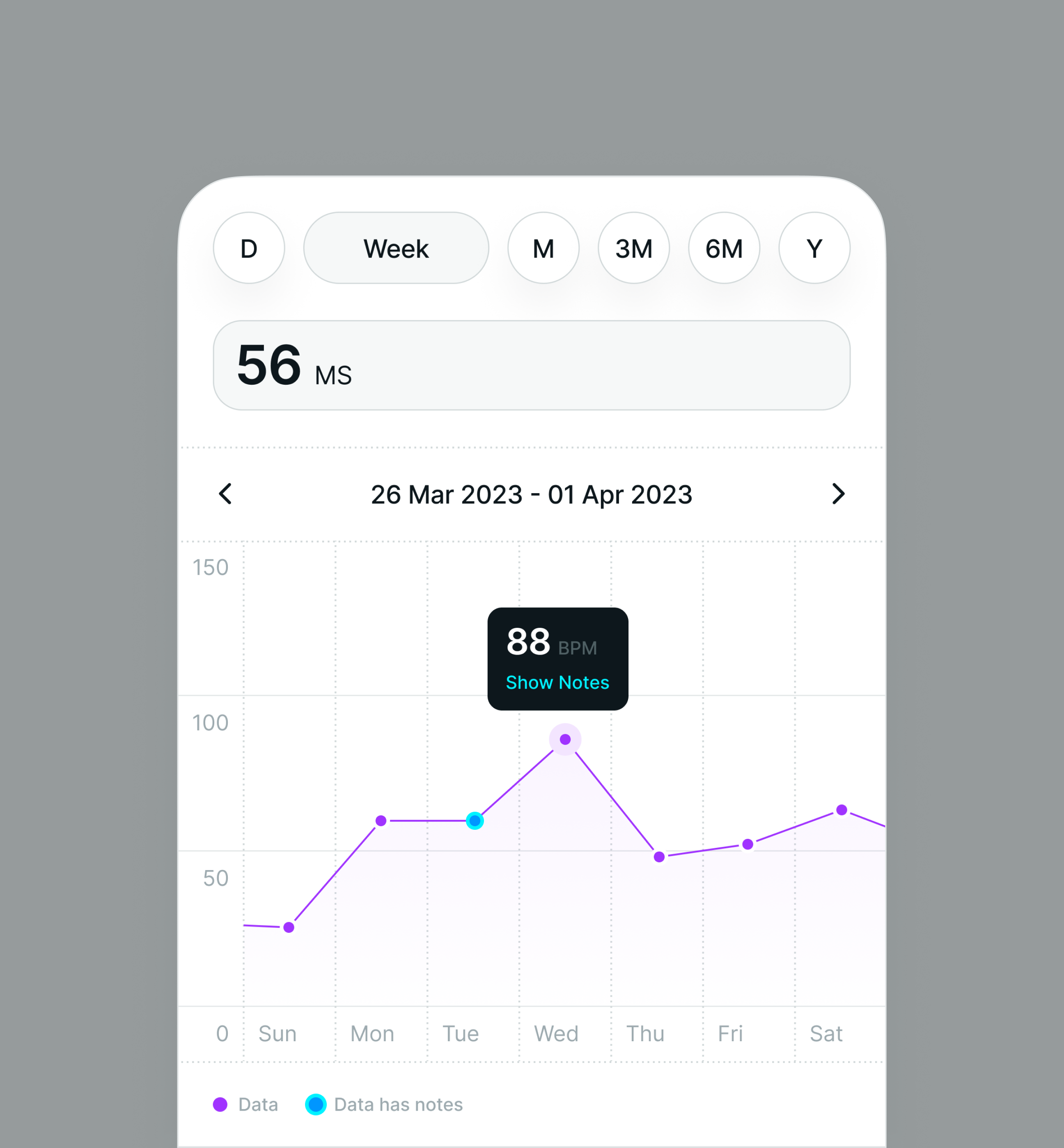
Behavior, Motion, and Interaction (The Feel)
Static components do not define experience on their own.
Motion and Micro-Interactions
Motion explains relationships between screens and states.
Transition durations, easing curves, and feedback animations should be standardized so nothing feels random. Subtle, consistent motion helps users understand cause and effect without drawing attention to itself.
Gestures and Touch Interactions
Gestures are core to mobile UX and easy to misuse.
A design system should document which gestures are supported, where they apply, and how they differ between platforms. Swipe actions, pull-to-refresh, drag-and-drop, and long-press behaviors should never be left to interpretation.
When interaction rules are clear, the app feels cohesive instead of stitched together.
Why This Structure Works
This layered approach mirrors how real teams build and maintain products.
Principles guide decisions. Foundations create consistency. Components enable speed. Behavior delivers polish.
When these layers are clearly defined and documented, a mobile design system becomes a tool teams rely on daily, not a PDF they forget exists.
Design Tokens for Mobile: How They Power Scalable, Consistent UI
If design systems are the “rules of the road,” design tokens for mobile are the street signs — tiny, universal pieces of information that keep everyone moving in the same direction. At Hooman Studio, we think of mobile design tokens as the connective tissue that keeps Figma, iOS, Android, and cross-platform frameworks speaking the same language without yelling at each other.
Tokens help you scale. They reduce chaos. And they save teams from having 47 slightly different blues floating around. Let’s break down what they are and how to make them work for you.
What Design Tokens Actually Are (Without the Jargon)
Design tokens definition:
They’re named variables that store values like color, spacing, typography, elevation, radii — basically the raw DNA of your visual system.
Examples you’ll actually use:
This is how design tokens in design systems become the single source of truth instead of scattered values.
Token Categories Every Mobile App Needs
You don’t need 500 tokens. But you do need the right categories.
Color Tokens
- Semantic color tokens (color.text.primary, color.bg.surface)
- States for dark/light themes
- Accessibility-ready contrast pairs
This is where design tokens color type spacing start their magic.
Typography Tokens
- Typography tokens for font families, weights, and scales
- Support dynamic type and sp scaling
- Mapped per platform (pt for iOS, sp for Android)
Spacing & Sizing Tokens
- Use an 8-point rhythm for spacing scale tokens mobile
- Consistent mobile UI spacing tokens like space.xs → 4, space.s → 8, etc.
Elevation, Radius & Motion Tokens
- Elevation tokens mobile for shadows (if your brand uses them)
- Border radius tokens for shapes
- Motion tokens for transition duration and easing
These help ensure your UI doesn’t accidentally change personality from one screen to another.
Units: DP vs PT vs SP (The Short Version)
This stuff confuses a lot of people, so here’s the easiest way to remember:
This is the heart of design tokens dp vs pt vs sp explained so your designs don’t go rogue.
How Tokens Move From Figma → Code
This is the workflow modern teams use (including us):
- 1.Designers define tokens in design tokens Figma variables or Tokens Studio.
- 2.Tokens get exported through Style Dictionary mobile.
- 3.Style Dictionary transforms tokens into:
- iOS Swift constants
- Android XML resources
- JS/Dart maps for React Native / Flutter
4. Developers consume them directly. No copy-pasting hex codes ever.
This creates a smooth design token transformation pipeline and keeps design + code aligned.
Keeping Tokens Healthy: Governance & Versioning
Even the best systems drift without maintenance. That’s where:
- token governance (review, approval, cleanup)
- design token versioning (semantic versions, changelogs)
…come in.
They help teams avoid “mystery values,” rollback safely, and evolve the design system without surprise visual regressions.
Quick FAQs
Designing for Multiple Platforms: iOS, Android, Flutter, and React Native
Designing a cross-platform design system sounds simple on paper — “make everything consistent across iOS, Android, Flutter, and React Native.”
But the real work lives in the nuance: respecting native platform conventions, maintaining a unified mobile design system, and still keeping your brand unmistakably your brand. This is where teams (and honestly, even seasoned designers) get overwhelmed. So let’s break it down like we would with a client at Hooman Studio: clearly, calmly, and without assuming you already know the difference between Material Design vs HIG by heart.
Start with a Shared Foundation (Then Layer Platform Logic on Top)
The core idea behind a multi-platform design system is simple:
→ Unify what’s universal. Adapt what’s expected.
Your colors? Unified.
Typography scale? Unified.
Spacing system, design tokens, icons, illustrations? Unified.
Your navigation patterns, gestures, elevation, and component behaviors?
Those should flex between iOS and Android because users instantly feel when something is “off.”
Here’s a quick snapshot:
This approach gives you both cross-platform UI consistency and the “feels right on my device” effect.
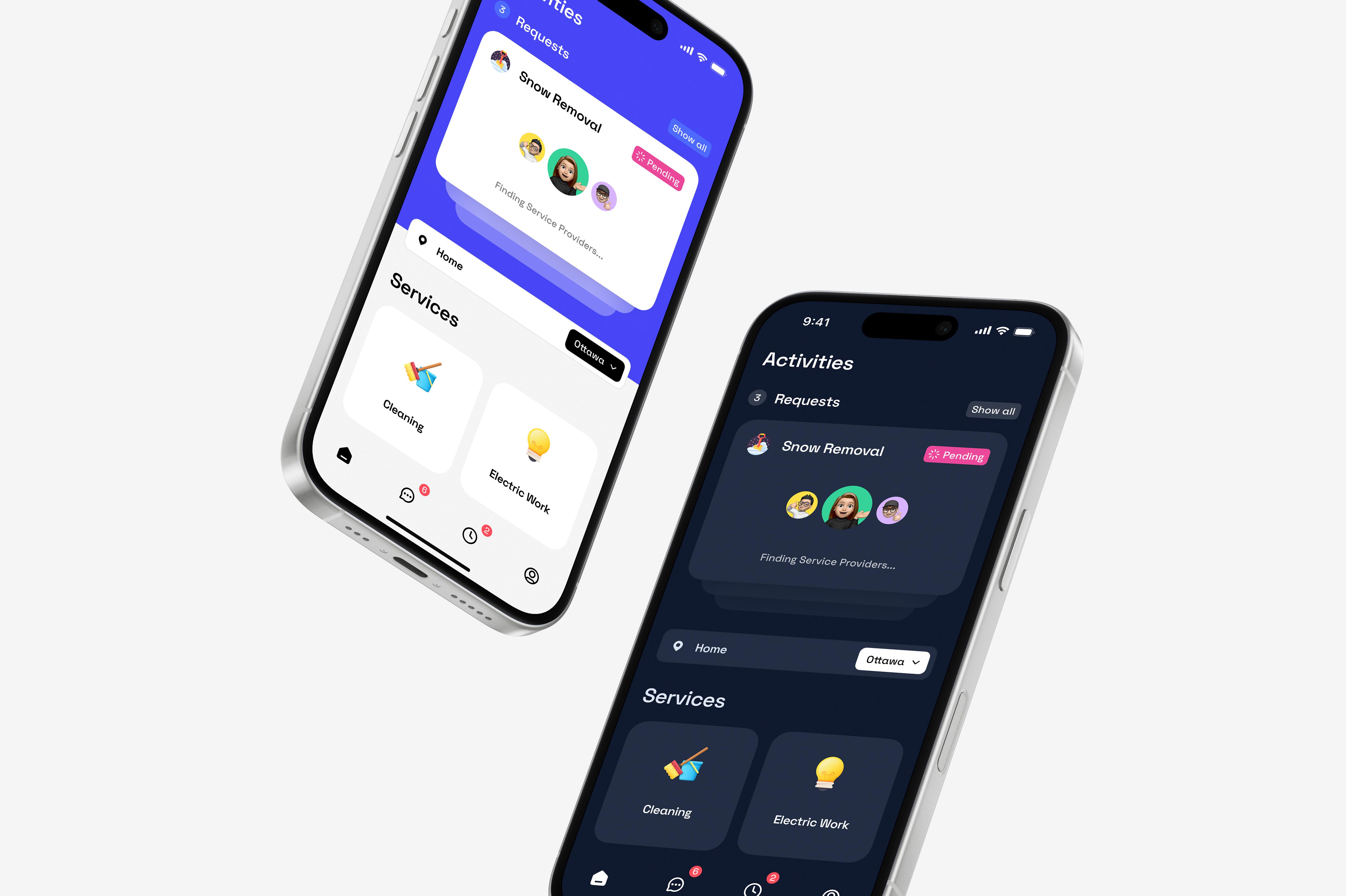
iOS vs Android: The Big Differences You Actually Need to Care About
The gap between iOS Human Interface Guidelines vs Material Design is more than aesthetics:
- iOS ≠ Android back behavior
1. iOS: swipe from the left edge
2. Android: system Back, Up arrow
- Elevation
1. iOS: subtle shadows, blur
2. Android: elevation levels + bold shadows
- Controls
1. iOS switches have a very specific look
2. Android uses Material toggles and FABs
- Navigation defaults
1. iOS loves a clean bottom tab bar
2. Android often adds drawers or extended FABs
This is why a platform-consistent UI matters — users bring expectations with them.
React Native & Flutter: Your “Single Codebase, Multiple Personalities”
Both React Native & Flutter frameworks let you build multi-platform apps from one codebase, but they behave differently inside a multi-platform design system:
React Native design system
Uses platform-native controls → great for platform differences.
(Think platform.select, .ios.js vs .android.js files.)

Flutter design system
Draws everything itself → ultra-consistent across platforms.
But you must intentionally add Cupertino vs Material variants to keep things “native enough.”
Both can consume the same design tokens shared across platforms.
That’s where true scalability comes from.
Component Abstraction: Your Secret to Staying Sane
You don’t design four separate libraries.
You design one conceptual component model:
Platform-agnostic component spec
(What is a Card? What parts does it have? What states?)
Platform-specific variations
(iOS header vs Android AppBar vs Flutter widget vs RN element)
This avoids the “forked design system” nightmare and keeps your cross-platform component library maintainable.
Quick FAQs
Tooling and Documentation Workflow for Modern Mobile Design Systems
If you’ve ever worked inside a messy Figma file or tried to reverse-engineer a component from screenshots in Slack (we’ve all been there), you already know this: the tooling and documentation workflow is the real engine behind a scalable mobile design system. At Hooman Studio, we treat our design system stack like a product of its own — Figma, Storybook, Supernova, design tokens, and our handoff tools are stitched into one workflow so we can challenge assumptions early, move with the client as a true product partner, and let teams spend less time chasing specs and more time shipping thoughtful, future-ready mobile experiences.
Below is a walk-through of how modern teams structure their design system tooling, organize documentation, and collaborate without stepping on each other’s toes.
Start With a Solid Figma Foundation (Your Design System’s “Home Base”)
A strong system begins with Figma design system best practices, because this is where most teams actually live day-to-day.
How to structure a Figma design system library
A clear layout helps every designer know where to find things:
Foundations page
colors, typography, spacing, elevation
Components page
buttons, inputs, cards, chips
Patterns/Templates
flows, layouts, shared UI patterns
Tokens/Variables page
Figma Variables (your design tokens)
Keep naming simple. Keep pages clean. And keep frames labeled like a human, not a robot.
Figma library setup
Once your components are polished:
- 1.Publish them as a Team Library
- 2.Version updates thoughtfully
- 3.Use library analytics to prune or refine unused components
- 4.Encourage designers not to detach instances unless absolutely necessary
This is the heart of design system library organization and the easiest way to enforce consistency.
Figma Variants, Tokens, and Variables (Your Dynamic Layer)
Modern mobile design systems rely heavily on:
- Figma component variants — different states, sizes, themes
- Figma tokens / Figma variables — your spacing, color, type, and theme values
This pairing is the secret to a flexible system:
- Variants define structure
- Tokens define style
- Publishing both creates a design environment that updates automatically when tokens change
It’s the most reliable way to keep design and code aligned without manual patchwork.
Handoff Tools: Zeplin, Storybook, and Supernova (Who Does What)
This is where mobile teams often ask, “Do we need all of these?”
Short answer: you use the right tool for the right moment.
(Think of Zeplin as a translator, Storybook as the component playground, and Supernova as the official handbook.)
Designer–Developer Collaboration (The Workflow That Actually Works)
You can have perfect tools and still have chaos if the team isn’t aligned. Here’s the workflow we see work best:
- Involve developers early (don’t surprise them two days before handoff)
- Use Figma → Storybook sync to compare components in design vs code
- Avoid “one-off components” unless absolutely necessary
- Use a shared naming system across Figma, tokens, and code
- Keep all documentation in one place (Supernova, Zeroheight, or Notion)
- Treat feedback loops as normal, not optional
This creates a design ops workflow where everyone is on the same page, literally and figuratively.
Governance Updates and Quality Control for Maintaining a Scalable Design System
If your design system feels like a neat Figma file today and a wild west of components six months from now… that’s a governance problem, not a talent problem. Design system maintenance is really about how decisions get made, not just how pretty your UI kit looks.
At Hooman Studio, we treat the system like a product with its own roadmap, owners, versioning, and release notes — especially for mobile apps that ship across iOS, Android, and sometimes web.
Who actually owns this thing?
You don’t want “everyone and no one” owning your design system. That’s how design system debt piles up and design drift sneaks into your mobile apps.
Governance Models
Centralized design system governance
A small core team (design + dev) owns the system end-to-end. Great for quality and consistency, but can become a bottleneck.
Federated design system governance
Feature teams contribute via a design system council or guild. More scalable, but you need clear rules to prevent UI chaos.
Hybrid (what we usually recommend)
Core team owns foundations and key components; product teams can add patterns via a defined design system contribution process (with reviews).
For growing product teams, a hybrid governance model works well: centralized where risk is high (foundations, core mobile components), more federated for patterns and platform-specific tweaks.
Versioning, change management, and not breaking everything
Treat your system like an API: changes are contracts. A simple semantic versioning scheme keeps everyone sane:
Every release should have design system release notes in human language, not just a Git tag: what changed, why, impact on mobile screens, and links to updated documentation. That’s how you manage design system changes across teams without surprise regressions.
We also like a lightweight design system RFC process for risky updates (new navigation pattern, big token changes). Short doc, clear rationale, async feedback, then approval from the design system owners.
Audits, drift prevention, and “no, we don’t need a 7th button style”
If you ignore the system for a year, you don’t have a system — you have legacy artboards. Regular design system audits keep things honest:
- Compare live apps vs Figma / Storybook: spot design drift and custom one-offs
- Merge duplicate components and tokens
- Tag candidates for removal under a deprecation policy
- Track a small design system backlog for cleanup and refactors
Simple design drift prevention checklist
- Use only library components and tokens in new designs
- Block PRs that don’t use system components where they should
- Add a “Is this already in the design system?” step to feature kickoffs
- Time-box monthly “refactor & cleanup” slots for the system itself
Over time, this kind of design system governance framework keeps your UI consistent across platforms, avoids runaway complexity, and lets designers and developers move faster instead of reinventing the same card, button, or modal for the 12th time.
This is where your design system starts feeling like quiet infrastructure: always there, always evolving, and supporting the rest of your mobile product — not fighting it.
Qick FAQs
Mobile Design System Best Practices with Lessons from Leading Apps
If you’ve ever looked at Material Design, Airbnb’s DLS, Spotify’s Encore, or even Duolingo’s delightfully consistent chaos and thought, “How do they keep this all so aligned across iOS and Android?” — welcome, you’re in the right place.
This section walks through mobile design system best practices, using real-world examples from the apps people actually use every day. Think of it as your “learn from the masters so you don’t recreate their mistakes” guide — friendly, honest, and rooted in what actually works when you’re shipping mobile products at scale.
Material Design 3 (Material You): Personalization with discipline
Material Design 3 is the perfect example of what a mature design system looks like when it evolves with platform trends instead of fighting them.
What Material 3 teaches mobile teams
- Lean into design tokens for mobile apps — MD3’s color, typography, and elevation tokens are why updates feel cohesive.
- Account for OS-level features (like Android’s dynamic color). Users can set their wallpaper and your app just… adapts.
- Keep your component library opinionated: MD3’s simplified text scale and updated components reduce decision fatigue.
For teams building cross-platform design systems, Material 3 reminds us that consistency doesn’t mean cloning iOS on Android — it means respecting each platform’s ergonomics while keeping your brand unmistakable.
Airbnb DLS: Cross-platform design tokens done right
Airbnb’s DLS remains one of the best examples of mobile UI design system examples at scale. They used platform-agnostic design tokens long before it was cool — meaning a single color or spacing change flowed to iOS, Android, and web without anyone manually tweaking a hex code.
The takeaway? If you want to maintain cross-platform consistency without slowing teams down, your tokens must do the heavy lifting.
Spotify Encore: Consistency across 45+ platforms
Spotify’s Encore design system is basically a masterclass in design system scalability. Their challenge wasn’t just “iOS and Android” — it was phones, TVs, cars, desktops, watches, speakers… you name it.
Encore’s smartest moves
- A shared foundation layer for all platforms
- A cross-platform component layer (Web + Mobile parity)
- A tight naming system for layout + spacing tokens
- Cross-functional auditing before creating new components
What this proves: consistency isn’t about matching pixels, it’s about matching intent and experience.
Duolingo: Playful but disciplined
Duolingo is proof that a strong design system doesn’t need to be formal to be effective. Their gamification UX design system blends dynamic feedback, character-driven UI, and simple components that scale across all ages and devices.
Why Duolingo works so well
- Consistent illustration style (Owl included, obviously)
- Predictable lesson structure = cognitive ease
- Mobile-first, distraction-free flows
- Reinforcement loops built into the UI
It’s a reminder: your design system should reflect your product’s personality — just consistently.
Common Mobile Design System Pitfalls to Avoid
Even top teams stumble. Some design system mistakes mobile teams hit again and again:
- Too many variants (nobody needs seven button styles)
- Not testing for cross-platform consistency
- Treating design tokens as “nice-to-have”
- Allowing documentation to get stale
- Ignoring accessibility in early component design
- Creating components without real usage context
Mobile design systems fail when they’re overbuilt, under-governed, or disconnected from the real product. Keep it simple, documented, and genuinely helpful for the people building your app.
Quick FAQs
Wrapping It Up: Your Design System Starts With One Intentional Step
If you made it this far, you already know something most teams figure out the hard way: a mobile design system isn’t a fancy Figma file or a pile of components — it’s the quiet engine that keeps your product coherent, scalable, and genuinely enjoyable to use. Every example we explored — Material 3, Airbnb’s DLS, Spotify’s Encore, Duolingo’s playful ecosystem — proves the same thing:
consistency isn’t luck. It’s built on intention, shared rules, thoughtful governance, and a whole lot of tiny decisions handled once instead of a hundred times.
And here’s the part people forget: you don’t need a massive team or a perfect first draft to start. You just need one principle, one token set, one organized component, one written guideline. Momentum follows clarity.
So take a breath, zoom out, and give yourself permission to build this step by step:
- Choose one foundation to standardize this week (colors, spacing, typography — pick the easiest win).
- Document the things your team repeats the most (a button rule, a spacing rule, a navigation pattern).
- Adopt tokens early, even if it’s a tiny set — your future self will send you a thank-you note.
- Audit what you already have before you create anything new. There’s always gold hiding in past work.
- And most importantly, design for real people on real devices, not for a hypothetical “perfect user.”
If you’re building a mobile product — or planning one — you’re already on the path. A design system doesn’t replace creativity; it protects it. It gives your team more space to innovate, more room to move fast, and fewer fires to put out. And once it’s running quietly in the background, you’ll wonder how you ever shipped without it.
Before you go, here’s a small reflection to carry with you:
What’s the one part of your mobile app that would instantly feel calmer, cleaner, or more consistent if you systemized it today?
Hold that thought — because that’s your starting point. And if you’re curious about where to take it next, stick around. At Hooman Studio, this is the stuff we live and breathe, and there’s a lot more we can explore together.