Havium Didn't Pick One Color: Here's Why
By Mobina
Hooman Studio built Havium's identity on two disciplined colors, navy and green, rather than one signature accent, each carrying a different half of what an investor needs to feel, security and opportunity, held consistently across cards, merchandise, and apparel.
Most financial brands settle on a single signature color and defend it everywhere, the way MWORK locked itself to one neon green. Havium made the opposite bet, building its identity on navy and green together, not one or the other.
Two Colors, One Discipline
A two-color system is riskier than a one-color system. Add a second strong hue and you risk neither one reading as a clear signal, the exact failure mode a single-accent brand is built to avoid.
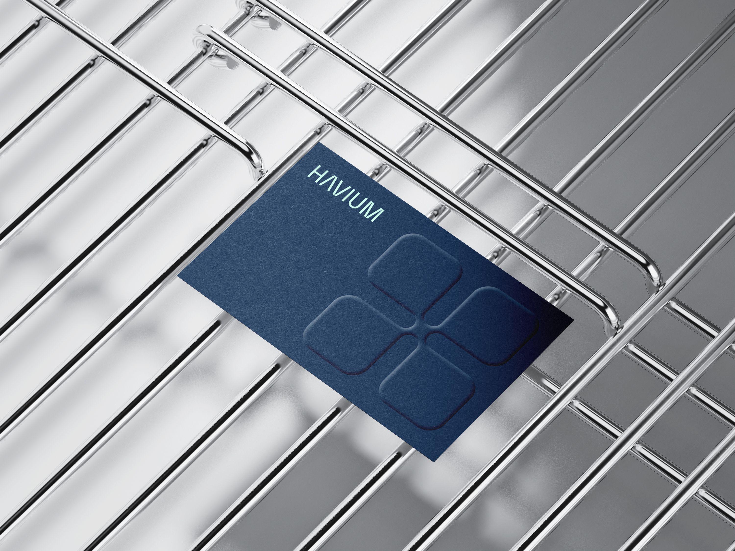
Havium avoids that failure not by picking one winner, but by giving each color a defined role and holding that division consistently everywhere the brand shows up: business cards in navy and in green as separate, deliberate variants rather than a single card trying to use both at once, a tote bag in navy with green handles, apparel in navy with a small logo and a bright green cap. Call this paired restraint: two colors treated with the same discipline most brands reserve for one, each color staying in its lane rather than competing for the same attention.
Why One Color Wasn't Enough Here
MWORK's single neon green had to do one job: get noticed on a job site. Havium's color system has a different job, representing two sides of the same decision an investor has to make, the security and trust navy signals, and the growth and opportunity green signals, in a category called fractional real estate investing where both have to be true at once for someone to actually invest.
A single color could have carried one half of that message. It would have struggled to carry both.
Consistency Across Cards, Merch, and Apparel
The real proof of discipline isn't the color choice itself, it's how consistently the split holds. The navy card and the green card don't blend into a muddy middle ground, each stays confidently in its own lane. The same split carries into the tote bag, navy body, green handles, and into apparel, a navy sweatshirt paired with a bright green cap rather than one garment trying to carry both colors evenly.
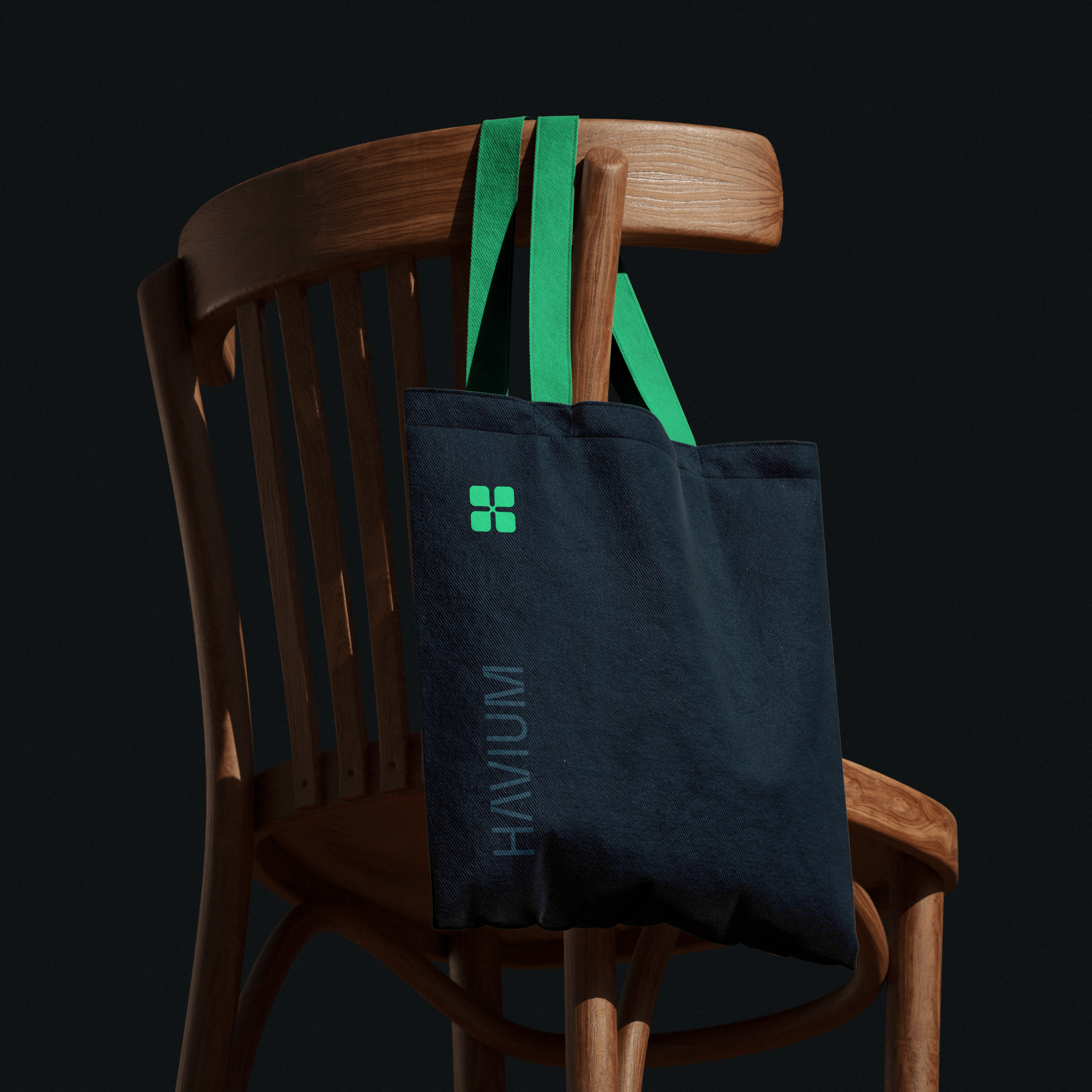
That consistency across formats as different as a business card and a baseball cap is what keeps two colors from reading as indecision. Nothing here is accidental, and nothing drifts.
What This Proves About the Brand
A one-color brand says "notice this." A two-color brand, held this carefully, says something closer to "trust both halves of this decision." For a platform asking people to understand an unfamiliar investment model, that's not a small distinction.
Havium's color system isn't the absence of restraint. It's restraint applied to two things at once instead of one, which is a harder discipline to hold, not an easier one.
If your brand needs more than one color to tell the whole truth, let's talk.
FAQ
Because a single accent color is easier to make distinct and memorable. Adding a second strong color risks diluting the signal, unless each color is given a clearly defined, consistently held role.
Yes, if each color is treated with real discipline rather than blended together. Havium keeps navy and green in separate, defined roles across every application, rather than letting them compete for the same attention.
Because the category asks investors to believe two things at once, that an investment is secure and that it offers real growth potential. Navy and green each carry one half of that message.
By holding the same split everywhere the brand appears, business cards, merchandise, apparel, rather than letting the balance shift format to format. Consistency is what keeps two colors from reading as indecision.