Impossible to Ignore: MWORK's One-Color Rule
By Mobina
Hooman Studio built MWORK's identity around a single accent color, a neon green (#55FF00), instead of a full palette. Everything else sits on neutral ground, brown and grey, so that one color carries all the visual weight and survives daylight, pavement, and foot traffic on an actual job site, not just a mockup.
Construction branding has a color problem. Everyone is either safety orange or corporate blue, and after enough job sites, both start to look like wallpaper.
MWORK needed to be seen on an actual job site, not just in a pitch deck. A muted palette dies in that environment. So when MWORK brought the brief to Hooman Studio, the team made a decision most branding briefs never get to: pick one color, make it impossible to look past, and build every other choice around protecting it, on top of the grid logic covered in The Grid Is the Point.
The Discipline of Picking Just One
A full color palette gives a brand options. A single accent color gives it a job.
Hooman Studio built MWORK's identity to run almost entirely on neutral ground: black, concrete grey, heavy brown paper stock. Against that, one neon green sits alone, with nothing competing for the same attention. That's not a limitation. It's the whole strategy the studio committed to. The moment you add a second bright color, the first one stops meaning anything specific. It becomes decoration instead of a signal.
Call this signal color discipline: a rule, applied deliberately here, where one hue is allowed to carry all the visual weight in a system, and everything else exists to keep it from getting crowded. The neutral background isn't the absence of color choices. It's the price paid to keep the signal clean.
A Color Built to Survive Outside
Most brand colors are chosen on a screen and tested in a boardroom. MWORK's had to survive the site itself, which meant Hooman couldn't design it purely from behind a monitor.
The green shows up as branded tape applied directly onto the pavement of an active job site, the exact kind of environment that washes out a weaker color choice under flat daylight and foot traffic. A softer green or a muted tone would have disappeared into that setting within a week. This one doesn't. It reads the same on pavement as it does on a business card pulled out of a jacket pocket, and that consistency across two extremely different surfaces is the actual test the studio held this color to.
Most identity colors are chosen for how they look in a mockup. Hooman chose this one for how it survives outside one.
What the Color Is Actually Saying
Color in a construction brand isn't decoration. It's a claim about how the company operates.
Soft, muted palettes signal caution, the visual equivalent of a firm that hedges. MWORK's neon does the opposite. It says the work doesn't apologize for its own presence, and neither does the brand attached to it. That's a specific bet Hooman Studio made on the client's behalf: that a design-build firm handling unconventional materials and bold spatial transformations shouldn't dress like a firm that plays it safe, the same bet Kafka's Organic made in a completely different industry, choosing warmth over the polished neutrality most pet food brands default to.
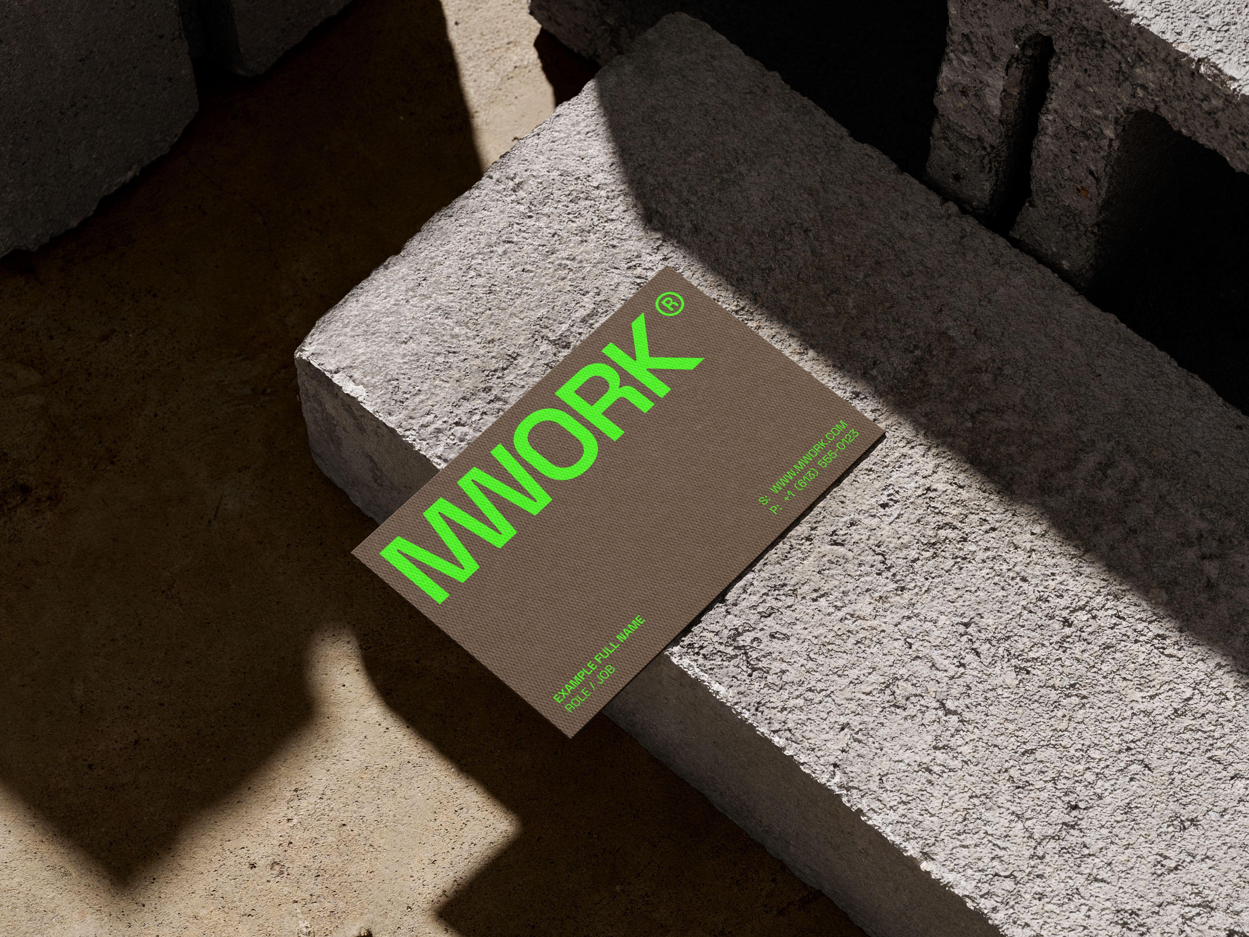
The restraint around the color is what keeps that bet from reading as a gimmick. One loud choice, made once, held consistently across a business card, a roll of tape, and everything in between, reads as conviction. A dozen loud choices read as noise.
Why Restraint Was the Real Decision
The easy version of this brief would have been "make it bold." The harder version, the one Hooman Studio actually delivered, was "make it bold exactly once, and defend that choice everywhere else."
That's the part that doesn't show up in a first glance at the identity. The neon gets noticed immediately. The discipline holding it in place is what makes it last past the first glance, and that difference between noticed and trusted is the entire job a job site color has to do.
If your brand needs one color people actually remember, instead of five nobody does, let's talk.
FAQ
A signature color is a single hue chosen to carry all of a brand's visual weight, rather than being one of several. Restricting a palette to one accent color turns that color into a signal instead of decoration, since nothing else competes for the same attention.
Test it against the environment it actually has to survive in, not a mockup. A color that reads well in a boardroom can wash out completely under flat daylight, on concrete, or against foot traffic, the exact conditions a screen-only design process never accounts for.
Only with discipline behind it. One loud color, used once and defended consistently everywhere it appears, reads as conviction. Several loud colors used at once tend to read as noise instead.