The Grid Is the Point: Inside MWORK's Brand Logic
By Mobina
MWORK didn't want a friendly construction brand, they wanted one you'd trust with a load calculation. Hooman Studio built the identity on one unbending grid that governs the logo, the business card, even the tape laid down on-site, so nothing drifts and nothing gets eyeballed into place. Neon green shows up, but it stays inside the lines. The whole point: precision, not color, is the loudest thing a brand can say.
Most construction brands try to look approachable. When MWORK came to Hooman Studio, they wanted the opposite, and that was the entire point.
While most construction brands lean on soft blues and rounded logos to promise comfort, MWORK sells conviction. They build with materials others won't touch, requiring a brand identity that matches their structural grit. In an industry of hedges and reassurance, Hooman Studio built MWORK a brutalist honesty that refuses to soften its edges.
A Grid That Argues, Not Just Aligns
Most grids exist to keep things tidy. The one Hooman Studio built for MWORK exists to make a case.
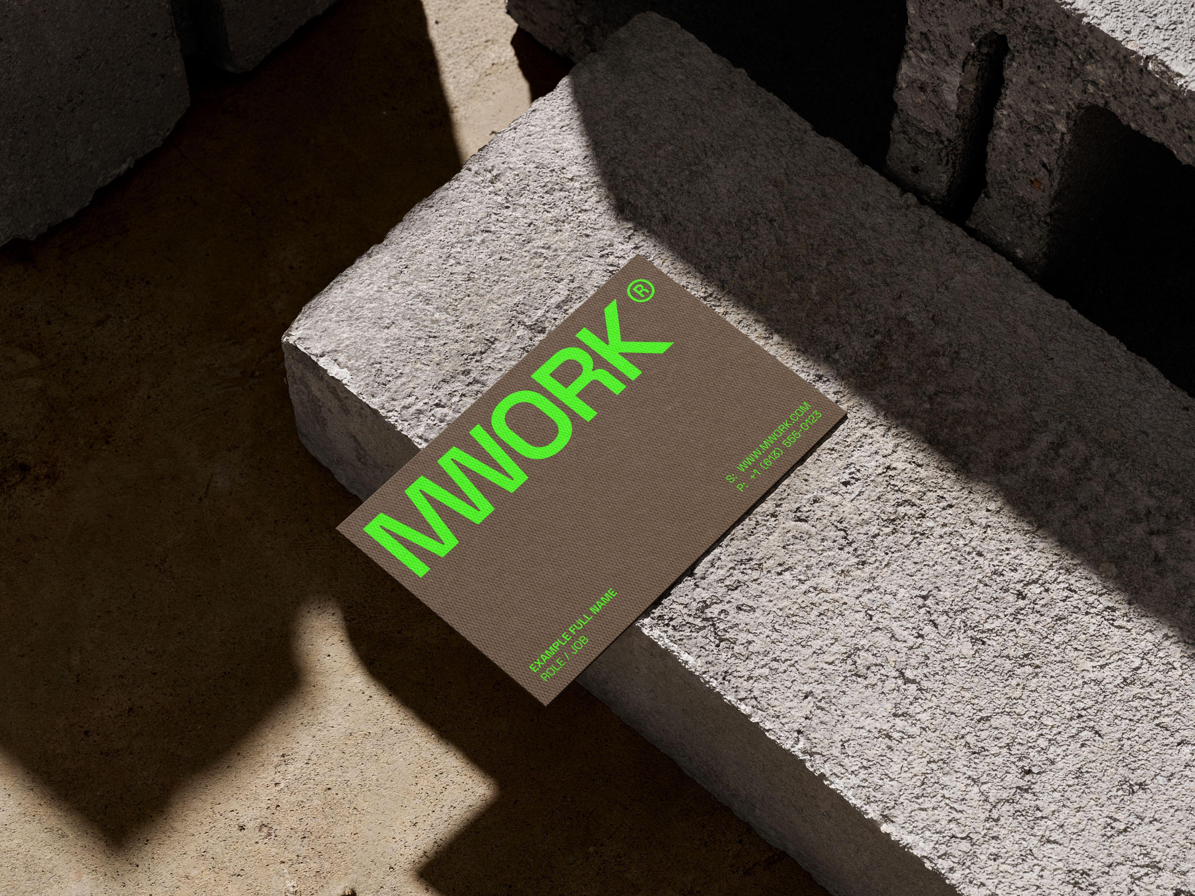
Every element in the identity sits inside a strict grid: the logo lockup, the business card layout, even the branded tape applied on site. That's a deliberate constraint the studio chose, not a default one. A design-build firm survives on tolerances measured in millimeters. A brand built on the same logic, where nothing drifts and nothing is eyeballed into place, reads as an extension of how the company actually works rather than a decoration applied on top of it. It's the same instinct Hooman brings to any identity project: the system should behave like the client's actual business, not just represent it.
The typography follows that instinct. It's assertive, full weight, no interpretive softness in the letterforms. Nothing about it asks to be liked. It asks to be read once and trusted.
Call it precision as provocation: the idea, central to how Hooman Studio approached this brief, that mathematical control, not color or shock value, is the loudest thing a brand can say. Most bold identities lead with color and hope the structure holds up behind it. Hooman built MWORK's structure first. The color is what happens once the structure has already made its point, a decision we get into in MWORK's One-Color Rule.
Where Precision Meets Provocation
The neon green almost reads as the headline, but it isn't. It's a component, governed by the same grid as the smallest label on the card. It sits exactly where the system says it should sit. That containment, deliberate on Hooman's part, is what makes it feel intentional instead of decorative. A color that obeys the rules around it reads as confidence. A color that doesn't just reads as noise.
You can see the same logic hold up outside the studio entirely. The identity doesn't stop at the business card. It shows up as bright green branded tape applied directly onto the job site, laid down on the pavement underfoot, sitting inside the same grid it uses in someone's pocket. A construction brand that only exists on paper is a costume. One that survives daylight and foot traffic on an actual site is a uniform, and building for that kind of durability is exactly what Hooman was hired to do.
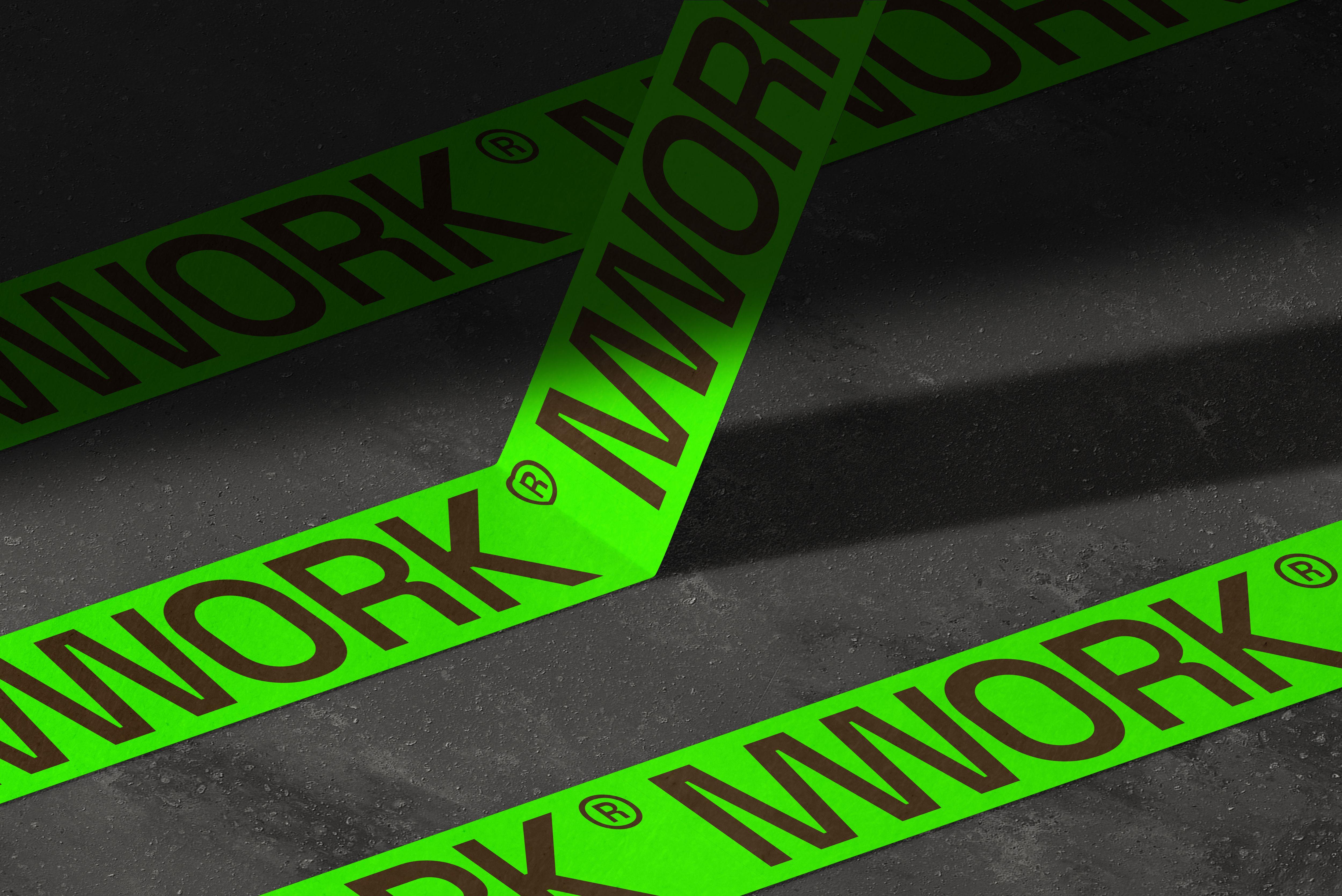
The paper stock carries the other half of the argument, which we unpack fully in MWORK's Boldest Move: Paper, Not Neon. Heavy brown stock and raw textures aren't a softening move against all that precision. They're the physical evidence of it: something you can feel has permanence, printed with the same discipline as everything digital. Neon says attention. Paper says weight. The grid is what makes sure they don't contradict each other.
The Point of All That Structure
None of this is brutalism borrowed for effect. It's a grid Hooman Studio used the way MWORK uses a foundation plan: as the thing everything else has to answer to.
The resulting identity doesn't ask to be liked. It asks to be trusted, the same way you trust a beam that's been calculated rather than guessed at. For a firm whose actual product is structural integrity, a brand held together by the same logic was never a metaphor. It was just consistency, applied one more time, and it's the same approach Hooman Studio brings to any brand that needs to be believed rather than just noticed.
If your brand is making promises your current identity can't back up, let's talk.
FAQ
A grid system is a set of alignment rules, columns, margins, unit spacing, that every element in an identity has to answer to. Done well, it's not a layout tool. It's a discipline that keeps a brand from being placed by eye.
Because color fades and structure doesn't. Most bold identities lead with color and hope the layout holds up behind it. A grid-first approach flips that: precision becomes the provocation, and color becomes just another component governed by the same rules as everything else, the logic Hooman Studio used to build MWORK's identity.
It should, or it isn't really a system. For MWORK, the same neon green and grid logic reappear as branded tape applied directly onto pavement at an active job site, proving the structure survives daylight and foot traffic, not just a business card in someone's pocket.