Three Clicks to Anywhere: Leeson's Navigation Logic
By Mobina
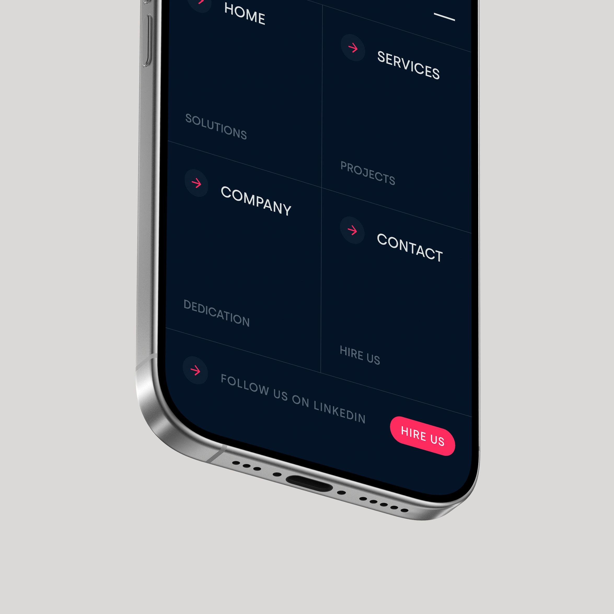
Hooman Studio built Leeson Engineering's navigation around five flat menu items, Home, Services, Company, Contact, Hire Us, letting the footer carry the company's actual service complexity so the top-level path to anywhere on the site stays short.
Engineering firms tend to bury their services under nested menus, on the assumption that visitors already know what they're looking for. Leeson Engineering's navigation makes the opposite bet: five items, Home, Services, Company, Contact, Hire Us, and nothing more to dig through.
Flat by Design, Not by Accident
A five-item menu looks simple, almost too simple for a firm with a complex service offering. That simplicity is the actual design decision, not a limitation. Call this shallow navigation: an information architecture built so that no page on the site is more than a click or two from the homepage, regardless of how technical the content underneath gets.
Most professional services sites solve for complexity by adding menu depth, sub-menus under sub-menus. Leeson's approach solves for complexity by refusing to let the navigation reflect it. The technical depth lives inside the pages. The path to get there stays flat.
Why "Hire Us" Sits Next to "Contact"
The menu includes both "Contact" and "Hire Us" as separate items, rather than folding a hiring or engagement path into a general contact page. That's a small structural choice with a clear intent: a potential client ready to start a project shouldn't have to sort through the same navigation path as someone with a general question.
Separating the two paths in the top-level navigation, rather than one level down, means the decision to route users differently happens at the moment they land, not several clicks later. It's a similar instinct to OpusSafe's approach to enterprise mobile UX, reducing the number of decisions a user has to make before reaching what they actually came for.
What the Footer Has to Finish
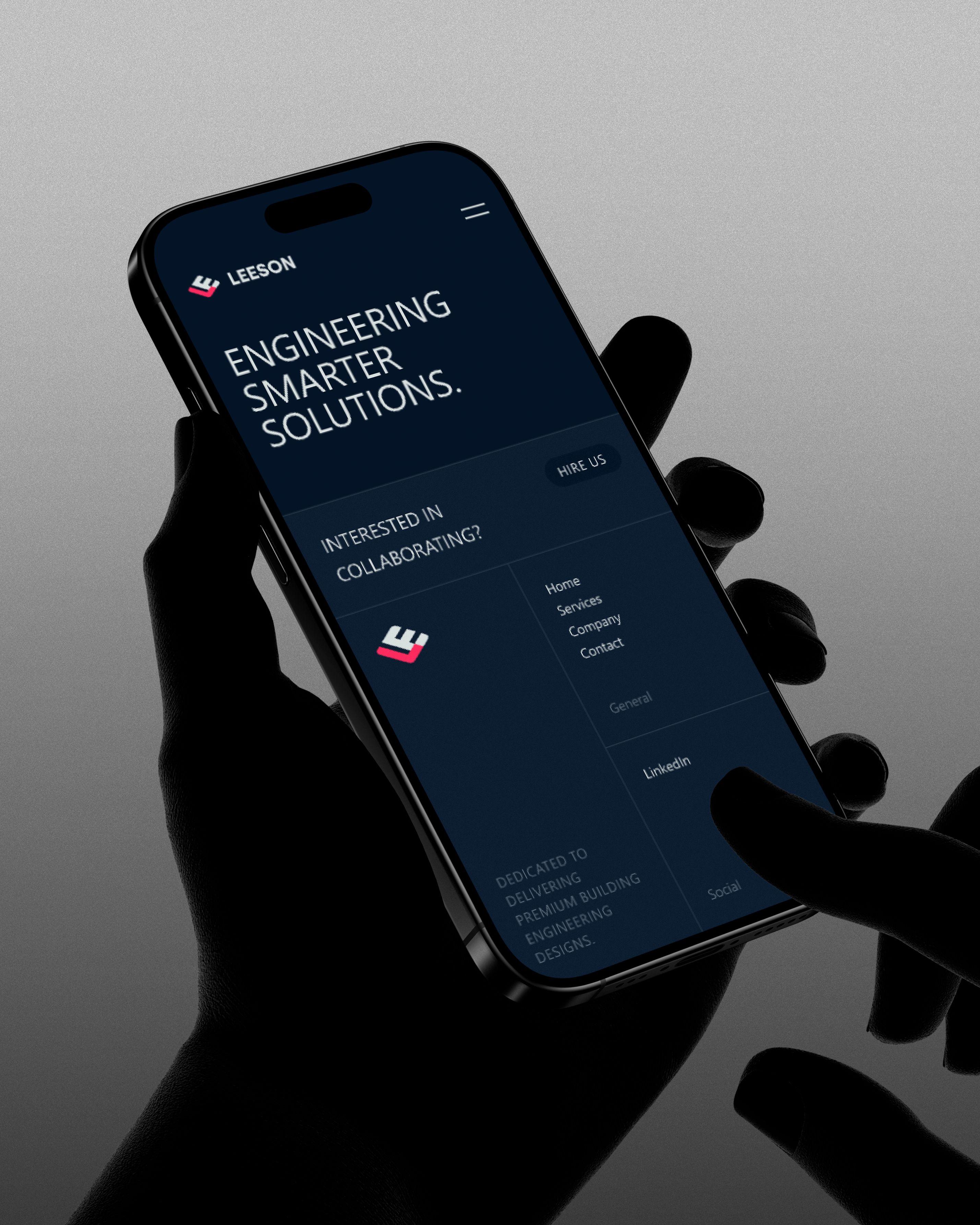
A flat top-level menu can't carry everything, and Leeson's footer picks up where the navigation stops, laying out engineering services, smart-building solutions, and contact links in one consolidated block rather than scattering them across secondary pages.
That division of labor matters. The header menu stays shallow so a first-time visitor never feels lost. The footer goes deeper, giving a visitor who's already engaged a full map of what the firm actually does, without ever needing that depth to show up in the primary navigation.
Why Simplicity Was the Harder Choice
It would have been easier to mirror the firm's actual organizational complexity in the menu structure, sub-services under services, sub-teams under company. Leeson's navigation resists that mirroring on purpose, trusting that five clear paths serve a visitor better than an accurate but overwhelming map of everything the company does.
That's the real argument this navigation makes: information architecture isn't obligated to represent a company's internal complexity. Its job is to get a visitor to the right answer in as few decisions as possible.
If your site's navigation needs to feel simpler than your org chart, let's talk.
FAQ
Flat navigation keeps every page reachable within one or two clicks from the homepage, rather than burying content under nested sub-menus. It reduces the decisions a visitor has to make to find what they need.
Because navigation doesn't have to mirror a company's internal complexity. A simple menu can route visitors quickly while the deeper detail lives inside individual pages or the footer, rather than in the menu structure itself.
To route two different types of visitors, someone with a general question versus someone ready to start a project, at the first click rather than several steps into the site.
The footer can carry the depth the top-level menu intentionally skips, giving an engaged visitor a fuller map of services without overwhelming a first-time visitor with too many choices upfront.
It serves a real purpose: reducing the number of decisions a user has to make before reaching what they actually came for, a principle that applies across industries, from enterprise software to professional services websites.