Engineering Needs a Human Voice: Leeson's Positioning Bet
By Anonymous
Hooman Studio positioned Leeson Engineering around "the human side of engineering," pairing technical credibility with warmth and vision, a bet that only works because the brand's structural rigor, established through the logo and system, earns the right to add that humanity on top.
Most engineering firms position themselves around numbers, specs, and technical capability alone. Leeson Engineering made a different bet, positioning itself as "the human side of engineering," and Hooman Studio had to design a brand that could actually make good on that claim.
The Reframe: Capability Plus Character
The easy version of an engineering firm's positioning is a list of capabilities, structural, smart-building, technical consulting. Leeson's brand asked for something harder: proof that clarity, innovation, and vision sit behind the numbers, not just competence.
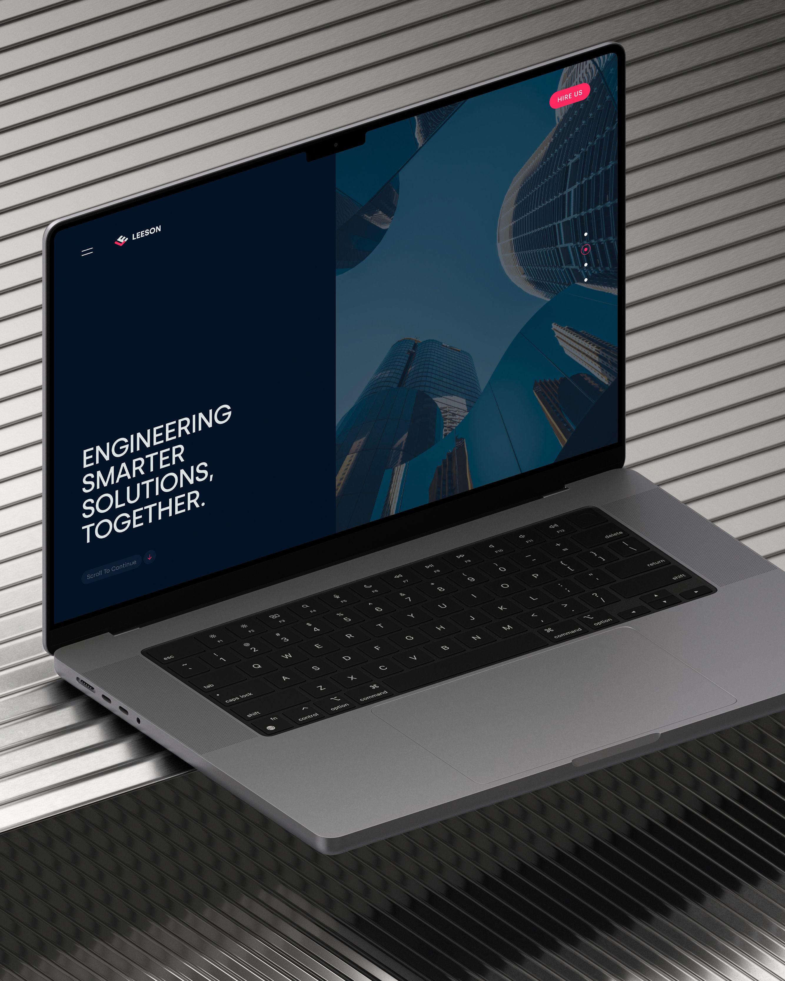
Call this competent humanity: a positioning bet that a firm can lead with warmth and personality without undercutting its technical credibility, so long as the credibility gets established elsewhere in the system. The website hero line, "Engineering Smarter Solutions Together," makes the bet directly, pairing a technical claim, "smarter solutions," with a collaborative, human one, "together," in the same breath.
Why the Structure Had to Come First
This kind of positioning only works if the rest of the brand can back it up. That's why the logo, covered in Built Like a Beam, leads with a rigorously structural, isometric mark rather than a friendly, rounded one. A firm claiming to be human without first proving it's rigorous risks sounding like it's compensating for a lack of technical seriousness.
The order matters. Structure earns the right to add warmth. Warmth without that structural proof underneath it would read as marketing rather than positioning.
The Same Bet, a Different Category
UnitIQ's repositioning reframed a listings platform as a decision engine, changing what the product was understood to be for. Leeson's positioning bet works on the same underlying principle in a completely different category: reframing what an engineering firm is understood to be, from a vendor of technical capability to a partner with actual vision and clarity behind the work.
Both are repositioning bets rather than surface-level rebrands, changing the standard the company gets judged against, not just how it looks while being judged.
Why This Bet Was Worth Making
A firm that only leads with technical capability competes on capability alone, a crowded, commoditized argument in professional services. A firm that can credibly claim both competence and character competes on something harder to copy: an actual point of view about how the work gets done.
That's the real stakes behind "the human side of engineering." It's not a soft addition to a technical brand. It's the argument that lets Leeson compete on something other than price and spec sheets.
If your positioning needs more than a capabilities list to stand on, let's talk.
FAQ
Because competing on technical capability alone is a crowded argument in professional services. Positioning around vision and clarity, alongside competence, gives a firm something harder to copy than a spec sheet.
It can be, if the warmth isn't backed by demonstrated rigor elsewhere in the brand. That's why structural credibility, like a precise logo and design system, typically needs to come first, earning the right to add humanity on top.
Repositioning changes what a company is understood to be for, shifting the standard it's judged against, rather than just changing its visual presentation. Leeson shifted from "vendor of technical capability" to "partner with vision."
Both are repositioning bets rather than surface rebrands. UnitIQ shifted from a listings site to a decision engine. Leeson shifted from a capabilities list to a firm with both competence and character. Same underlying strategy, different categories.
Yes, ideally the visual identity provides proof for the positioning's harder claim. Leeson's structurally rigorous logo supports its technical credibility, making the brand's added claim of "humanity" land as earned rather than aspirational.