Built Like a Beam: Leeson Engineering's Logo Structure
By Mobina
Hooman Studio built Leeson Engineering's logo from isometric gray and white blocks arranged on a construction grid, so the mark reads as engineered rather than drawn, structural credibility built into the logo itself rather than added on top of it.
An engineering firm's logo has one job most other logos don't: it has to look like it was built, not just designed. Leeson Engineering's mark, a stylized "E" built from shaded gray and white isometric blocks, does that literally, constructed the way an actual structure would be.
A Logo That Reads as Engineered
Most brand marks are drawn. This one reads as assembled, a series of shaded blocks arranged in isometric perspective to form the letter, the same visual logic an engineering drawing would use to represent a physical structure.
Call this load-bearing lockup: a logo where the construction method itself is the message. An isometric grid gives the mark actual depth and shading, rather than a flat icon standing in for the idea of building. For a firm whose entire business is structural precision, a logo drawn with the same isometric discipline used in technical drawings isn't a stylistic choice, it's evidence.

The Grid Behind the Letterform
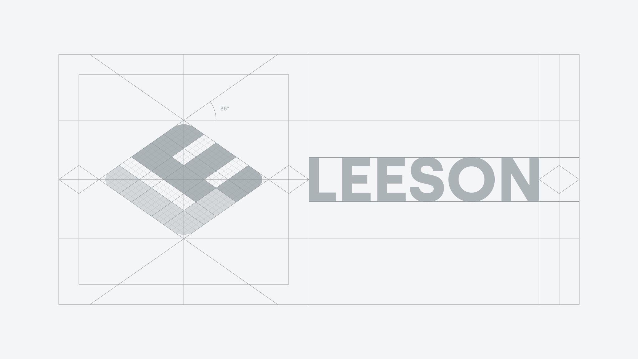
The mark didn't arrive at that isometric block structure by accident. A separate reference sheet lays the full logo out on a grid, geometric shapes and text alignment locked to the same underlying structure the "E" itself is built from.
That's the same discipline MWORK's identity uses in a completely different corner of the construction and engineering world, a grid the logo has to answer to rather than a shape placed by eye. Two different firms, two different visual languages, brutalist neon grid versus isometric gray blocks, but the same underlying belief: a brand for a company that builds things should itself be built, not just illustrated.
Why Gray and White, Not Color
The mark's restraint, gray and white blocks rather than a bold accent color, matters as much as its structure. A logo built from shading and form rather than color reads as material, closer to steel and concrete than to a typical tech wordmark.
That choice sets up everything the rest of the identity has to do. The color system, and the professional warmth the firm actually wanted to project, gets introduced elsewhere, covered in The Rulebook Is the Brand. The logo itself stays monochrome and structural, letting the palette do a different job entirely.
What the Logo Is Actually Proving
A logo built like a beam doesn't ask to be liked any more than an actual beam does. It asks to hold weight, literally in its construction, and figuratively in what it signals about the company behind it.
For a firm positioned around "the human side of engineering," a logo this literal about structure might seem like a contradiction. It isn't. The structure is the credibility. The humanity gets built on top of it.
If your brand needs to look like it was actually engineered, let's talk.
FAQ
Because credibility for an engineering firm comes from precision and structure, not decoration. A logo that reads as assembled, using the same isometric logic as a technical drawing, signals that discipline before a single word of copy is read.
Isometric design represents three-dimensional objects on a flat plane using consistent angles, the technique used in technical and architectural drawings. Applying it to a logo gives the mark actual depth and a sense of physical construction rather than a flat icon.
Restraint in color lets the logo read as material, closer to steel or concrete, and reserves color for other parts of the identity, like the palette covered in the brand guidelines, rather than competing with the logo's structural message.
No, it's a broader discipline used across industries, including MWORK's construction brand identity, where a strict grid governs the logo the same way it does here, even though the visual languages are completely different.
The structure builds credibility first. Humanity and warmth get introduced through other parts of the identity, like typography, color, and messaging, built on top of that structural foundation rather than replacing it.