The Rulebook Is the Brand: Leeson's Guideline System
By Mobina
Hooman Studio built Leeson Engineering's brand guidelines with named colors, Folly, Space Cadet, Anti-flash White, rather than anonymous hex codes, treating the rulebook itself as a brand expression instead of internal-only paperwork.
Most companies treat brand guidelines as internal paperwork, a document nobody outside the design team ever sees. For Leeson Engineering, the guideline system itself is where the brand's actual personality shows up, not just the logo it governs.
A Palette With Names, Not Just Codes
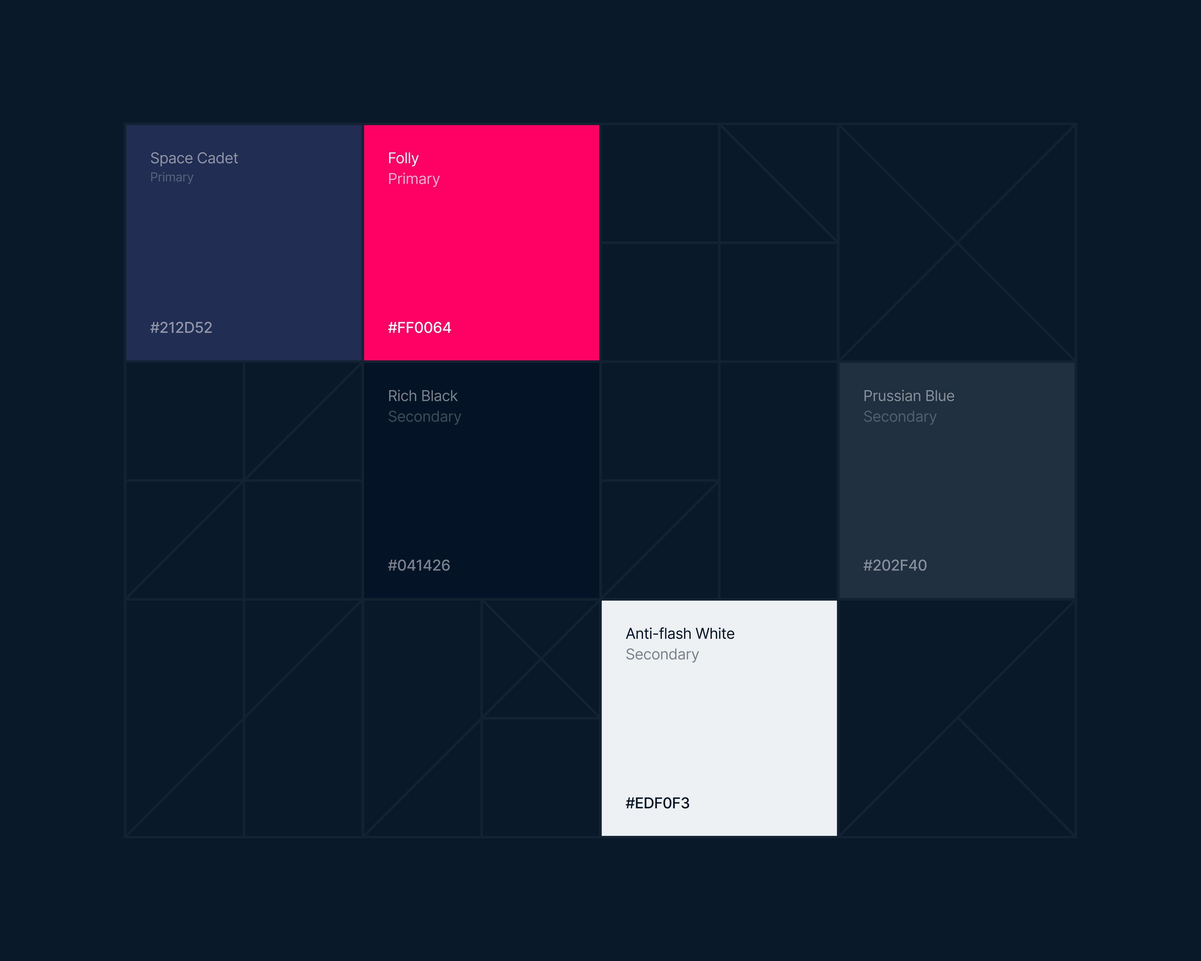
Leeson's brand guidelines name their colors: Folly, Space Cadet, and Anti-flash White, alongside their hex codes. Most brand documents skip the names entirely and just list codes, treating color as a technical spec rather than part of the brand's voice.
Call this operational branding: the idea that a guideline document isn't just a rulebook, it's a brand touchpoint in its own right, one that communicates personality through the language it uses to describe its own components. A named palette, rather than an anonymous list of hex values, signals that even the internal-facing parts of this identity were considered brand expressions, not just production specs.
Why the Guidelines Had to Do More Than Standardize
A typical guideline document exists to prevent mistakes, keeping a logo from being stretched or a color from drifting off-brand. Leeson's guidelines do that job too, but the naming choice suggests a second one: making sure whoever opens the document, designer or not, understands the personality behind the rules, not just the rules themselves.
That's a small decision with an outsized effect. A designer handed "Folly" and "Space Cadet" instead of "#XXXXXX" and "#YYYYYY" is handed a little bit of the brand's actual voice along with its technical constraints.
The Rulebook as Proof of the Logo's Discipline
The same grid-based construction covered in Built Like a Beam shows up here as documented rule, not just executed result. A guideline system exists precisely to prove that a logo's structure wasn't a one-time decision, it's a standard the brand can be held to consistently, across every future application.
That's the deeper argument for treating the rulebook as part of the brand: it's the mechanism that keeps "built like a beam" true five years and a hundred applications later, not just true in the first deliverable.
What a Guideline Document Actually Signals
A company that invests in naming its own colors, not just coding them, is making a quiet claim about how seriously it takes its own identity. For an engineering firm trying to prove it has "the human side" alongside the technical one, that's not a small detail.
The rulebook, in other words, isn't separate from the brand. For Leeson, it's one of the clearest expressions of it.
If your brand's rulebook deserves to say as much as your logo does, let's talk.
FAQ
Brand guidelines are a reference document that standardizes how a logo, color palette, and typography get used, preventing inconsistent or off-brand applications as a company grows and more people touch the brand.
Named colors carry personality in a way anonymous codes don't. A designer working from "Folly" and "Space Cadet" gets a sense of the brand's voice along with the technical specification, not just a number to match.
Not necessarily. Treating a guideline document as a brand touchpoint in its own right, rather than purely internal paperwork, means it can communicate personality to anyone who opens it, not just prevent production mistakes.
Guidelines document and enforce the discipline a logo was built with, proving that structural choices, like a grid-based construction, hold up consistently across every future application, not just the first deliverable.
Yes, arguably more than for consumer brands. A firm selling precision and reliability benefits from a brand system that visibly practices the same discipline internally that it promises to clients externally.