The Bag That Doesn't Look Like Pet Food: Kafka's Packaging
By Mobina
Hooman Studio designed Kafka's Organic's packaging to break pet food category conventions, using bold color blocks and hand-drawn illustration instead of photography, so the bag briefly reads like human food rather than standard pet feed.
Walk down a pet food aisle and the packaging conventions repeat almost identically: a photo of the animal, a nutrition callout, colors chosen to signal "natural" rather than to actually look appetizing. Kafka's Organic's packaging breaks that pattern on purpose.
Designed to Be Mistaken for Human Food, Briefly
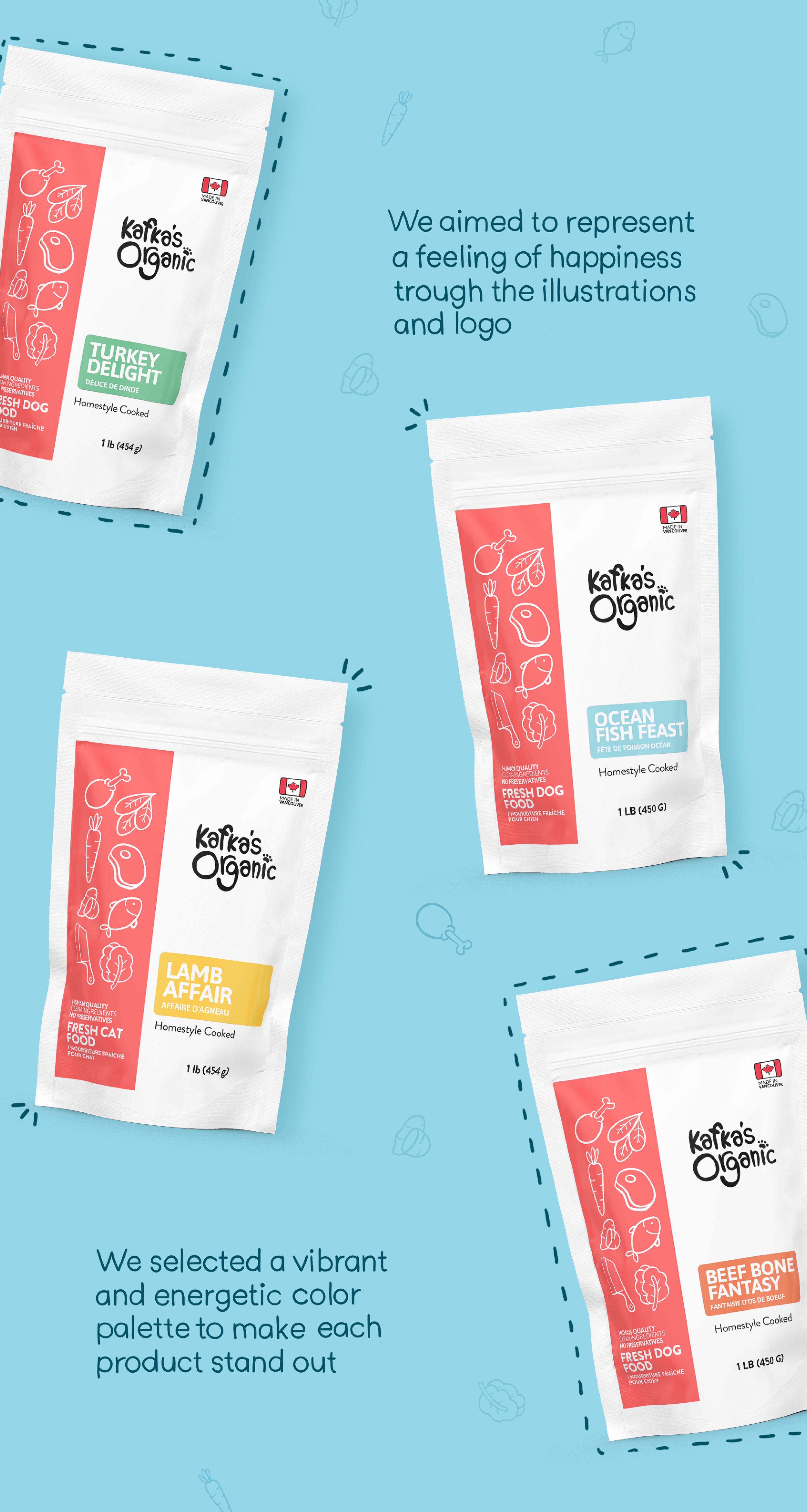
For a second, Kafka's Organic's packaging could pass for something in the human food aisle: flavors named "Turkey Delight" and "Lamb Affair," bold color blocks, and illustration standing in for a photograph of kibble.
That's not an accident of style. It's the packaging doing the exact job the positioning covered in Treat It Like Your Own Dinner demands, making pet food look like something a person would want to eat themselves, not just something adequate for an animal.
Color as Variety, Not Just Decoration
Bold color blocks across the packaging range do double duty: they make each flavor distinct on shelf and they replace the photographic realism most pet food brands rely on to communicate flavor. A block of warm orange for one flavor and a deep green for another lets a full product line read as varied and appetizing without needing a single food photograph anywhere on the packaging.
That's a real design bet, most food packaging leans on photography specifically because color and illustration alone are harder to make appetizing. Kafka's Organic's packaging has to earn that appetite appeal through color and line work instead, a harder problem solved without the usual shortcut.
Illustration Instead of Photography
Hand-drawn illustration across the packaging range does the emotional work photography usually does in food packaging, standing in for warmth rather than realism. It's a deliberate trade: photography can look more literal, but illustration can look more personal, closer to something drawn by a person who cared, rather than shot in a studio for a catalog.
That illustration style carries directly into the smaller collateral covered in A Sticker Is Still a Promise, the same line work showing up at a much smaller scale.
What the Packaging Is Actually Proving
A bag that doesn't look like pet food isn't trying to disguise what's inside it. It's trying to prove that the same care applied to a person's own meal was applied here too, and packaging conventions built around clinical nutrition claims can't make that case on their own.
Color, illustration, and naming all had to work together to pull pet food packaging out of its own category's default look, without losing the credibility a buyer still needs to trust what's actually in the bag.
If your packaging needs to break its category's defaults without losing credibility, let's talk.
FAQ
Most pet food packaging relies on photography of the animal or the product, nutrition callouts, and colors chosen to signal "natural" rather than to look genuinely appetizing.
Because color and illustration can do the emotional work photography usually handles, appetite appeal and warmth, without relying on the literal realism most competitors default to, making the brand feel more personal and distinct.
Bold color blocks distinguish each flavor on shelf and replace the appetite appeal photography would normally provide, letting a full product range read as varied without a single food photo anywhere on the bags.
Illustration can read as more personal and warm than photography, closer to something made with care rather than shot for a catalog, which matters for a brand built around a "treated like family" positioning.
It can, which is why color, illustration, and naming all have to work together carefully, proving genuine quality and care rather than just novelty, so the packaging still earns a buyer's trust in what's inside.