Warmth Over Whitespace: Why Kafka's Organic Skipped Polish
By Mobina
Hooman Studio used whitespace for clarity, not restraint, in Kafka's Organic's identity, pairing it with hand-drawn illustration so the brand could feel premium without defaulting to the sterile, clinical minimalism most upscale brands rely on.
Premium branding usually reaches for the same toolkit: clean whitespace, minimal color, restrained typography, the visual shorthand for "expensive." Kafka's Organic reaches for premium a different way, and it's worth being precise about what actually happened here: whitespace wasn't abandoned, it was put to work alongside warmth instead of standing in for it.
Premium Doesn't Have to Mean Sterile
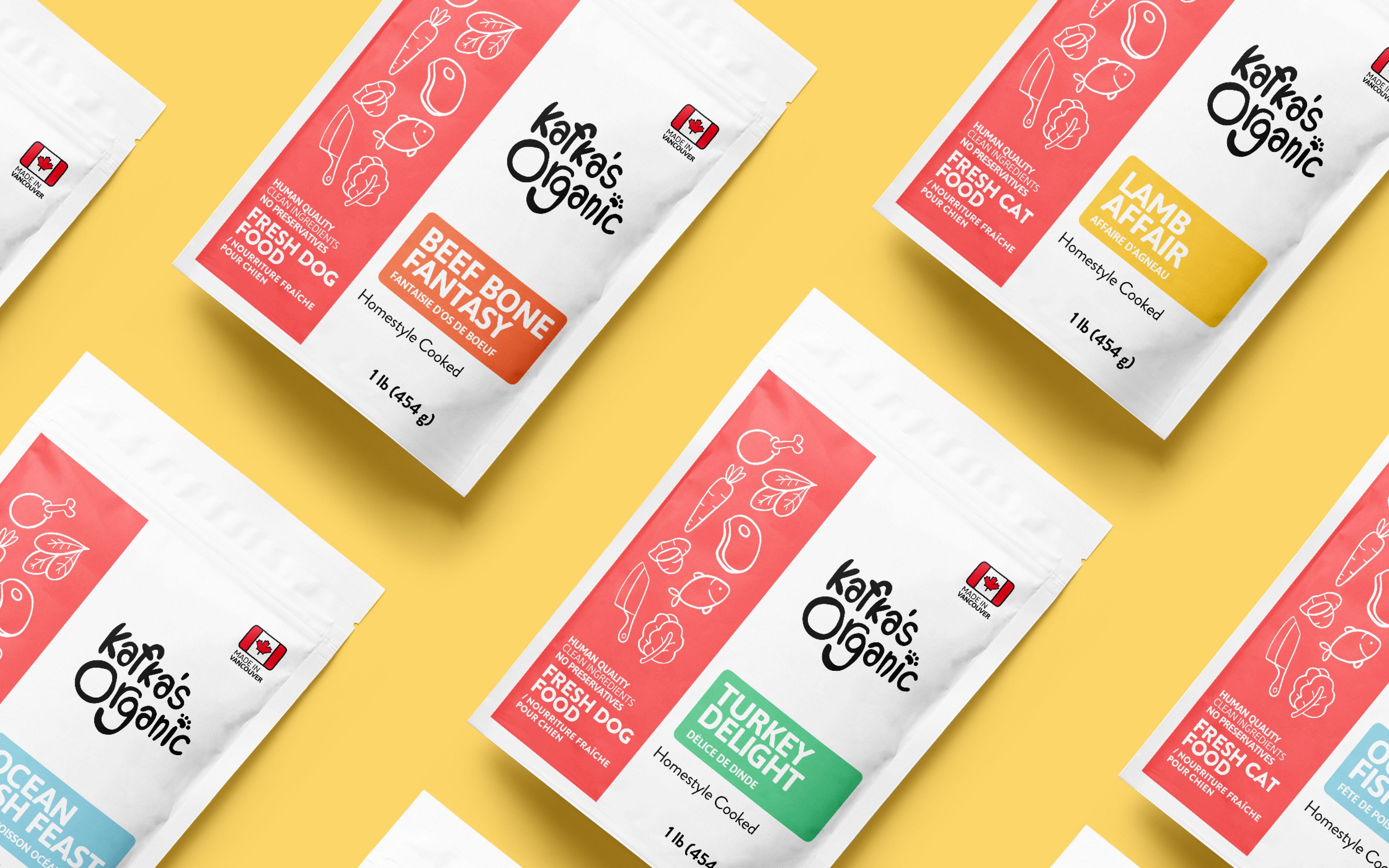
The confirmed brief behind this identity is direct: white space gave the packaging clarity, bold color blocks brought variety without clutter, and hand-drawn illustrations made it personal. All three worked together, not against each other. The real tension this brand resolves isn't warmth-versus-whitespace, it's warmth-versus-sterility, proving a brand can look premium without looking cold.
Call this warm minimalism: using whitespace for what it's actually good at, clarity and breathing room, while refusing to let that same whitespace slide into the sterile, clinical feeling most minimalist branding defaults to. The hand-drawn illustration is what keeps the whitespace from reading as empty rather than intentional.
Why "Perfectly Imperfect" Still Needed Structure
Hand-drawn illustration, by its nature, introduces a kind of imperfection, a slightly uneven line, a human hand behind the mark. Left completely unstructured, that warmth risks reading as unpolished or amateur rather than intentional and premium.

Whitespace is what keeps that from happening. It gives the hand-drawn illustrations room to breathe rather than crowding them against busy backgrounds, letting each illustrated element read as a considered choice rather than clutter. The clarity whitespace provides is what makes the imperfection of the illustration read as "perfectly imperfect," rather than just imperfect.
The Same Instinct in a Completely Different Category
An Elegant Mind's brand identity resolves a related but distinct tension, refusing both clinical coldness and forced softness in mental healthcare branding. Kafka's Organic works the equivalent problem in pet food: refusing both sterile, minimal "premium" branding and cluttered, busy warmth, landing on a version of both that reinforces rather than undercuts the other.
Two industries with nothing else in common, both solving the same underlying design problem: how to be warm without looking careless, and clear without looking cold.
What "Skipping Polish" Actually Means Here
The idea isn't that Kafka's Organic skipped polish altogether, "premium yet approachable" was an explicit goal of the identity. What it skipped was a specific, narrower definition of polish, the glossy, clinical minimalism most premium brands default to, in favor of a version of polish built from warmth, clarity, and care instead.
That distinction matters. This isn't a brand that chose to look less finished. It's a brand that redefined what finished looks like for pet food, built on hand-drawn honesty rather than manufactured gloss.
If your brand needs to feel premium without feeling cold, let's talk.
FAQ
No. Whitespace can support clarity without requiring a brand to feel cold or clinical, especially when paired with warmer elements like hand-drawn illustration, as Kafka's Organic demonstrates.
Minimal design uses restraint deliberately, often to create clarity or focus. Sterile design uses restraint in a way that feels cold or impersonal. The distinction lies in whether warmth is designed in alongside the simplicity or left out entirely.
Because hand-drawn illustration introduces natural imperfection. Without enough breathing room, that imperfection can read as unpolished rather than intentional. Whitespace gives each illustrated element room to be seen as a deliberate choice.
Both resolve a version of the same tension: refusing to choose between warmth and structure. An Elegant Mind avoids clinical coldness and forced softness in healthcare. Kafka's Organic avoids sterile minimalism and cluttered warmth in pet food.
Not necessarily. Whitespace can be used specifically in service of warmth, giving personal, hand-drawn elements clarity and room to stand out, rather than being used to strip a brand of personality altogether.