Treat It Like Your Own Dinner: Kafka's Organic's Big Bet
By Mobina
Hooman Studio positioned Kafka's Organic as a home-cooked meal rather than standard pet food, betting that treating pets like family means their packaging should earn the same trust a person's own dinner would.
Pet food branding has a low ceiling by default: bags built to survive a warehouse shelf, not to look like something you'd actually want to eat. Kafka's Organic started from a different question entirely: if we treat pets like family, why should their food look any different from ours?
The Reframe: From Feed to Meal
Most pet food packaging signals function, nutrition facts, a photo of kibble, a breed on the bag. Kafka's Organic needed to signal something closer to a home-cooked meal, fresh, joyful, made with the same care as something a person would actually cook for themselves.
Call this meal, not feed positioning: a reframe that treats pet food as a category adjacent to human food rather than a separate, lower-tier one. That's a specific bet, not a cosmetic choice, it changes what the packaging has to prove. A feed bag needs to convince a buyer the contents are nutritionally adequate. A meal needs to convince them it's something they'd trust putting in front of their own family.
Why This Bet Runs Against the Category
Most pet food brands don't take this bet, because it's genuinely riskier. Leaning into "home-cooked" language and warmth means the packaging has to work harder to still look credible and premium, rather than hiding behind clinical nutrition-label language the way most competitors do.
It's the same kind of category bet MWORK made in construction, refusing to dress like a firm that plays it safe, just aimed at a completely different audience and shelf.
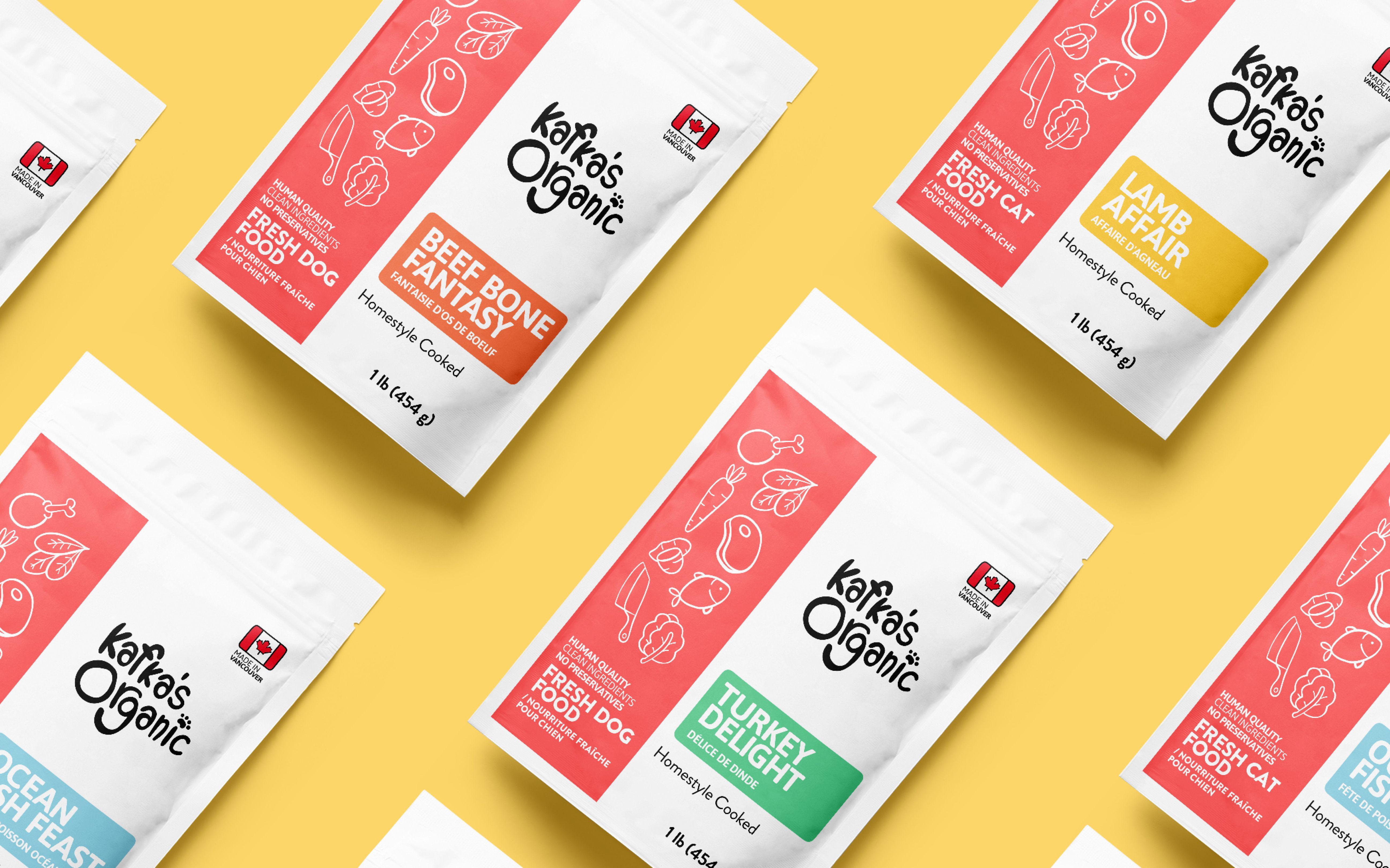
What "Treated Like Family" Actually Requires
A positioning built on this idea can't stop at a tagline. It has to show up in the actual materials: the packaging, covered in The Bag That Doesn't Look Like Pet Food, the illustration and collateral covered in A Sticker Is Still a Promise, and the balance of warmth and clarity covered in Warmth Over Whitespace.
None of those pieces work in isolation. The positioning is the argument the rest of the identity has to keep proving, bag after bag, sticker after sticker.
Why the Bet Was Worth Making
A pet food brand that looks like feed competes on price and shelf visibility alone. A pet food brand that looks like a meal competes on something harder to copy: the emotional case that this is what care actually looks like, not just what nutrition looks like.
That's the real stakes behind treating pet food like your own dinner. It's not a design flourish. It's the argument the entire brand is built to make.
If your product deserves a bigger bet than "looks fine on a shelf," let's talk.
FAQ
Because the category defaults to signaling nutritional adequacy, ingredient lists, breed photography, rather than emotional trust. That approach is safe, but it competes on price and shelf visibility rather than genuine differentiation.
It's a reframe that treats pet food as adjacent to human food, rather than a separate, lower-tier category, changing what the packaging has to prove, from nutritional adequacy to the same trust a home-cooked meal would earn.
Yes, more than staying clinical. Leaning into warmth and "home-cooked" language means the packaging has to work harder to still read as credible and premium, rather than hiding behind standard nutrition-label conventions.
It has to be proven materially, through packaging design, illustration, and small collateral like stickers, not just stated in a tagline. Positioning is the argument every physical touchpoint then has to keep making.
Because a brand that looks like feed competes only on cost and visibility. A brand that looks like care competes on something harder for competitors to copy, the emotional case that this is what treating a pet like family actually looks like.