Not Clinical, Not Cute: An Elegant Mind's Brand
By Mobina
Hooman Studio built An Elegant Mind's identity around an infinity mark and a burgundy, peach, and plum palette, avoiding both cold clinical branding and forced softness, so the brand feels personal from the first glance without feeling fragile.
Not Clinical, Not Cute: An Elegant Mind's Brand
Mental health branding tends to fail in one of two directions. Cold and clinical, or soft to the point of condescending. An Elegant Mind needed neither, and that tension is what Hooman Studio actually designed for.
A mental health clinic's brand has to do something most identities don't: reassure someone who may be having the worst week of their year, without ever talking down to them. Stock photography and borrowed language, the industry default, do the opposite. They signal that the brand wasn't built specifically for this person, at this moment.
Warmth With a Structure Underneath
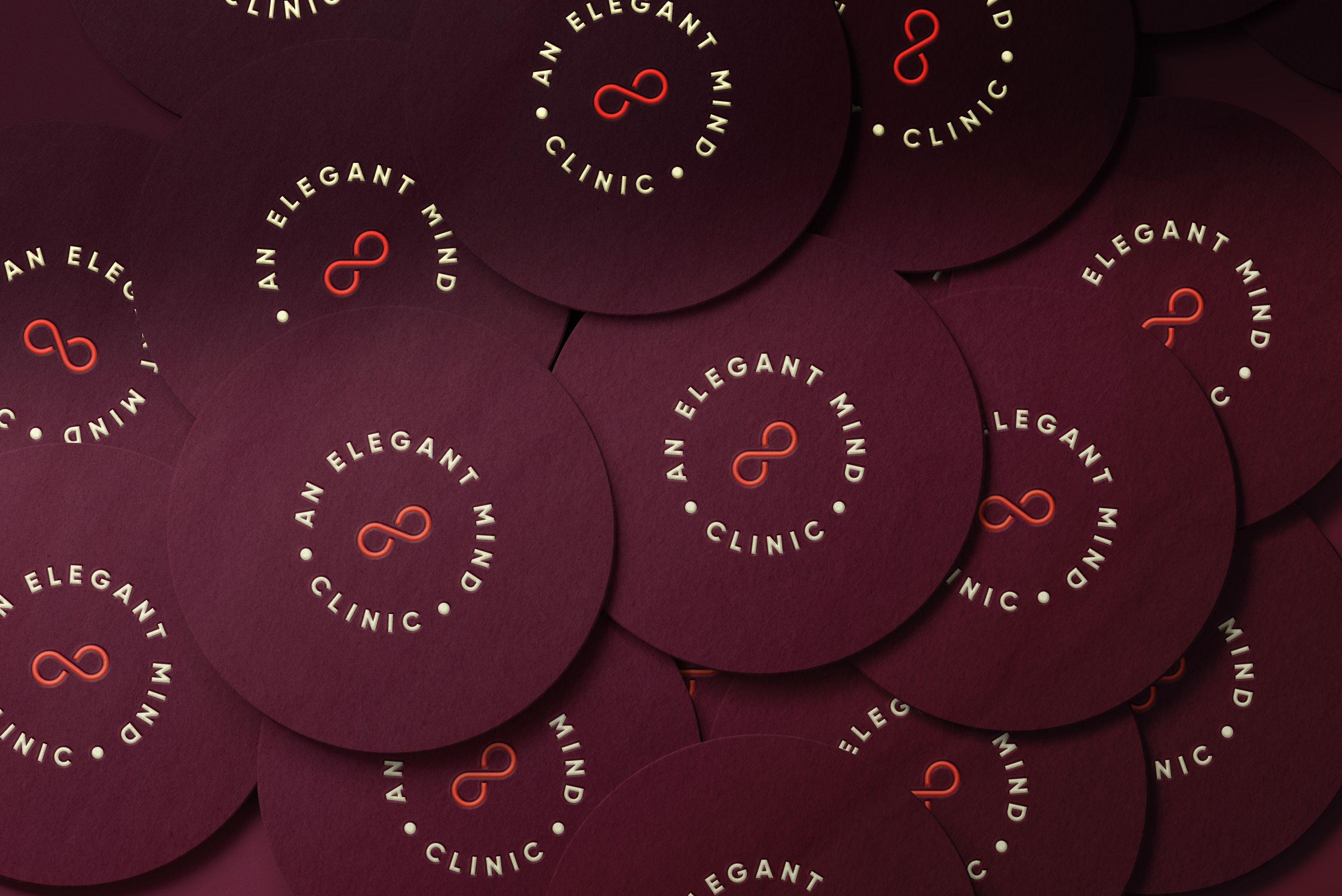
Warmth without structure reads as vague. Structure without warmth reads as a hospital intake form. An Elegant Mind's identity holds both at once, anchored by a single, deliberate symbol: an infinity mark, standing in for a mind without limits, set against a burgundy background rather than the sterile blues or greens most healthcare brands default to.
Call this measured warmth: a brand built to feel personal and calm at the same time, refusing both the cold detachment of clinical design and the saccharine softness that can feel dismissive of real pain. The infinity mark carries the whole idea in one shape, timeless rather than trendy, simple enough to hold weight without needing decoration around it.
Where the Warmth Actually Lives
A logo can promise warmth. Print is where it has to prove it.
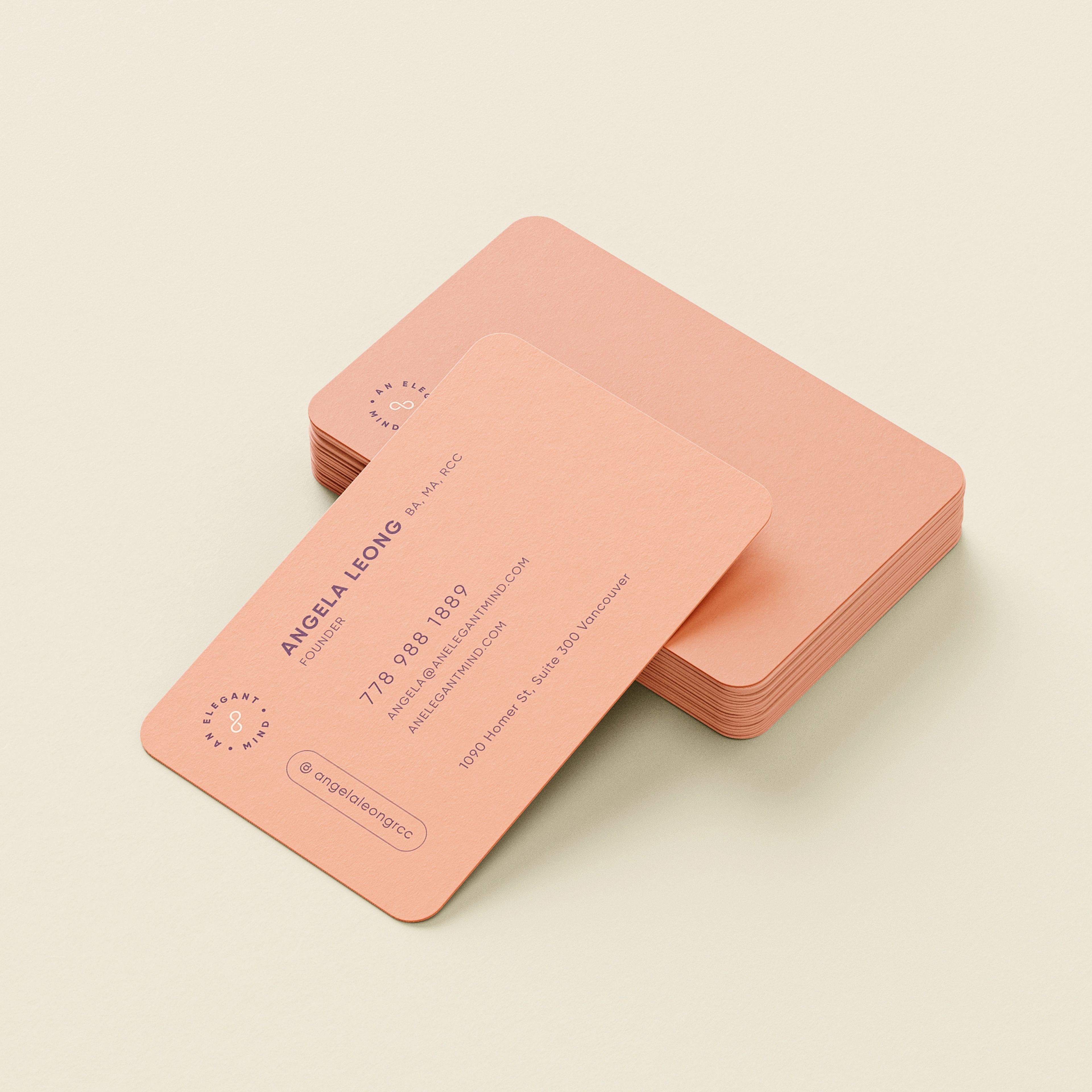
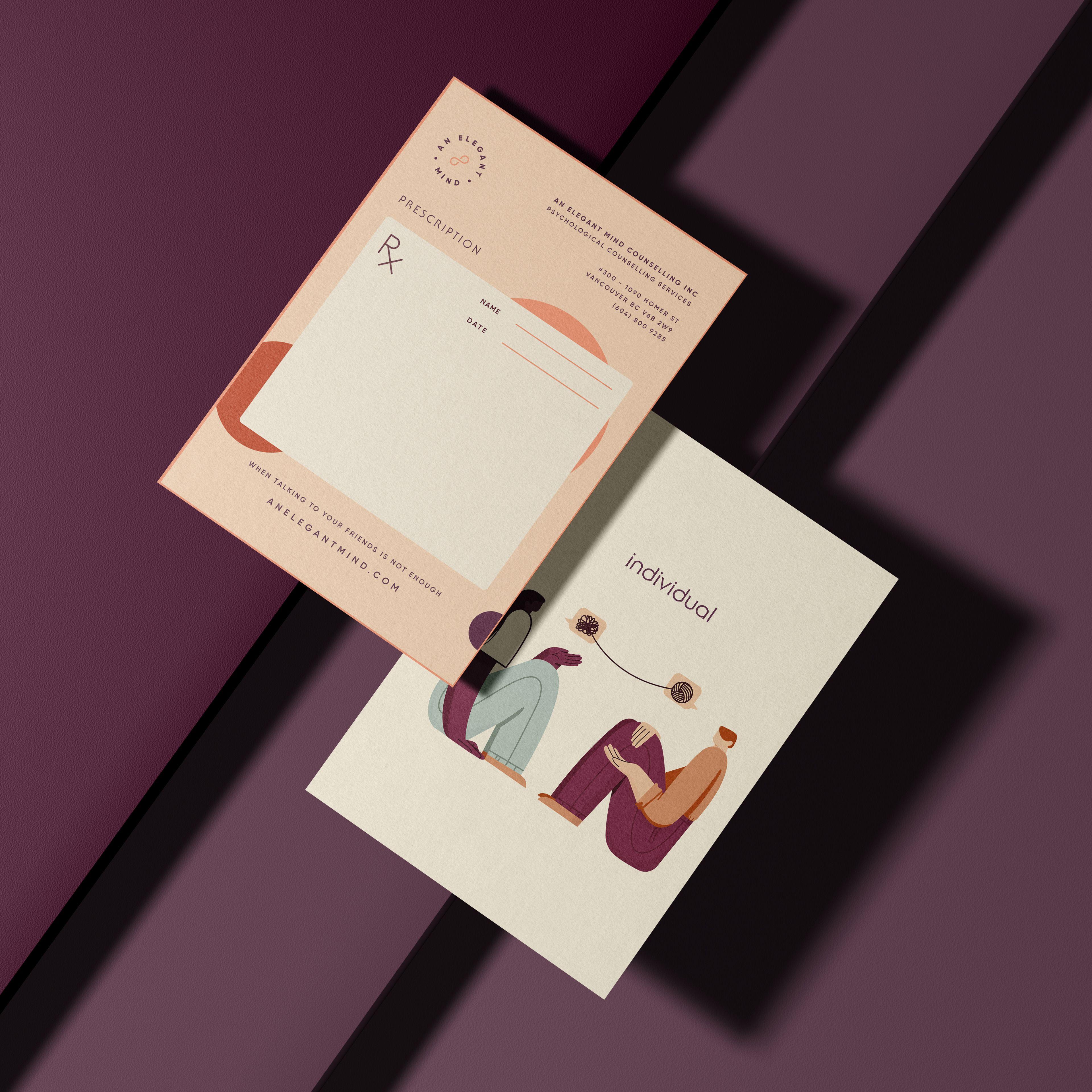
The business cards, in a soft peach rather than clinical white, are one of the places that promise gets tested, since a business card is handed over in person, in a moment where trust is being decided in real time. The same restraint carries into the clinic's stationery, a prescription pad and flyer in peach, cream, and plum tones, print applications built to feel professional without feeling distant. It's the same instinct behind UnitIQ's brand, quiet confidence applied to a completely different category, credibility earned through restraint rather than declared through polish.
Why Healthcare Branding Can't Borrow From Tech
Most healthcare brands either copy hospital signage or copy startup design systems. Neither fits a mental health clinic specifically, where the person on the other end of the brand is often in a vulnerable moment, not evaluating a product feature set.
That's the real difference between this and Pulsia's health-tech branding, a comparable industry with a different emotional register. Pulsia's trust had to read as clinical competence. An Elegant Mind's had to read as personal safety. Same industry, same underlying discipline of restraint, but the brief asked for a different kind of belief entirely.
What the Brand Is Actually Doing
None of this is decoration layered onto a logo. It's the identity doing the actual job a mental health brand has to do: making the first contact with the clinic feel like relief, not another form to fill out.
The infinity mark, the burgundy, the peach print applications, all of it works toward the same outcome. Not memorability for its own sake, but the sense that this brand was built for exactly the person encountering it, at exactly the moment they need it most.
If your brand needs to feel personal without feeling fragile, let's talk.
FAQ
Mental health branding has to reassure someone who may be in a genuinely vulnerable moment, not just signal competence. That means avoiding both clinical coldness and softness that can feel condescending.
Because they default to stock photography, clinical blues, and borrowed language built for no one in particular. That approach fails a mental health clinic specifically, since the person encountering the brand needs to feel it was built for them.
It's a simple, timeless mark that can carry a big idea, in this case, a mind without limits, without relying on decoration or trend-driven design choices to make its point.
Pulsia's identity needed to read as clinical competence in health-tech. An Elegant Mind's needed to read as personal safety in mental health. Same discipline of restraint, different emotional register entirely.
Yes, especially somewhere trust is decided face to face, like a business card handed over in person. Print is often where a brand's promised warmth actually gets tested.