Built to Be Believed: UnitIQ's Trust-First Brand
By Mobina
Hooman Studio built UnitIQ's brand around "quiet confidence," rejecting both playful startup energy and cold enterprise minimalism so the identity earns trust before attention. The same brand had to hold up across social posts, emails, the website, and the web app, showing up fully in some and stepping back completely the instant a cash flow number appears in others.
A listings app can afford to be charming. A financial tool cannot. When UnitIQ brought that brief to Hooman Studio, the brand had to earn belief before it earned attention.
Real estate investment is a category full of confident claims and thin proof, everyone promising returns, few showing the math. Walking into that space with a playful, decorative identity would have undercut the product before a user opened it. Hooman built UnitIQ a brand that looked like it belonged next to a mortgage statement, not next to a listing photo.
Quiet Confidence as a Design Principle
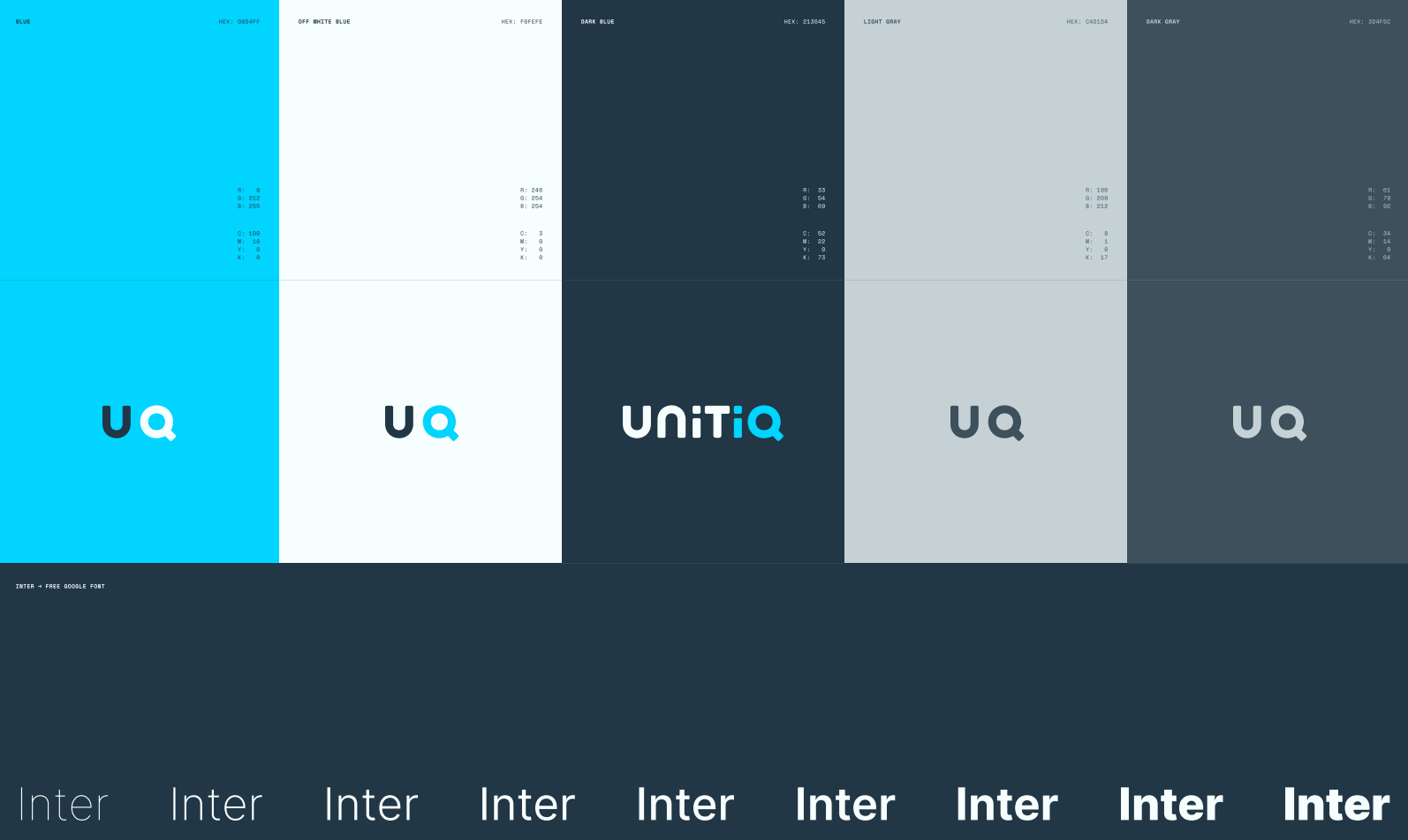
Fintech design often traps itself in a false choice: either lean into playful, distracting startup tropes or pivot to cold, lifeless enterprise templates. For UnitIQ, Hooman steered clear of both. We recognized that a financial tool requires more than just clinical restraint; it requires an inherent sense of capability that doesn't alienate the user.
We built this foundation on "quiet confidence." This design philosophy rejects the extremes of high-energy branding and sterile minimalism, opting instead for a state of calm competence. Typography is prioritized for absolute clarity, while the color palette remains intentionally subdued, ensuring that data, not the interface, takes center stage. Our goal wasn't to entertain the user, but to earn their immediate trust, mirroring the rigorous "Anatomy of Trust" framework we successfully deployed for Pulsia, now tailored to the high-stakes world of real estate investment.
One Identity, Many Rooms
A logo only has to hold up in one place. A brand system covering social templates, email templates, the website, and the web app has to hold up in a dozen, each with a different job to do, and Hooman was responsible for all of them.
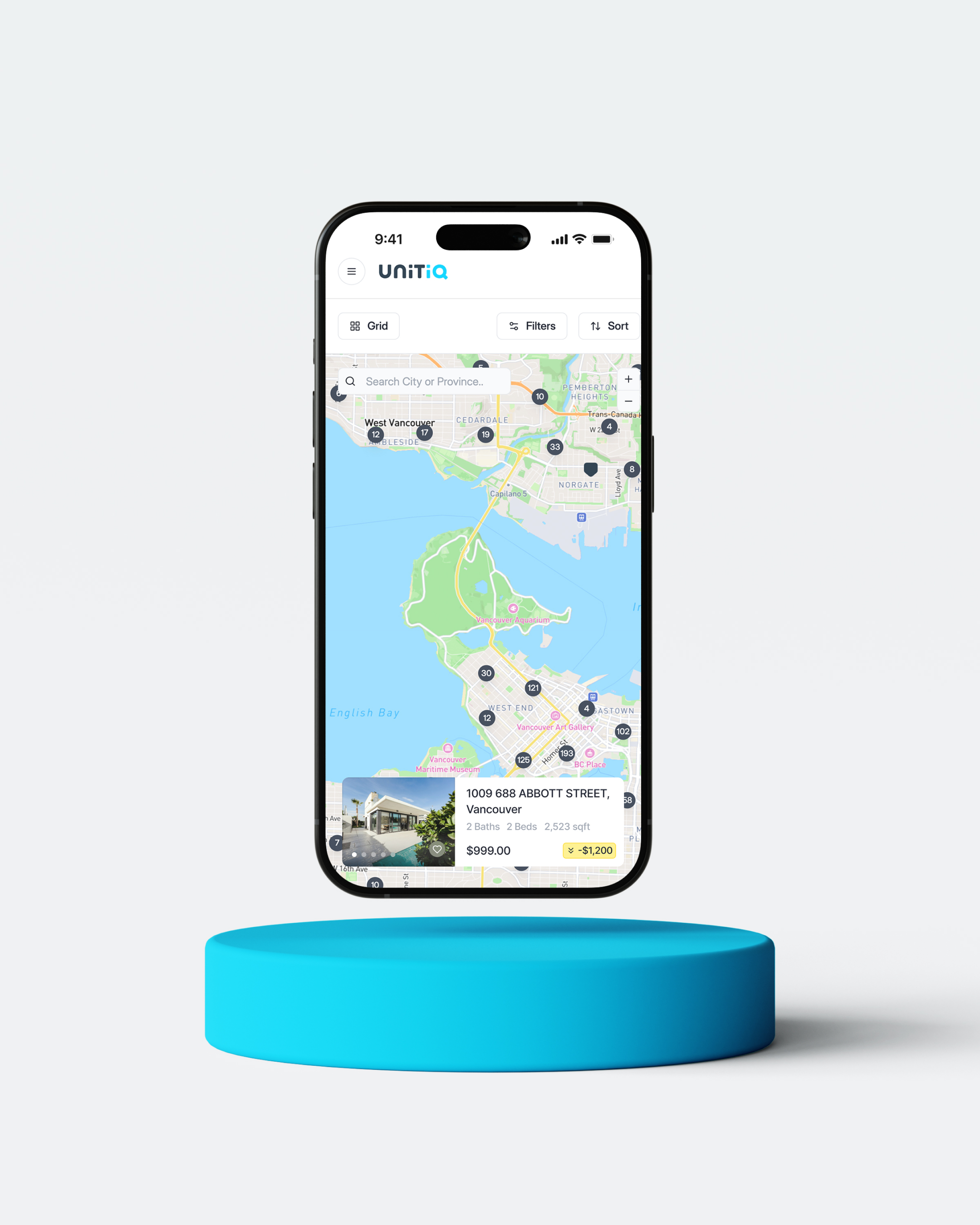
That range was part of the brief here, not an afterthought. A social template announcing a new market has to carry personality and stop a scroll. An email confirming a saved property has to feel calm and transactional, closer to a bank statement than a marketing push. The web app itself has to stay out of the way of live numbers. Quiet confidence only works as a principle if it can flex across all of those rooms without becoming a different brand in each one, which is exactly what Hooman built it to do. The version of the logo on a social post and the version sitting quietly behind a cash flow figure have to be recognizably the same company, even though the two contexts are asking almost opposite things of it: one wants attention, the other wants to disappear. The logo's own animated version, covered in The Half-Second That Matters, is where that tension is most visible.
What Trust Actually Looks Like Here
Trust in a listings app looks like nice photography. Trust in an investment tool looks like nothing getting in the way of the numbers.
That's a harder brief than it sounds, because a brand identity's natural instinct is to take up space, to make sure the logo, the color, and the type are all felt. Hooman had to make UnitIQ's brand do the opposite in the moments that mattered most: step back the instant a cash flow figure appeared, and let the data carry the emotional weight instead of the visual system. The identity is confident enough to disappear when the number needs the room, and confident enough to show up fully everywhere else it's asked to.
Speed as a Brand Attribute, Not Just a UX One
A realtor pulling up UnitIQ mid-conversation isn’t looking for a 'brand experience'; they’re looking for authority. We had to compress that promise of credibility into the sub-second gap before the data populates. The product doesn't just need to be trustworthy; it needs to feel like the absolute truth the moment the pixels hit the screen.
This is the ultimate test of high-stakes design: abandoning the pursuit of 'memorable' aesthetics to achieve something far rarer: instant, unwavering credibility. A financial tool doesn't need to win a popularity contest. It needs to command authority the moment it appears, regardless of the device, the context, or the client staring over the user’s shoulder.
Ready to stop chasing attention and start engineering conviction? Let’s build your foundation together.
FAQ
Quiet confidence is a design principle that avoids two common extremes: playful, attention-seeking branding and cold, sterile minimalism. Instead, it aims for calm competence, clear typography, and a controlled palette that let the product's substance do the work instead of the visual identity.
Because trust works differently in each category. A listings or lifestyle app earns trust through good photography and personality. A financial tool earns trust by getting out of the way of its own numbers, since anything that competes with the data for attention undermines the thing the user actually came for.
By treating "consistent" as recognizable, not identical. Each format has a different job: a social post needs to stop a scroll, a transactional email needs to feel calm, and a web app needs to disappear behind live data. The brand has to flex without becoming a different company in each context.
A realtor pulling up a tool mid-conversation with a client can't wait for a "brand experience." The identity has to signal credibility in the fraction of a second before the actual numbers even load, making speed itself a trust signal, not just a performance metric.