Why the Logo Moves: An Elegant Mind's Quiet Motion
By Mobina
Hooman Studio animated An Elegant Mind's infinity mark logo to reassure, not impress, giving the brand a small sense of calm at the exact moment someone anxious about seeking help first arrives on the site.
Most brand animations exist to look impressive in a reel. An Elegant Mind's spinning logo animation has a smaller, more specific job: reassurance, delivered in a few seconds, for someone who might be nervous about clicking through to a mental health clinic's site in the first place.
Motion as a First Impression, Not a Flourish
A static logo makes a claim. A moving one makes a first impression, and for a mental health brand, that first impression happens at a moment when someone may already be anxious.
The infinity mark's spinning animation isn't there to show off technical polish. It's there to soften the moment of arrival, giving the brand a small sense of life and calm before a single word of copy has loaded. Call this motion as reassurance: animation whose entire purpose is to lower the emotional temperature of a first visit, not to demonstrate craft for its own sake.
Why the Symbol Itself Made This Possible
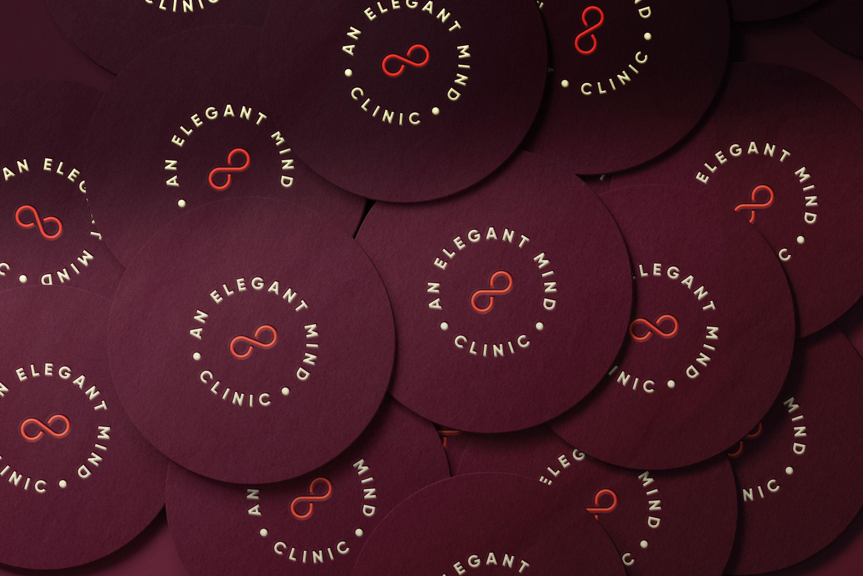
Not every logo can carry motion well. A wordmark spinning risks looking like a loading spinner or a gimmick. An infinity mark, by contrast, already implies continuity and motion conceptually, spinning it is less an added effect and more the symbol completing its own idea.
That's the advantage of the brand's core decision covered in Not Clinical, Not Cute: choosing a single, simple symbol instead of a more literal wordmark meant motion had somewhere natural to go. A logo built for stillness would have needed an artificial reason to move. This one already had one built in.
The Same Instinct, a Different Category
UnitIQ's logo animation exists to establish quiet confidence before a financial number ever loads, motion as a trust signal in a high-stakes financial moment. An Elegant Mind's spinning mark is doing the same fundamental job, motion earning trust before any content appears, just translated into an emotional register instead of a financial one.
Both examples share the same underlying rule: motion that exists to do a specific job for the person encountering it, not motion added because the brand had budget left over for it.
Why Restraint Still Applies
The temptation with any brand animation is to add more of it: transitions everywhere, motion on every hover state. An Elegant Mind's system resists that. The spinning logo is essentially the one piece of pure brand motion in the identity, everything else, the illustrations, the print materials, stays still.
That restraint is what keeps the animation meaningful instead of decorative. One moment of motion, used at the one moment it matters most, arrival, says more than motion scattered across every element would.
If your brand's first impression needs to feel calmer, not louder, let's talk.
FAQ
Because the first few seconds of a visit matter more in healthcare than almost anywhere else. A small, calm motion can lower the emotional temperature of arrival before any text or imagery loads.
A symbol that already implies motion or continuity conceptually, rather than a static wordmark. An infinity mark spinning completes its own idea instead of needing an artificial reason to move.
Not when it's done well. The best brand motion has a specific emotional or functional job, like reassurance or trust, rather than existing purely to demonstrate technical polish.
Both use motion for the same underlying reason: to establish trust before any real content or data appears. One does it for a financial tool, the other for a mental health brand, same principle, different emotional stakes.
Not necessarily. An Elegant Mind keeps motion to essentially one moment, the logo at arrival, which keeps it meaningful rather than turning into decoration spread across the whole experience.