The Illustration That Doesn't Flinch: An Elegant Mind's Style
By Mobina
Hooman Studio built one illustration system for An Elegant Mind that covers sex therapy, anxiety, ketamine treatment, and mindfulness with the same soft, consistent visual language, so no subject the clinic treats looks more clinical or more "other" than any other.
Most healthcare illustration plays it safe: generic figures, generic gestures, nothing that could make anyone uncomfortable. An Elegant Mind's illustration system doesn't have that luxury. A clinic covering sex therapy, anxiety, and ketamine treatment in the same practice needs art that can sit with all of it, in the same visual language, without flinching at any of it.

One Style, Every Subject
The easy version of this problem is inconsistency: soft, dreamy illustration for the approachable topics, and something clinical or absent for the harder ones. Hooman Studio built one illustrated language instead, covering emotional support, anxiety, ketamine therapy, and sex therapy with the same visual approach.
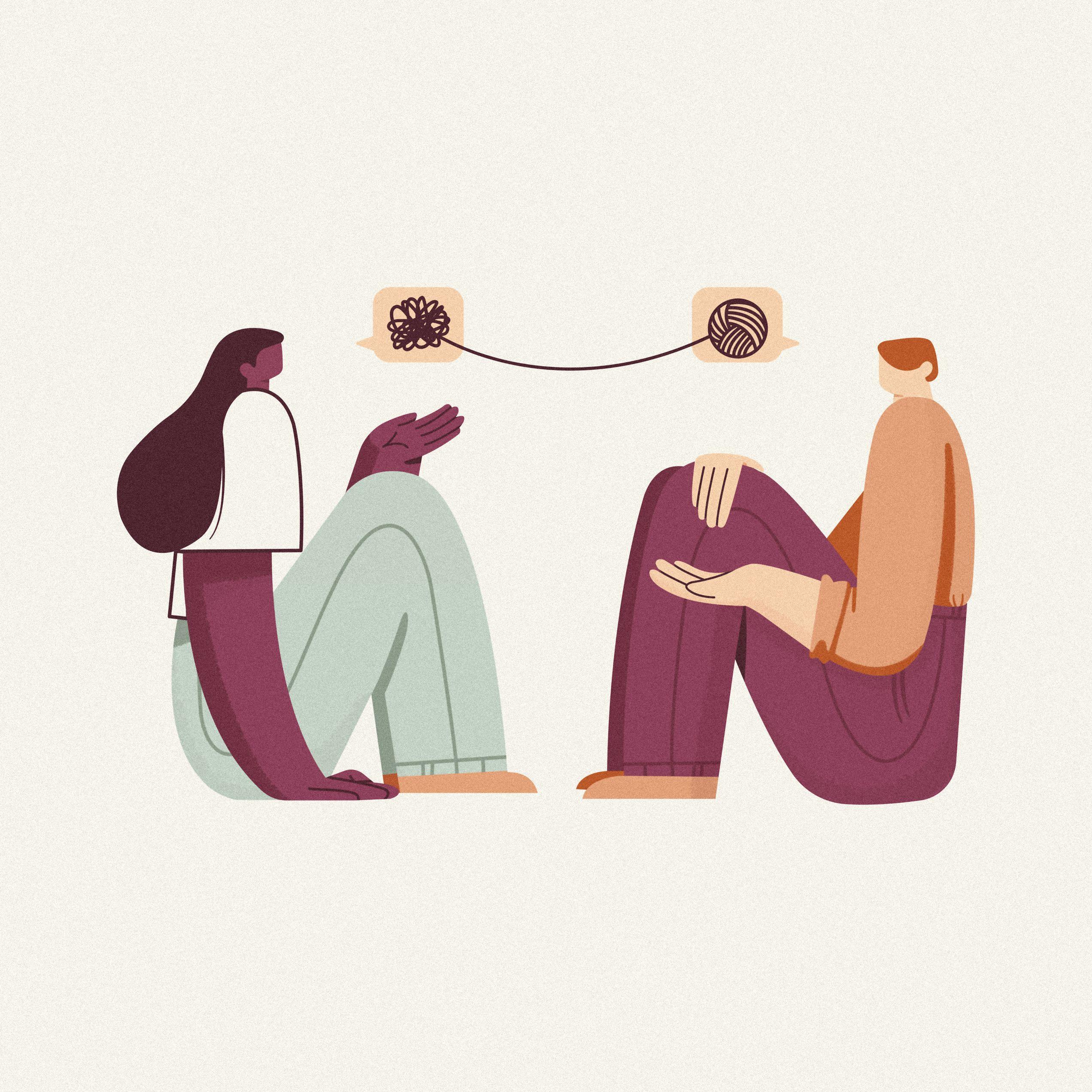
Call this illustrated candor: a system built to represent genuinely difficult subjects without either sanitizing them into abstraction or over-dramatizing them into discomfort. A conceptual illustration for sex therapy and emotional healing uses the same soft, rounded figure style as an illustration for anxiety counseling, two people connected by a single thread standing in for the whole idea of emotional support. Neither subject gets treated as more sensitive than the other in how it's drawn, only in what it's drawn.
Consistency Across an Emotional Range
A ketamine therapy illustration, a person in an online counseling video call, and a sunset-and-clouds piece for mindfulness sit at wildly different points on an emotional spectrum. All three use the same soft color register and the same rounded, gentle figure work.
That range is the actual test of the system. It would be easy to let the harder topics look heavier and the lighter topics look breezier, but that inconsistency would undercut the whole premise, that no subject the clinic treats is visually "other." A cosmic, imaginative illustration sits in the same family as a straightforward illustration of remote counseling, proving the style can flex across tone without fracturing into different visual languages for different comfort levels.

Illustration as Inclusion, Not Just Decoration
An inclusive illustration of diverse figures in an embrace does more work in this system than a stock photo of "diverse people smiling" ever could, because it was drawn specifically for this brand's actual patient base, not licensed generically and dropped in.
That's the deeper argument the illustration system makes: representation here isn't a box to check, it's baked into the same warm, consistent line work that covers every other topic the clinic treats. A card set gathering several of these illustrations together in earthy plum tones reads less like a mood board and more like a single, coherent visual world the clinic's patients can recognize across every touchpoint.

Why This Couldn't Be Generic
A generic illustration library would have solved the "we need pictures" problem without solving the actual one: making genuinely difficult healthcare topics feel human rather than clinical or embarrassing. That's the job custom illustration does here that stock imagery structurally can't.
The same illustrations carry directly into how the clinic's website UI handles sensitive content, where discretion matters as much as warmth.
If your brand needs illustration that can hold difficult subjects without flinching, let's talk.
FAQ
Because it's built to avoid discomfort rather than represent real subjects specifically. Generic figures and gestures play it safe, but that safety often comes at the cost of actually feeling relevant to the person looking at it.
By using the same warm, consistent visual style used everywhere else in the brand, rather than treating harder subjects differently. Consistency signals that no topic is being singled out as more sensitive to look at than another.
It's a cohesive set of illustrations built specifically for a brand's actual subject matter and patient base, rather than licensed generic stock art. For a mental health clinic, that means illustrations that represent its actual range of services honestly.
Not necessarily. An Elegant Mind's illustrations use the same soft color register and figure style whether the subject is mindfulness or ketamine therapy, which keeps the whole system feeling like one coherent world rather than several disconnected ones.
Custom illustration can represent a clinic's actual patient base directly, rather than relying on generic stock photography, making inclusion part of the brand's visual language instead of an afterthought.