MWORK's Boldest Move: Paper, Not Neon
By Mobina
Hooman Studio grounded MWORK's neon-and-grid identity in something physical: heavy, uncoated brown paper stock. Where the color earns attention and the grid earns discipline, the material earns belief, giving the brand something the eye can't fake and the hand can actually feel.
Everyone notices the green first. That's by design. But the part of the identity doing the harder work is the part nobody photographs.
A brand built entirely on neon and grid precision, the logic behind The Grid Is the Point, risks reading as an effect rather than a company. Structure proves discipline. Color proves confidence, the argument made in MWORK's One-Color Rule. Neither one proves that the thing behind the logo is real, permanent, built to last past a single job. When MWORK came to Hooman Studio, the team knew the identity needed all three, and the third one came from paper, not pixels.
Why the Loudest Brand Also Needed the Heaviest
A brand that only shouts eventually sounds like noise. Hooman made sure MWORK's didn't, by building something into the system that holds still.
Heavy brown paper stock and raw, uncoated textures show up across the print applications, sitting opposite the neon rather than softening it. That's a specific choice the studio made against a specific risk. Neon on glossy white stock reads as a startup. Neon on heavy, uncoated brown stock reads as something that's already been poured, framed, and inspected. The paper isn't there to calm the color down. It's there to give the color something solid to stand on.
We call this material honesty: the idea, central to Hooman's thinking on this project, that a construction brand's physical materials should carry the same evidence of substance as the buildings the company actually produces. A logo can claim precision. Paper stock either has weight in your hand or it doesn't. There's no faking that part. It's worth noting Hooman's own internal brief for this piece of the identity distilled the whole idea down to three words: texture, contrast, presence.
Earth Against Neon, on Purpose
Put a construction firm's brand next to actual construction materials and most identities fall apart immediately. Hooman built MWORK's to survive that comparison.
The resulting pairing runs on contrast held in tension rather than resolved: neon and earth, modern grid and raw texture, industrial grit and design discipline. Neither side wins. The brown paper stock keeps the neon from floating off into pure graphic effect. The neon keeps the brown paper from reading as safe or expected. Each material is doing a job the other one can't do alone.
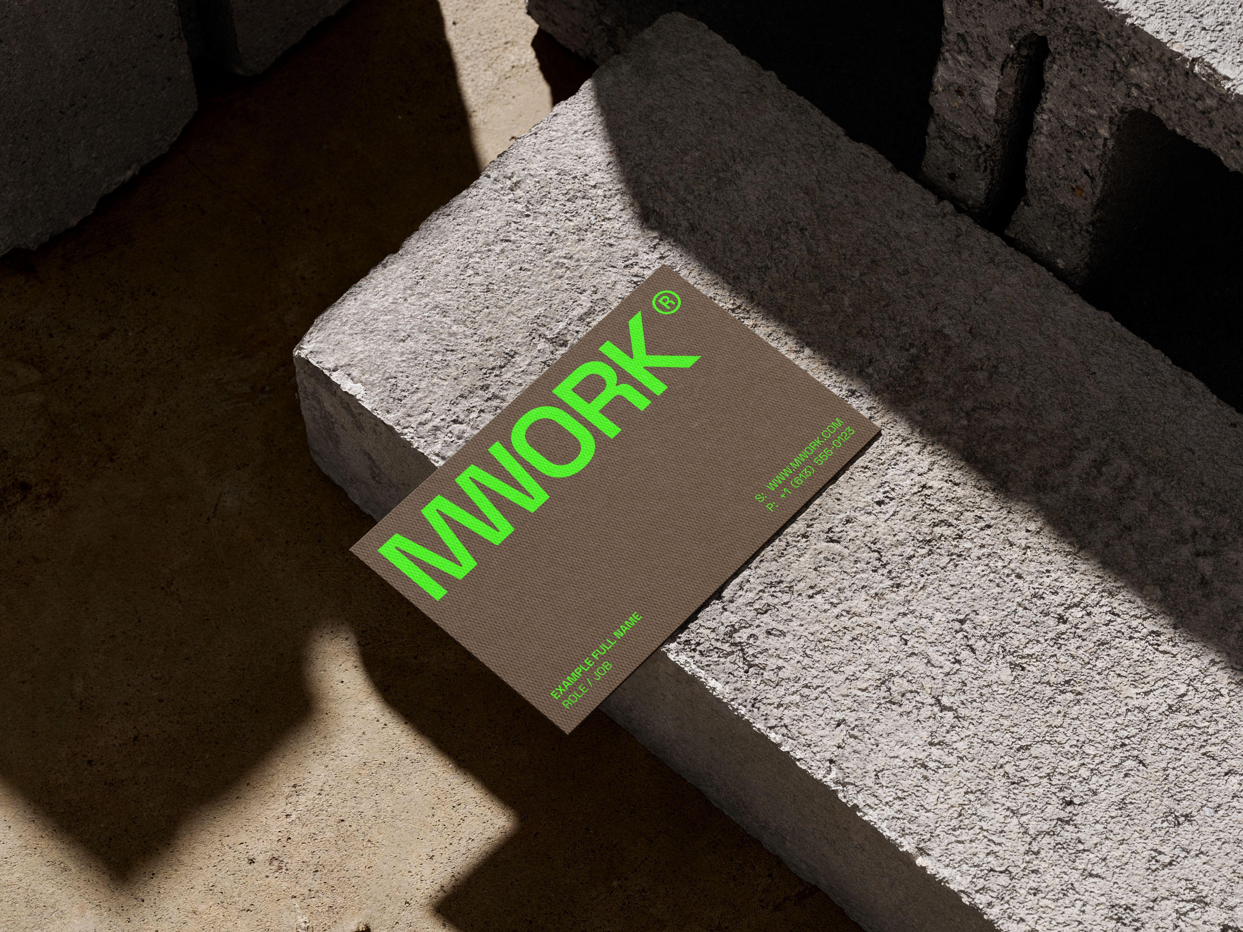
This is different from the color story, where the neon had to survive daylight and foot traffic on an active site. Here the question isn't visibility; It's credibility. A business card is a small, close-up object, handed over in a room, felt before it's read. The stock weight and texture are answering a question the neon can't: does this company build things that last? It's a question Hooman explores from the opposite direction when the material in question is a screen instead of a card, but the underlying logic doesn't change: perceived weight is rarely accidental.
What a Business Card Is Actually Proving
Print applications carry more evidence than people expect from a piece of paper the size of a hand.
The MWORK card is built on that same heavy brown stock, with a texture closer to raw board than coated stock. That physical weight is doing brand work before a single word gets read. A client meeting a design-build firm for the first time is quietly asking whether this company overpromises. A card that feels substantial, deliberately specified by Hooman down to the stock choice, answers part of that question before the pitch even starts.
None of this shows up if you only look at the identity on a screen. It only shows up in the hand, which is exactly where a construction client is most likely to first encounter the brand: across a table, not across a browser tab.
Grit as the Missing Ingredient
Boldness alone reads as a statement. Boldness plus weight reads as a company that's actually built something before.
MWORK's paper choice isn't decoration layered on top of the grid and the neon. It's the third leg Hooman Studio gave the identity to stand on its own. Structure earns trust through precision. Color earns attention through restraint. Material earns belief through weight you can actually feel. Take any one of the three away, and the brand stops being proof and goes back to being a claim.
If your brand's physical touchpoints aren't pulling their weight, let's talk.
FAQ
Paper stock is one of the few parts of an identity a person can feel before they read a single word. Weight and texture communicate substance in a way a screen can't, which makes stock choice a credibility signal, not just a production detail.
Color earns attention. Material earns belief. A bold color gets noticed instantly, but it can't answer whether a company is substantial or built to last, that's a job physical texture and weight do instead.
It's the idea that a brand's physical materials should carry the same evidence of substance as whatever the company actually produces. For a construction firm, that means the business card can't just claim precision, it has to have real weight in the hand.