Why Responsive Website Design Services Are a Must for eCommerce Brands?
By Yekta

Your Website Called. It Wants to Be Responsive Now.
What a high-demand site you’ve got, right? Doesn’t it see how much work you’ve already piled on? But hey—this one really needs your attention.
Think of this as your site’s friendly nudge. It’s craving layouts that flex, images that adapt, and buttons that land right where thumbs expect them. Ready to give your store the glow-up it deserves? Dive in, and let’s make your eCommerce brand shine on every screen.
Understanding Responsive Web Design
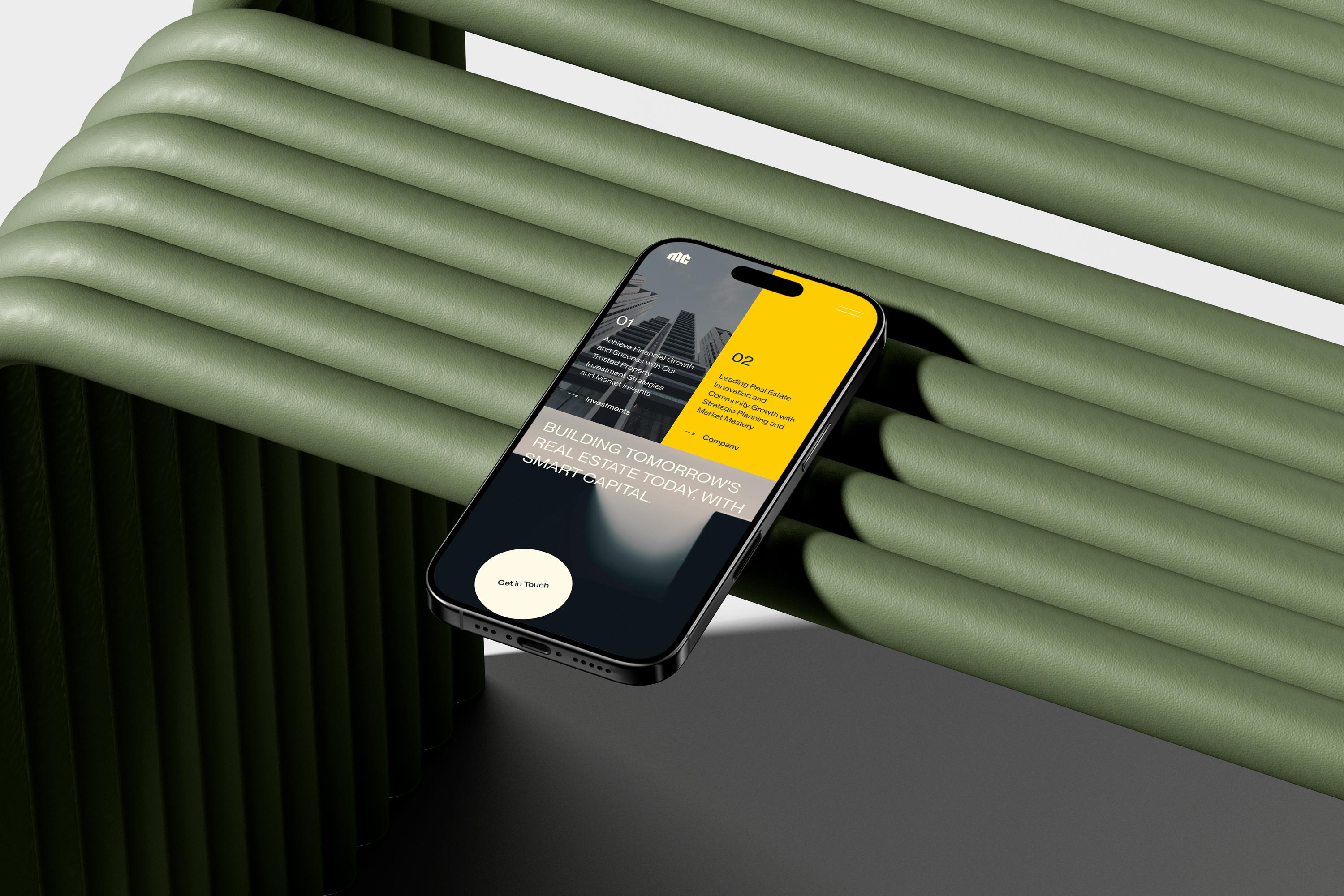
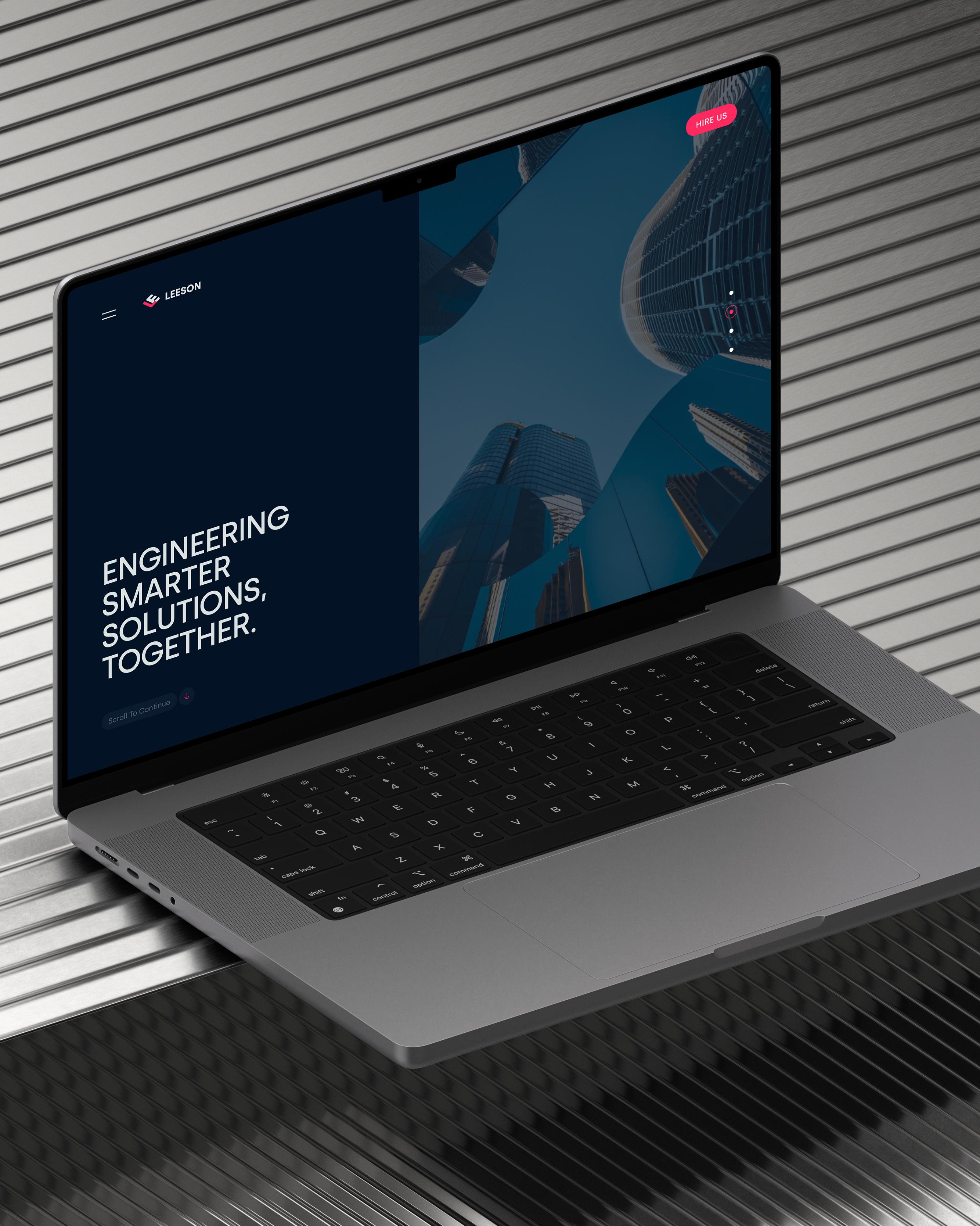
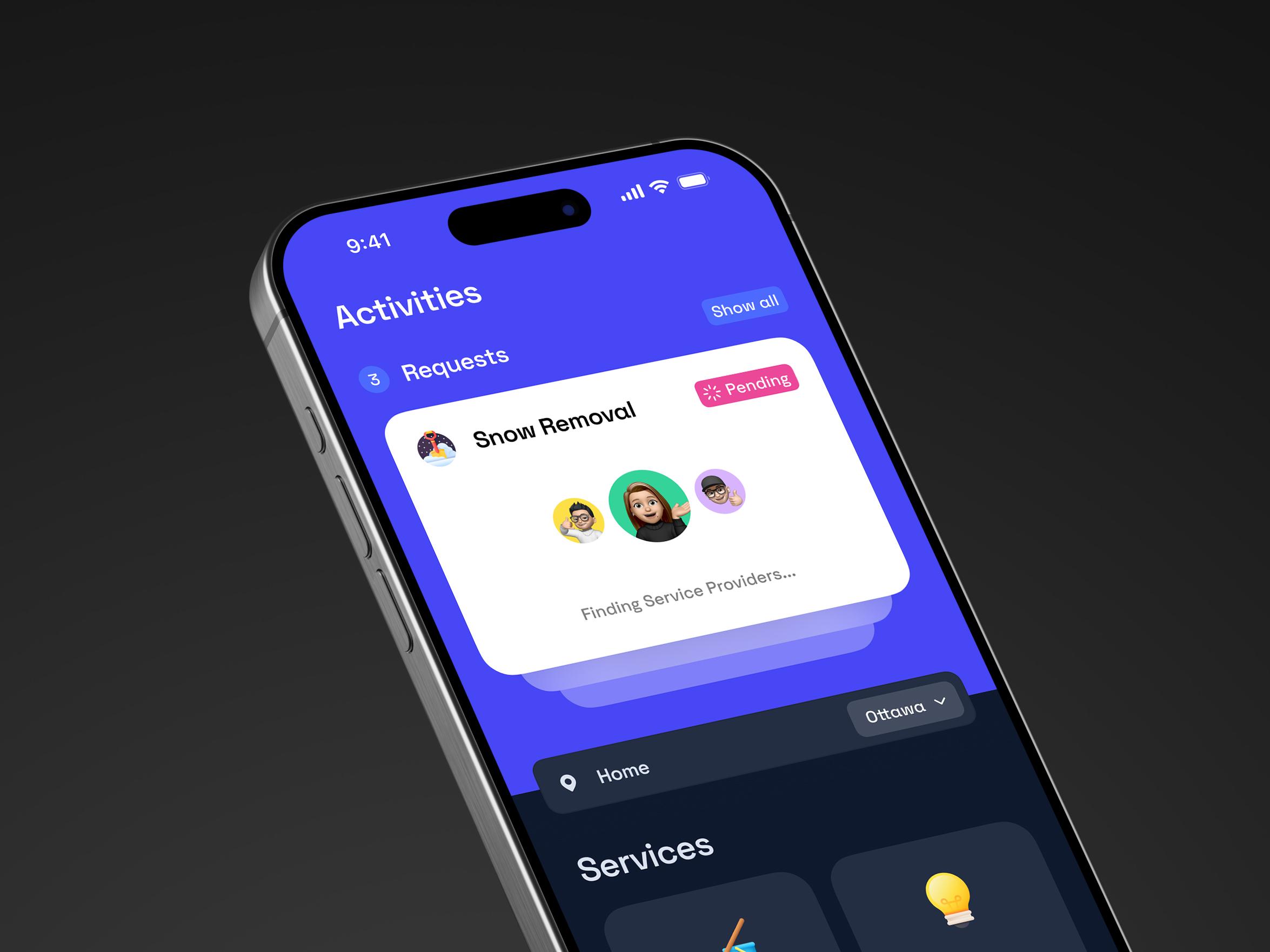
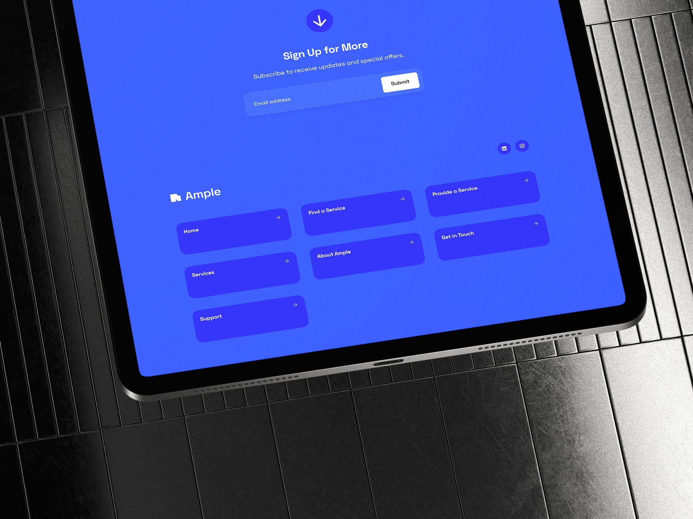
A responsive design website is like a shape-shifter. It adjusts itself to fit the screen it’s on—whether that’s a phone, tablet, laptop, or giant desktop. No weird zooming, no off-center buttons, no frustration.
It all starts with fluid grids. Instead of fixed sizes, everything scales in percentages, so it fits any screen. Images and videos resize too, without getting blurry or cut off.
The real magic? Media queries in CSS. They tell the layout how to behave at different screen widths. Hit a certain size, and things move around to keep it smooth and readable.

The goal is simple: one website that works everywhere. Not a mobile version. Not a desktop version. Just one design that knows how to stretch, shrink, and adapt. It’s smart, efficient, and makes your site feel like it belongs—no matter where it’s being seen.
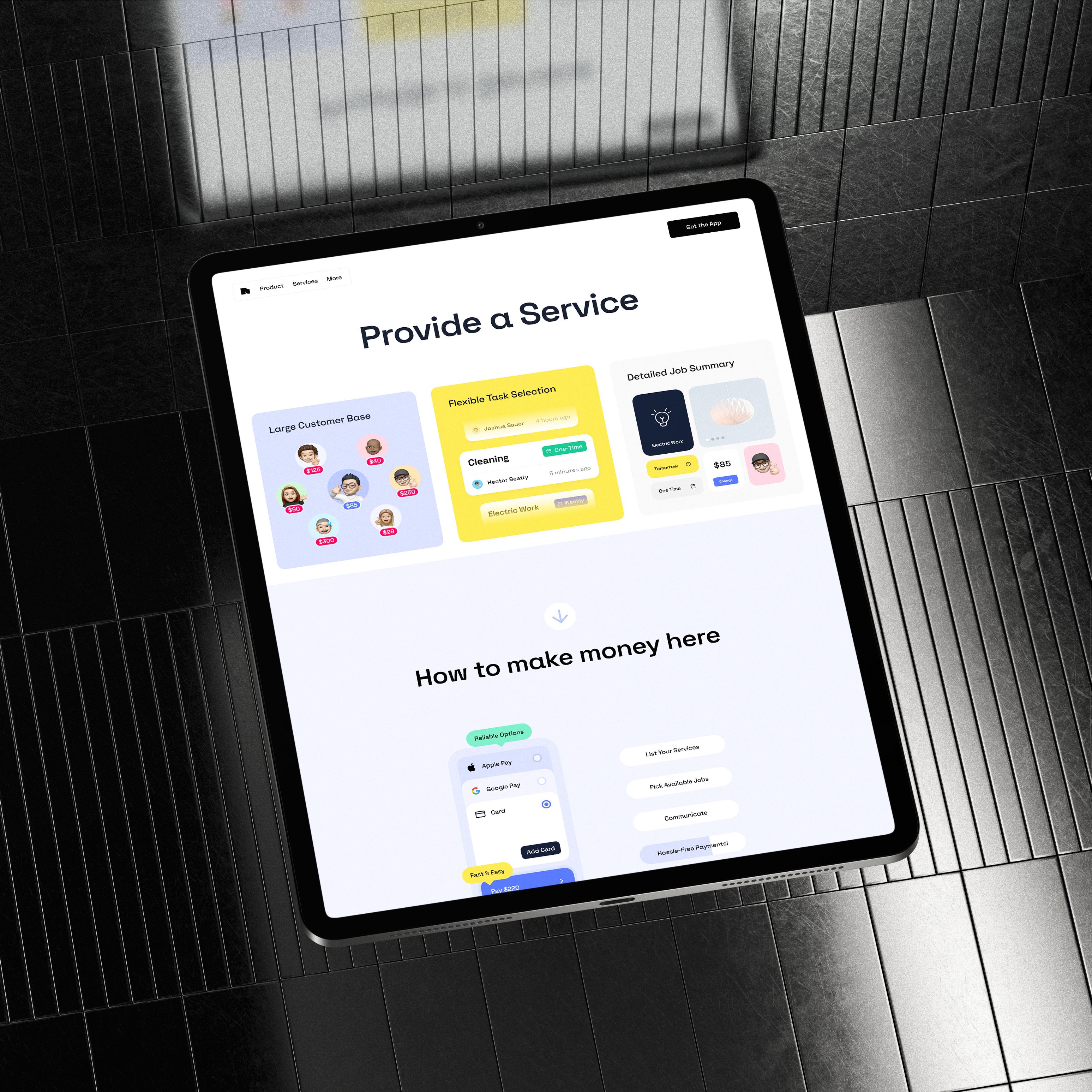
Why Responsive Design Matters for Your eCommerce Store
There’s more to responsive site design than just “looking good everywhere.” Did you know that over 60% of online shoppers use mobile devices? Sites that aren’t responsive risk losing up to 67% of these potential customers — and that’s a huge chunk of sales slipping away.
Let’s dig into the stuff people don’t always talk about—but should.
No More Design Chaos Behind the Scenes
With mobile responsive web design, you can stop juggling device-specific layouts or chasing down updates for separate versions. Designers and developers work in one clean environment. Less mess. Fewer bugs. Faster updates. It also makes A/B testing way easier when everything runs through one layout.
Easier Maintenance = Faster Growth
One site means fewer headaches when it’s time to update a banner, tweak a layout, or run a promo. You’re not redoing things five times. That saved time? You can spend it on growing your store instead of fixing layout glitches.
Flexibility for the Unknown
Tech doesn’t sit still. New devices drop constantly—foldable screens, VR browsers, smart displays. What is the purpose of responsive web design if not to keep up? A flexible layout adapts without needing to be rebuilt. You design once, and your site stays stable even as the digital world shifts around it.
Consistent Feel, No Matter the Journey
A customer might check your product on their phone, dig in more on a laptop, and buy on a tablet. With responsive design, it all feels familiar. Fonts, buttons, flow—it’s all locked in. That comfort builds trust and makes people stick around.
More Traffic, Fewer Bounces
Search engines love responsive websites. And guess what? So do users. When your store loads fast and looks great on mobile, you don’t just get more visitors—you keep them. A well-built responsive layout reduces bounce rates and helps guide customers smoothly from product to purchase.
SEO Loves It Too
Google ranks mobile-friendly sites higher. So if you're wondering what is the purpose of responsive web design, here's one big reason: it gives your store a better shot at showing up in searches. One site that works everywhere also means easier SEO management and cleaner analytics.
Smart brands don’t just build for today. They build for the scroll, the swipe, the tap, and everything next. That’s what responsive site design is really about.
Does Your Website Work on Every Device?
Not sure if your site is truly responsive? Don’t worry—it’s easier to check than you think. First, try this: open your website on different devices—phone, tablet, laptop. Does everything fit the screen? Are buttons easy to tap? If you’re pinching, zooming, or scrolling sideways, that’s a red flag.
For a quick tech check, use free tools like Google’s Mobile-Friendly Test or BrowserStack. These show exactly how your site behaves on various devices and screen sizes. They highlight issues like slow loading or unreadable text.
You can also watch real users interact with your site on different devices. Their “Hmm, what’s this?” moments are pure gold feedback.
If any of these tests reveal problems, it’s a sign your site isn’t using mobile responsive design properly—and fixing that should be top priority.
A Step-by-Step Guide to Responsive Design for eCommerce
You already know what responsive design is. Great. But knowing isn’t doing—and your site isn’t going to magically fix itself overnight (we tried yelling at ours; no luck).
So if things feel clunky, outdated, or just plain broken on mobile, it’s time for a rethink. A redesign. A glow-up your site actually deserves.
Here’s how to rebuild it so it works cleanly, smoothly, and yes—even on that weird tablet your uncle still uses.
Step 1: Audit What You’ve Already Got
Before building new layouts, see what’s breaking the current one. Which pages get the most mobile traffic? Which ones are getting bounces? Open your site on your phone right now. What’s frustrating? What takes too many taps?
Mark it down. This is your fix list.
Step 2: Strip It Down to the Essentials
Start fresh. Ask yourself: if your homepage had to fit on a single phone screen, what stays? What gets cut? That’s your content priority list. Most eCommerce sites drown in extras—this step makes sure you don’t.
It’s not minimalism. It’s clarity.
Step 3: Pick Components That Can Stretch and Shrink
Design elements should behave like rubber bands—not bricks. Buttons, cards, product tiles—they all need to resize and reposition smoothly. Think how elements move when space runs out. That movement is just as important as how they look.
Step 4: Design for Thumbs, Not Just Eyes
Can your customer tap “Add to Cart” with one hand while holding coffee in the other? If not, rethink placement, padding, and interaction size. Responsive site design is more than screen size—it’s about how people hold and use the screen.

Step 5: Test Like a Real Human
Don’t just preview it on your laptop—pull out your phone. And since you met your uncle’s tablet earlier, now it’s grandma’s turn for a test drive. Tools like Chrome DevTools or BrowserStack let you check every screen shape out there. You’ll spot weird glitches early. UX responsive design is all about making things feel effortless—kind of like your grandma’s soup after you’re done testing and return her tablet.
Step 6: Think in Load States
What does your store look like while it’s loading? On a slow train connection? In a basement cafe? Design with skeleton loaders, progress indicators, and offline states. It’s what separates a polished brand from an amateur one.
Step 7: Sync Design With Inventory Logic
When your product grid shrinks from four columns to one on mobile, think about how that changes the shopping experience. The layout needs to support how customers browse, filter, and compare items. Make sure it feels natural and helps them find what they want quickly.
Step 8: Revisit After 30 Days
Set a calendar reminder. After your redesign goes live, return to analytics. Where are users still dropping off? What’s getting more clicks now? You’re not done when it launches. You’re done when it works better.
This is what responsive design actually looks like when you're in the trenches. One decision at a time. No big speeches—just practical moves that make your site better today.
Why Hooman Studio Nails Responsive Design
At Hooman Studio, we treat every store like it’s our own. We start by mapping real touch paths—so buttons land right under thumbs. We build performance budgets to keep pages snappy, even on slow networks. We craft micro-interactions that feel alive without draining battery life.
Our analytics-driven breakpoints adapt to how your audience actually browses. We layer in accessibility beyond the basics—think voice commands and custom focus indicators. And as a custom web design agency, we even optimize for emerging devices, from foldables to in-car screens. It’s more than fitting screens. It’s about creating an online shop that feels intuitive, personal, and truly human-first.
Time to move on from old designs(:
Your website’s ready for more than just clicks. It’s ready for real connections. Responsive design isn’t a checkbox; it’s a promise to every visitor that you get them—no matter their device, mood, or morning coffee spill.
If this feels like a lot, don’t stress. We’re here to untangle the mess, brainstorm the smart moves, and find the best path forward— just practical steps tailored to your brand.
When you’re ready, we’re here. Let’s make your site the one that simply works.
Together.